*** NOTE: ALL INFORMATION IS ACCURATE AT DATE OF PUBLISHING ***
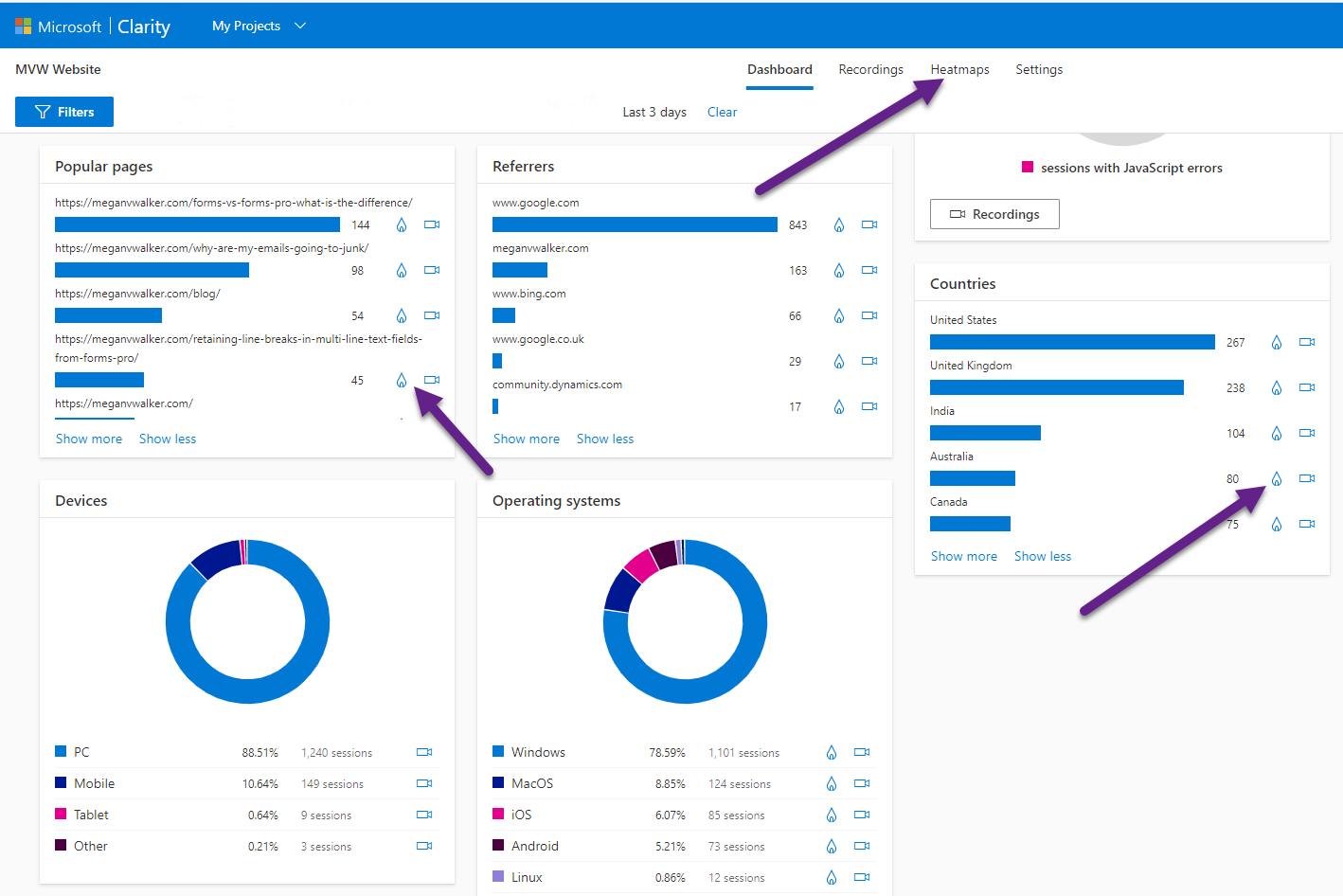
We’ve seen recordings in Clarity, and the integration Microsoft Clarity has with Google Analytics. Next, let’s take a look at heatmaps. Heatmaps are not new, with many great email marketing products including them to see where on your emails the recipients clicked and interacted. It’s a way to visualise your email to gauge how successful it was. Did your calls to action work? In Microsoft Clarity, the heatmaps do the same but with your web pages, showing the clicks made by your site visitors on a desktop, tablet or mobile device. Are people clicking in the places you want them to? Let’s check them out!
After logging in to Clarity, you can see the Heatmaps option from the top menu. You will also see a nice little flame icon next to various widgets on the main dashboard. Clicking on one of those flames will add whatever item you clicked from to the filter on the Heatmaps page. So if I clicked on the flame next to Australia in the Countries section, that would be applied to the filter on the Heatmaps page. Clicking on a flame next to a specific page would pass that through as the visited URL on the Heatmaps page.
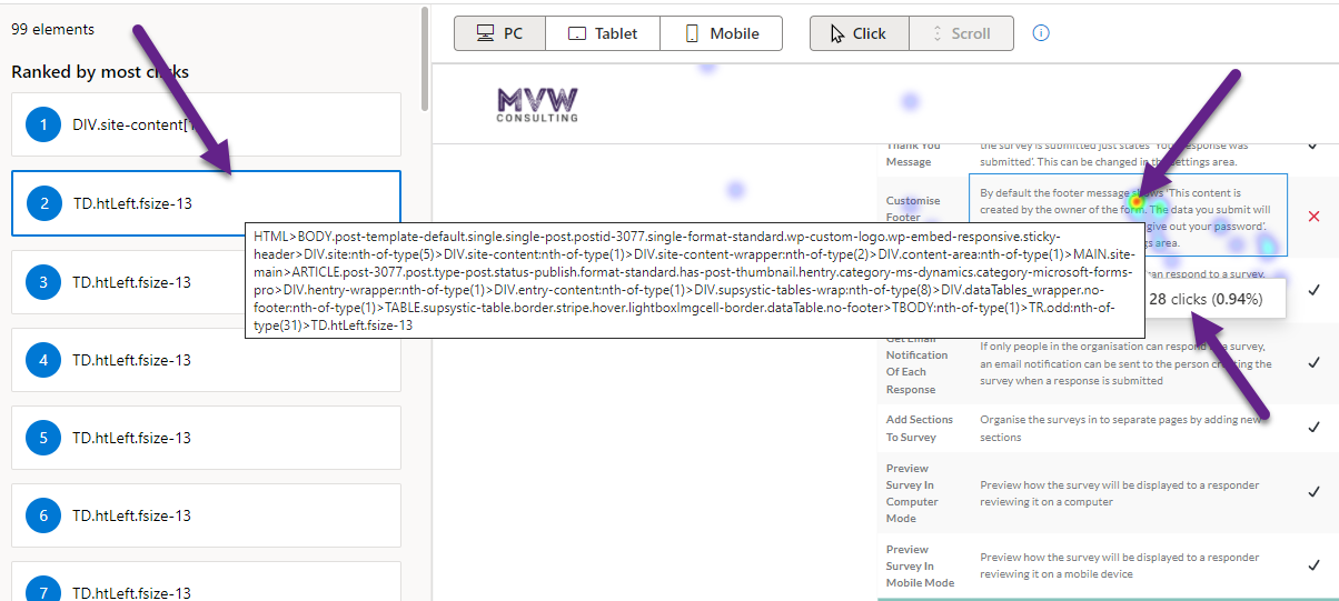
Your heatmaps will include various coloured dots and markings on the visualisation of your page. There is a colour scale at the bottom right of the page, but essentially it goes from blue (cold, less interactions on the page) to red (hot, the most interactions on the page) to indicate interactions in a specific area on the page. Hovering your mouse over one of the dots will show you how many clicks, and what that is in a percentage of the overall clicks on the page.

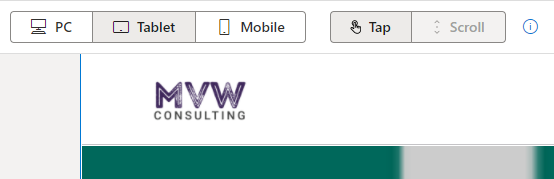
There are several types of heatmaps, although the scroll option is still listed as Coming soon and cannot yet be accessed. This will be interesting to see a heatmap based on how far visitors have scrolled down a page. For now, you can look at clicks for visitors from a desktop machine (computer/laptop).

If you click on the tablet or mobile option, the Click changes to Taps, but is essentially showing you the same thing… where have visitors interacted with the page.
On each heatmap, you have a panel on the left. This shows all of the elements on your site that were interacted with, ranked by the number of clicks for each. While this might not be of interest to some, I found it useful that when hovering over one of these elements, I can see the code from my site that makes up this element. So if you don’t code your own site, you will likely ignore this, but can be useful to see and make note of specific elements that are garnering more clicks than others. Might help with then deciding to add more of the same kind, or removing others that no one ever clicks on.
A few things to note about heatmaps. The data is kept for heatmaps for 12 months, and limited up to 100,000 page views per heatmap (oh to have that many views 😉 ).
You can watch a video on this here.
Check out the latest post:
Removing Issues With Mobile Phone Numbers On Realtime Forms
This is just 1 of 447 articles. You can browse through all of them by going to the main blog page, or navigate through different categories to find more content you are interested in. You can also subscribe and get new blog posts emailed to you directly.