*** NOTE: ALL INFORMATION IS ACCURATE AT DATE OF PUBLISHING ***
I started on my Power Platform journey over a decade ago, and like many people just learning as I go, bumbling around and often figuring things out with luck or a lucky Google. I know there are many people who have started their journey in similar ways, or have come from Canvas Apps or other places and are just dipping their toe in the model-driven app world. This post will provide some tips and tricks that hopefully will have at least one item that is new to you. There are still different ways to configure (classic and within the maker portal) but this post assumes using the experience found in https://make.powerapps.com. If you have any tips of your own, please share in the comments below!
1. Disable Recent Items
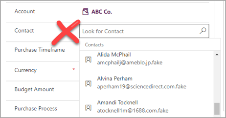
If you’ve added Lookup field to one of your forms, you’ve likely noticed that when you go to populate it, any records of the same type that you’ve recently viewed will be displayed.
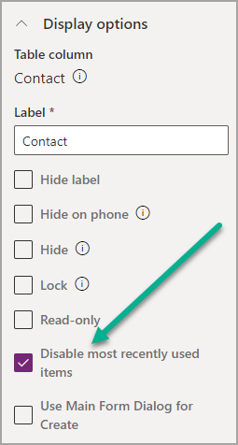
In some circumstances, and for some users, this can be confusing, leading them to pick the wrong record rather than making sure they search for, and select the correct one each time. Using the maker experience, select the field from your form, then review the display options to the right hand side. From the list of options, select ‘Disable most recently used items’. Save and then publish your form.
Now when using the Lookup field, none of the recently viewed records are displayed so a user will need to search for the record they need each time.
2. Related Records Filtering
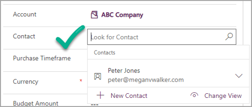
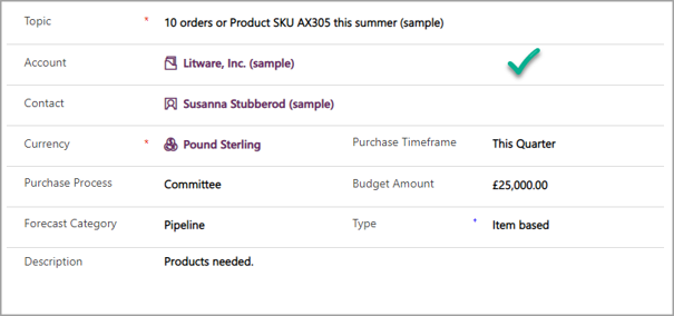
If you have a series of Lookup fields, you can filter them based on their relationship to one another. For example, on an Opportunity, selecting an Account, then picking a Contact from a filtered list based on the one selected.
By default, the list would show you all Contact records. To change this, open the form, then click Switch to classic.
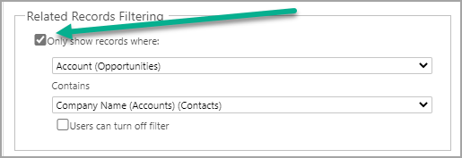
Find the field you want to filter, then click Change Properties. Tick the box for Only show records where, then pick the relationship. So here we want to only see Contacts that are linked to the Account selected on the Opportunity. Save and publish.
Now our Contact is filtered based on those that are linked to the Account selected first.
3. Remove Related Items On Forms
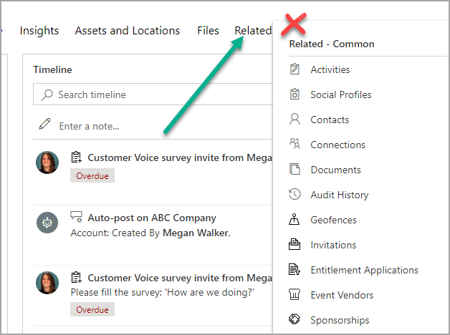
Forms are typically created using a series of tabs and sections. A form will also include a related ‘tab’ at the end showing all other records based on relationships in Dataverse. This can be confusing and often better hidden from users.
Open the form, then click Switch to classic.
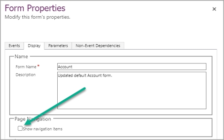
Click on the Form Properties from the top of the form, then click on Display. Untick the box in the Page Navigation section that states ‘Show navigation items’. Save and publish the form.
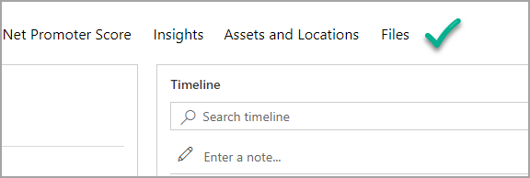
The Related option is no longer visible from the top of the form.
4. Set Field Label Position
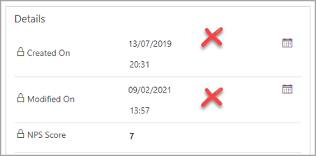
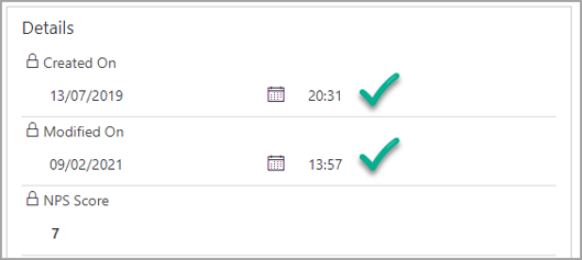
Labels are shown to the left side of the field by default. While this might work most of the time, sometimes shifting them to the top can provide a better experience visually. Long labels can wrap around, while date/time fields can end up looking strange.
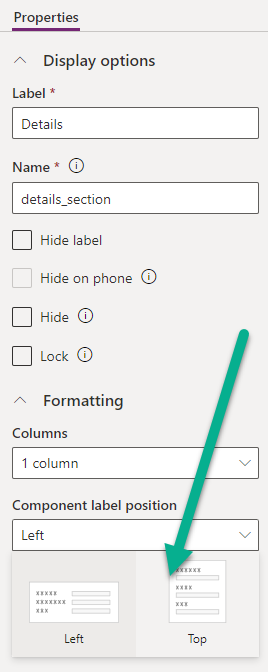
On the form, select the section with the fields you wish to change, then go to the Formatting area in the Display options under Properties on the right. On the Component label position option, select Top. Then save and publish the form.
All labels within that section will now be displayed at the top of the field rather than the left.
5. Expand Field Length Across A Section
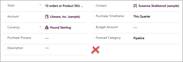
Sections can be formatted to have a number of columns. For example, we can have two columns and set up fields across them like below. What if some fields need a bit more space than others though?
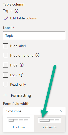
Select the field, then go to the properties on the right. Click on Form field width under the formatting area at the bottom and select 2 columns. Save and publish the form.
Now we have some fields sitting next to each other in one column, and others stretching across using two columns,
6. Using Toggle Switch For Yes/No Fields
A Yes/No field can be used to show one of two options. It doesn’t have to be those values and could show True/False, Stop/Go or any other combinations as required. By default the field shows as a dropdown when added to a form.
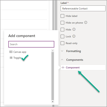
Once the field has been added, the way it’s displayed on the form can be altered, providing a more aesthetically pleasing look with a switch. Select the field on your form in the maker portal, then click on Component. Select the Toggle component, then click Done. Save and publish the form.
Now the field uses a nice little toggle switch instead of the drop down list. It’s quickly clear and obvious which option has been selected and gives a clear indicator with a pop of colour.
7. Using Stars For Whole Number Fields
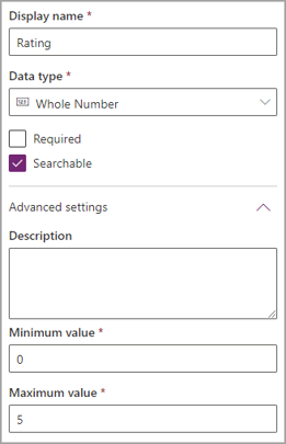
A whole number field can be used to capture details on a record. The minimum and maximum values allowed can be set to make sure users do not go above or below the purpose of the field. Adding it to a form, and the field just shows the number entered.
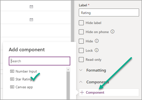
However, if the number you are capturing is for a rating of some kind, you can add a component to provide a clear star visual to see exactly what kind of rating has been added. Select the field on your form in the maker portal, then click on Component. Select the Star Rating component.
Then select the max number for the rating and click Done. Save and publish the form.
Instead of the user typing in a whole number, they can simply click on the stars to set it to the value needed for the rating field. Simple, easy to use, and a really nice visual.
8. Use Option Set Control For Choice
**WARNING**
Point suggested to me by George Doubinski from CRM Tip of the Day fame, this one does have accesibility issues that could be unpredictable for any users that might be colour blind or have other visual challenges. Use with caution!
**END WARNING**
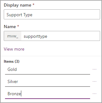
Choice fields were originally known as Option Sets. This provides the user with the ability to select one of the values from a list. In this example, there are three options for Support Type.
When adding the field to a form, it shows as a drop down list to be selected from. However, if the Choice field has two or three values, a different control can be used to display the values as blocks, making it much easier to see the one selected.
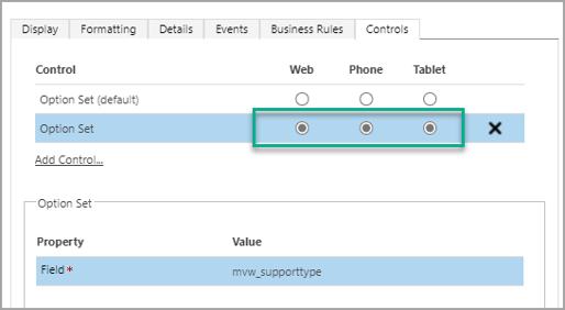
From the form, click Switch to classic. Select the field on the form and click on Change Properties. On the Controls tab, scroll to the Option Set control. Select Web, Phone and Tablet, then save the changes on the field. Save and publish the form.
When viewing the field, it now shows all of your options along in one line of blocks. Reminder, this will only work if your Choice field has two or three options in it.
9. Conditionally Make Fields Required
Having required fields can be necessary, some of the time. Consider adding Contacts to your system. You won’t need an Account for each one, but sometimes it’s been made required. How can we change that?
Creating a business rule means you can set the Account field as required only if another field has a specific value. Adding a Client Contact Yes/No field allows us to do that. If that field is Yes, make the Account field required, if not it’s no longer required.
This makes sure data is required at the right times and in the right situations.
Makes it less frustrating for the users and means only necessary records are added.
10. Set New Error Message
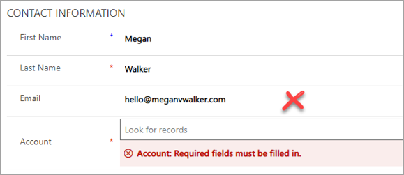
If you have a field that’s required and a user saves the record without it being filled out, an error message will display. While it can often be obvious why it’s required, sometimes users might need a little more info.
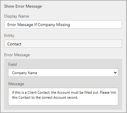
Create a business rule and add an action for ‘Show Error Message’. Select the field that should show a message if it hasn’t been populated. A more detailed descriptive message than then be added for this specific field.
After saving and activating the business rule, it will take immediate effect. The user now knows specifically why the Account record is required and understands how to resolve it.
11. Make Sure First Tab Opens On Form
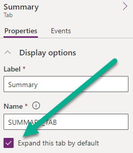
This one can be frustrating. If someone is editing a Form in the classic editor, and expands some of the tabs and minimises others, what you can end up is a situation where the second or third tab opens automatically by default, rather than the record opens with the first tab showing which is the most logical.
To solve this, open the form and click on each tab. Make sure this is either selected for all tabs, or deselected for all tabs. If some are selected and some are not, this will mean the first tab that is set as selected will open as the default tab. Also, if someone else then edits in the classic editor and leaves some tabs open and some closed, this will edit what you have done here. So make sure all System Administrators or Customisers are doing things the same way. THIS has to be my biggest pet peeve. 😉
Share Your Tips
What other tips do you have? These are things that can seem so simple when you have been doing this a long time but could really help out someone new to Model-driven Apps! Share them in the comments below!
Bonus Tip 1
Thanks to Alex McLachlan for the suggestion in the comments! Here is a bonus tip I had forgotten about. When adding a column (field), make sure you add a description that will help users understand it’s purpose. Without a description, when hovering over the name of the field we just see that appear which isn’t helpful at all.
Go to the column in make.powerapps.com and add something useful that will give the users enough information to understand the purpose.
Once saved, you should now see the new description when hovering your mouse over the field name. Much better. Thanks Alex!
Bonus Tip 2
This one is thanks to James Glover and his post I saw on LinkedIn. This is actually a new preview feature but WELL WORTH a mention here! If you have a view where you have included an option set (choice) field, it looks kind of boring initially right? It’s just a plain list of values.
However, if you go in to make.powerapps.com you can easily add a colour for each item you have in your Choices column. The ability to set colours has been there for some time, and it was used in certain areas (Customer Service mainly and useful in Power BI reports) but not really of much use to most people. Make sure you set the colours as fairly light as the text needs to still show up in the grid.
Now go in to the Classic editor and to your table/entity at the top level (not the View itself) and add the Preview Power Apps grid control. It doesn’t have the option at the View level just yet. Make sure you set it to be used on at least the Web. Then you can play around with the controls, save and Publish the entity changes.
Then we get this little beauty! Nice find James, loving this one. I also like the ability to add in the column icons, so we see what type of field it is in the column header too.
Bonus Tip 3
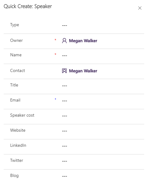
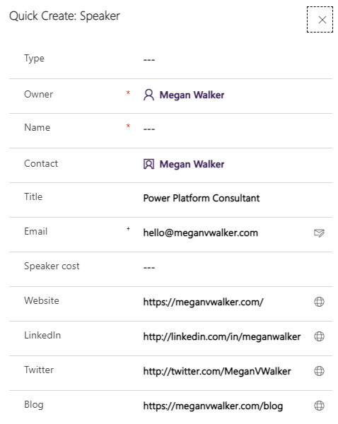
Thanks to Stefan Strube for the reminder of this one. It’s something I do on pretty much every implementation to make things easier for users, and ideally reduce errors on re-keying information, and that’s mapping from one entity to another. So let’s say we want to add a new even speaker record directly from a Contact. When we click to add the related record only the lookup back to the Contact is filled out. What about getting all the other items like the title and email? Passing it through automatically would be so much easier and faster.
Although we can start from the make.powerapps.com area, we can’t actually do the mapping from here. So make sure you add the relationship from the initial table (Contact in this instance) to the related table (Speaker) to your solution first.
Then from the Tables area we can switch to classic to get what we need.
From the entity. go in to the relationships area and then open up the relationship you need to edit. Then from the Mappings area we can click New.
You’ll be given a screen with two sides, the source and then the target entity. Find the two values that you want to map, select them both and click OK. Keep in mind that the two fields need to be of the same type and also the same size. So if your source text field holds 200 characters but your target text field only holds 100, you won’t be able to map it. Continue mapping all your fields then save and publish once finished.
Now when you create a new target record from the source, all of your values will be mapped in to it automatically. Awesome!
Check out the latest post:
Add Information Buttons To Provide Additional Details For Custom Page Users
This is just 1 of 580 articles. You can browse through all of them by going to the main blog page, or navigate through different categories to find more content you are interested in. You can also subscribe and get new blog posts emailed to you directly.



















Thanks for these, and in particular the Option Set tip, that one had passed me by.
My tip (and biggest peeve when it isn’t done) is to add descriptions to the columns so that users can understand what the column is for when hovering over the label. For example, for the column ‘Large Print’ adding the description “whether the Contact wants the Large Print version of the magazine”.
Yes! Good one. I agree. Think I might need to add this to the end of the blog. Thanks Alex!
I really like the way every suggestion is laid out in the article, with before and after screenshots. Very informative. Thank you!
Thanks Ivan!!!
Is there any way to change the vertical size of an image in a form? I have a form that is only used by users to navigate through to related records, and I’ve added a map to the form. I know users can click on the image to see it full size, but it looks kinda naf having a small image on the app view with all this empty space around it, but I can’t see any way to make it display bigger …
Hi Graeme, I’m not sure. I haven’t played around with that much to know. Likely if it’s not obvious and there is no setting for it, then I would imagine not out of the box. Have you checked out the PCF Gallery to see if someone has created a control that will do what you want? https://pcf.gallery/
This is great! Really helpful. Thanks!
You are very welcome!
That was awesome tips!
Any tips to force a specific field to be the first select field when we open the form or the tab?
Hi James…. maybe there is with Javascript? Not sure but I think it would go from left to right from the top left of the first section on a tab. Would be curious if there is a way other than code to do this!
That are nice tips, it will surely help!!
Is there a way we can hide datepicker calendar icon , that is displayed on right side , when we add a date field to our model driven app form?
Hi Prachi. Not that I am aware of!
This is a fantastic article for anyone navigating the complexities of model-driven Power Apps! Your tips are practical and easy to follow. For those looking to dive even deeper, we’ve compiled some additional insights in our article https://www.resco.net/learning/power-apps/
Thanks for sharing Ivet! Loving your insights and tips too!
Good tips, but Bonus Tip 3 does not seem to be functional. I have tried to apply this for Choice and Whole Number fields (both of the same exact structure across the 2 tables, with a different field name for Whole Number column) without any luck. When I looked-up an ID value from the source entity, it only retrieved that specific column, but both the Choice and Whole Number fields remained empty in the target entity. I presume that once a lookup column is populated it should also populate all of the other mapped (associated) columns right in the form view, without the need to save it first?
Hi Mantas, I can assure you, it is 100% functional and used by consultants all over the world daily! 🙂 Based on one of the things you’ve said, I am not sure how you are trying to use it. There isn’t anything related to a lookup column. Instead, it would work if you are on one record and create a related record from it. So if you are on an Account and go to a subgrid for Contacts, and click to create a new Contact. Any fields mapped from Account to Contact would be populated in to the new Contact record,. If you set a field using a lookup, the Primary Contact field on an Account for example, nothing will happen, no fields are mapped in this scenario. Hope this helps!
Hi,
In our model-driven form, there are date, multi-choice, and text fields. When the user enters values, all of the field values are displayed in a normal font except for the multi-choice field and a lookup field, which use PCF control to display as dropdowns. These fields are displayed in bold (please refer to the attached image).
The requirement is to display all the values in a normal font. How can we make the values of the multi-choice and lookup fields display in an unbold font?
Thank you.
Hi Siva, I would imagine there is no way to change that at all based on it being a PCF control, the font is just rendered differently. Can only suggest you open a ticket with Microsoft to confirm, but think it’s unlikely they would change this to be honest.
great tips – thank you so much! 🙂
Re: Bonus Tip 3 (= BT3), does your comment to Mantas mean that:
1) even though lookup columns do create relationships between tables, it’s not possible to pre-populate fields in related tables when creating new records?
2) the tip works when the source is on the 1 side of a 1:N relationship, but not the other way around?
Scenario: a Vacancy table with fields like salary, manager and job title. When the vacancy is filled, we either select or create an employee record for the successful candidate.
Vacancy is the N side and Employee is the 1 side, because a vacancy can only be filled by 1 employee, but an employee can apply to multiple vacancies and change role internally.
Obvs, we don’t want to type in Job Title/Manager/Salary again when creating a new employee record.
However, there doesn’t seem to be a way to make Vacancy the source and Employee the target when following BT3 instructions.
The only direction is Employee -> Vacancy, which is no use at all.
I must have missed something 🙁
Hi Linda, Bonus Tip 3 is all about setting up mappings. Mappings work when you have a relationship between records, but the values ONLY populate when you create the record FROM another one. So in your example with Employee and Vacancy, I am guessing you already have the Vacancy record that exists, correct? The only way the values from the Vacancy would populate in to the Employee is if you had a subgrid on the Vacancy record for Employees, or you clicked Create new from the Lookup field directly and created the new Employee. THEN the values that you had mapped from the Vacancy table to the Employee table would be mapped.
IF you already had the Vacancy record and used the lookup for Employee and filled it with an EXISTING RECORD, then no, nothing would map. If you wanted those things to map for an existing record, you would need to create a workflow of some kind (a CRM realtime workflow, or using Power Automate). Hope that makes sense!
Hi Megan, this is a great and comprehensive list, thank you!
I’ve got a specific issue which I can’t see a solution for, hoping you can help!?
My lookup field correctly brings back the Reference Number of a property from a master property table, however in my new record created I don’t want to save the Reference Number, but the actual property Address Line 1, which is another field in the master property table. I’ve added a Quick View so I can SEE the address details, but it won’t save it into my new record. Is there a way to pull this info through in a save-able way?
Paul, if you are creating a new record and then using a lookup to set the property, you would either need Address Line 1 to be a calculated field that gets set pulling the value from the related property, or you would need a workflow (either CRM to do real time or Power Automate to run in the background) to set the necessary fields from the property on to your record.