*** NOTE: ALL INFORMATION IS ACCURATE AT DATE OF PUBLISHING ***
It’s pretty easy to add an expression in your custom pages to allow someone to delete a record. Sure, they still need to have a Dataverse security role that gives them delete permissions for that to work, but we shouldn’t make it so easy that someone could make a mistake without some kind of confirmation. How about we build a modern delete confirmation popup in your custom page? This we can do, and make it look nice, and make someone stop and think before they complete the deletion. This method also means you are not taking someone back and forth between pages for this, it’s all done from one screen. Let’s take a look!
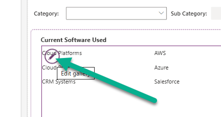
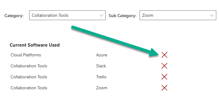
First, in my example I am going to add a new icon to a gallery that will show a cancel X for someone to use to delete a record. I can edit the gallery to add an icon that shows for each row.
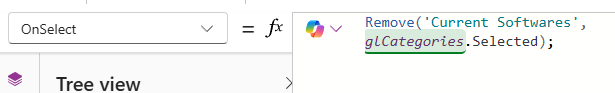
Now to simply delete a record, we can use the Remove command to delete the selected record in the gallery from the Current Software table.
And while this does exactly that, it’s not giving the person any chance to confirm it before they just remove records from Dataverse. So let’s add a confirmation popup in to the process.
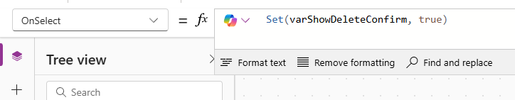
First, instead of using the Remove logic on that icon, add this instead. This is going to set a variable within the custom page to true when the button is pressed. We can then use the same variable elsewhere to determine if a confirmation shows rather than just deleting the record right away.
Set(varShowDeleteConfirm, true)
Now you will need to add some new items to your custom page. Start from your main screen to add the first container, then all other items add to the new container.
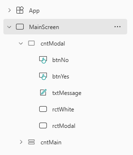
Here is what you will need to add. Obviously you can set different colours or style the buttons etc. how you see fit but ultimately we are creating a container that will only be visible when one of the cancel icons from the gallery is pressed. The container is visible when varShowDeleteConfirm is true and hidden when false. Using the X and Y logic allows us to figure out the middle of the custom page rather than just dragging things to where we ‘think’ the middle is. Notice we can do things like (Parent.Width – Self.Width) / 2 and (Parent.Height- Self.Height) / 2 which puts things in the centre, which is perfect for the white rectangle that we want to show exactly in the middle. The text and buttons then put items in the middle but shift left or right from the centre with a positive or negative value, allowing us to centre things dynamically. Play around with those numbers till you are happy with the positioning.
- cntModal – Regular Container
- Width – Parent.Width
- Height – Parent.Height
- Fill – RGBA(0, 0, 0, 0.4)
- Visible – varShowDeleteConfirm
- HoverFill – Remove the value
- PressedFill – Remove the value
- btnNo – Button
- Button type – Standard
- Text – No
- X – (Parent.Width – Self.Width)/2 – 60
- Y – (Parent.Height – Self.Height)/2 + 40
- btnYes – Button
- Button type – Primary
- Text – Yes
- X – (Parent.Width – Self.Width)/2 + 60
- Y – (Parent.Height – Self.Height)/2 + 40
- txtMessage – Label
- Text – “Are you sure you want to delete this record?”
- X – (Parent.Width – Self.Width)/2
- Y – (Parent.Height – Self.Height)/2 – 30
- rctWhite – Rectangle
- Width – 400
- Height – 200
- X – (Parent.Width – Self.Width)/2
- Y – (Parent.Height – Self.Height)/2
- Fill – RGBA(255, 255, 255, 1)
- HoverFill – Remove the value
- PressedFill – Remove the value
- rctModal – Rectangle
- Fill – RGBA(0, 0, 0, 0.4)
- Width – Parent.Width
- Height – Parent.Height
- HoverFill – Remove the value
- PressedFill – Remove the value
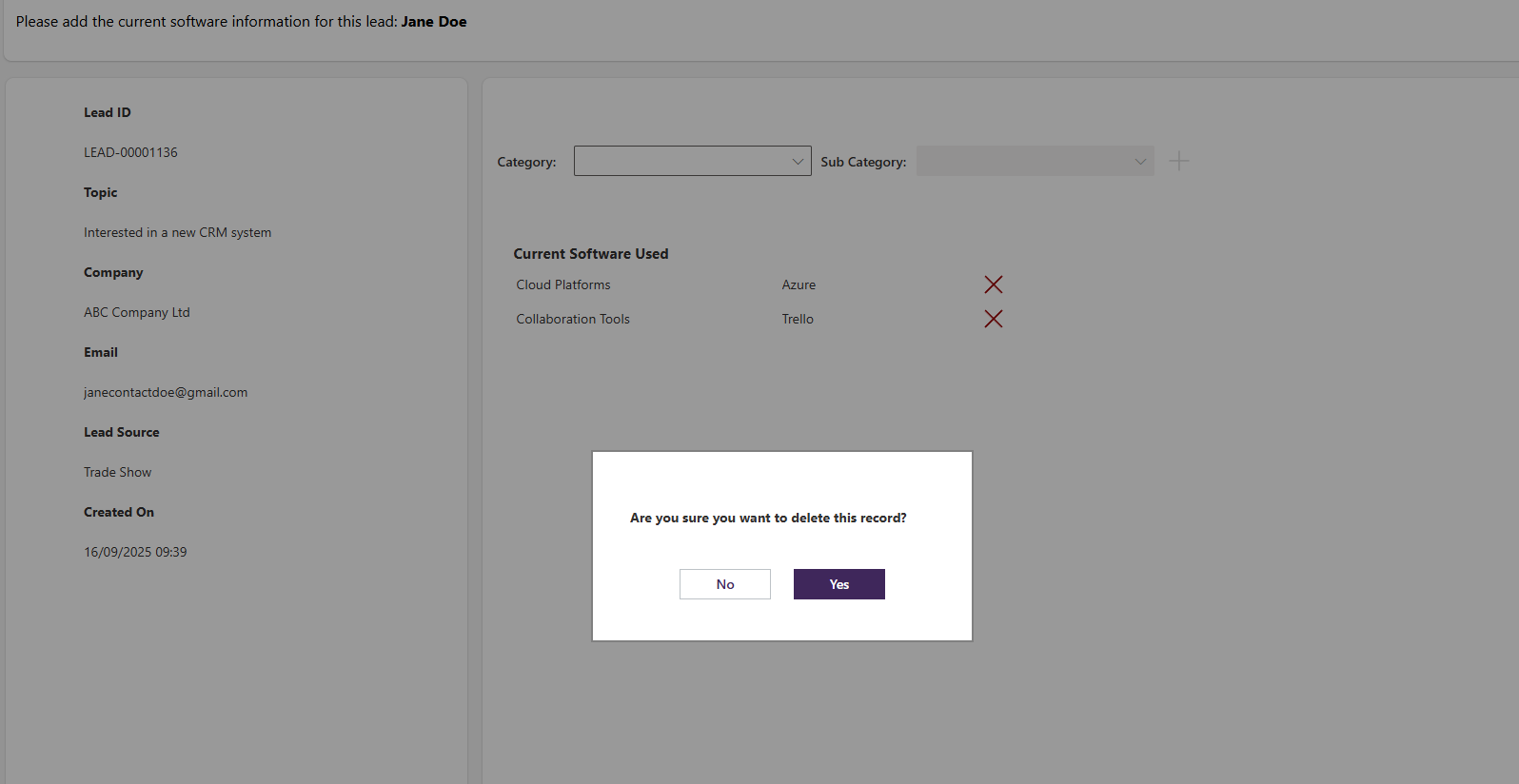
Then preview and click on one of the records in the gallery and you can see it look something like this.
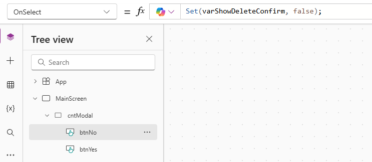
Back to the buttons, we need the following OnSelect expression on the No button. If someone clicks No that they do not want to delete the record, we set the varShowDeleteConfirm variable back to false which in turn hides the container making it seem like the popup has disappeared.
Set(varShowDeleteConfirm, false);
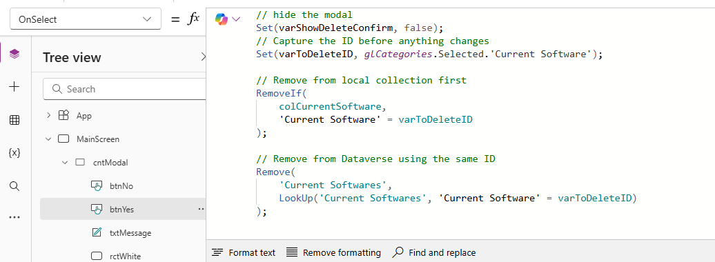
For the OnSelect for the Yes button, the first thing we are going to do is the same as for the No button and change the variable back to false. Before we just use the remove function, we need to get the ID and store it in a temporary variable so that we can make sure it also gets removed from a collection we are using on the gallery. So we find the Current Software record where the ID of that record in the collection matches the value in the varToDeleteID variable. Lastly, we do the actual delete from the table by using the Remove logic directly on the table in the database (rather than in the collection) where and again finding the Current Software record where the ID of that record in the table matches the value in the varToDeleteID. This means our collection is updated AND the table is updated. If you are not using a collection you can just go directly to the remove from the table instead.
// hide the modal
Set(varShowDeleteConfirm, false);
// Capture the ID before anything changes
Set(varToDeleteID, glCategories.Selected.'Current Software');

// Remove from local collection first
RemoveIf(
    colCurrentSoftware,
    'Current Software' = varToDeleteID
);

// Remove from Dataverse using the same ID
Remove(
    'Current Softwares',
    LookUp('Current Softwares', 'Current Software' = varToDeleteID)
);
Here it is in action. A really nice looking popup modal effect when someone clicks an X next to one of the rows in the gallery (which is using a collection). The user can then cancel it by clicking No, or complete the deletion by clicking Yes, and the changes are then visible to them immediately in the custom page.
Check out the latest post:
Create Add To Outlook Link For Session Or Event Registrations
Considering Custom Pages?
Thinking about using Custom Pages but unsure where they fit best?
I help organisations design model-driven experiences that are intuitive, scalable, and built for real users, not just technical possibility.
This is just 1 of 583 articles. You can browse through all of them by going to the main blog page, or navigate through different categories to find more content you are interested in. You can also subscribe and get new blog posts emailed to you directly.