*** NOTE: ALL INFORMATION IS ACCURATE AT DATE OF PUBLISHING ***
Did you know there is a right way to add the fields to your marketing forms in Real-time Marketing? It might not be immediately obvious but the order in which you add the fields and the overall layout you pick can make a different to your customers or prospects filling out the form, and even how it looks on a mobile device. In this post I’ll walk through the best approach to take so your forms can be filled out easily AND will still be laid out in the right way when viewed from a mobile device.
Sometimes you want your forms to be a little minimised and rather than having one field on each row it can often look better to have two fields side by side. So in your layout, the section can be set to have 2 columns and add the fields on like we see in the image below.
What can then be tempting is to keep going and add your fields in to the different columns like we see below. It’s easy and looks good right?
However, this actually creates a poor experience for the person filling it out. I like to tab through fields when I complete a form… but the tabbing will follow the path of navigating through all of the fields in one column first and THEN go to the second column. This means the person filling the form out below would go First Name, Email, Job Title, Last Name, Business Phone and then Country. What we really want is to go First Name, Last Name, Email, Business Phone, Job Title and Country.
What’s even worse is when the form is viewed on a mobile phone. What this does is displays a section and each column within that section is displayed in order. This means the First Name and Last Name aren’t even near each other. Again, a pretty bad experience for the person visiting your website.
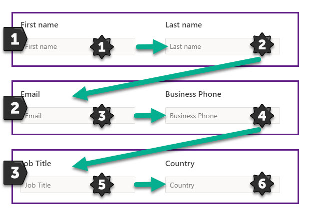
To create the right experience and make sure the user can tab through the form logically AND that fields show in the right order on a mobile device, make sure you add one section for each set of columns like you see below. We have 3 sections with 2 columns in each one. When someone tabs through the columns they will go through column 1 and then column 2 of each one, then move on to the next section. When looking on a mobile, all of the fields will be in the correct order too. Hooray!
Check out the latest post:
Assign Records To A User Or A Team From Your Custom Page
This is just 1 of 571 articles. You can browse through all of them by going to the main blog page, or navigate through different categories to find more content you are interested in. You can also subscribe and get new blog posts emailed to you directly.


Great post! Thanks Megan! 🙂
You are welcome!!!