*** NOTE: ALL INFORMATION IS ACCURATE AT DATE OF PUBLISHING ***
Who likes things to make your life easier? Who hates doing the same thing over and over again? Well, me, on both counts. Each week I put together the D365 Marketing Weekly newsletter and the email that goes along with it. Each article has a title, author, description, image and a button with a link. I’ve styled it to be a nice little content card. If you have a similar requirement for a reusable content card for your own newsletter, I hope this post will help. It does mean jumping in to a bit of custom HTML, so be brave and follow along!
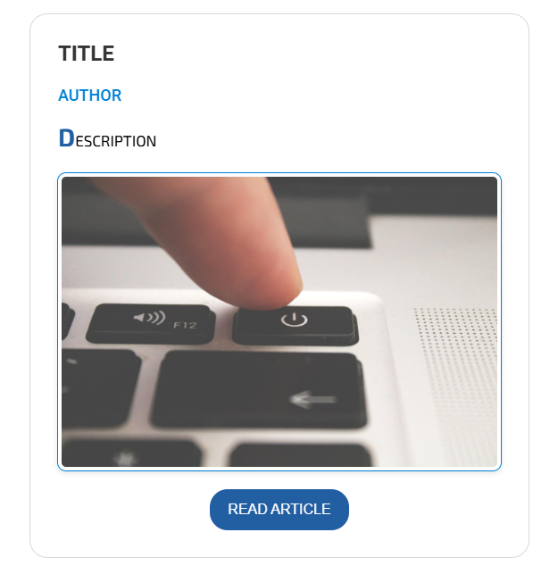
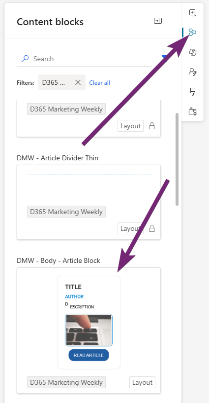
First, this is what I want to end up with. It’s a content block so that I can add it to an email template but also bring in to email when I need additional blocks on a weekly basis. It’s a content block with one section and one column, then three text boxes, an image, then a button. For the text items, add something short and obvious like I have below. Makes it easier to find in the HTML.
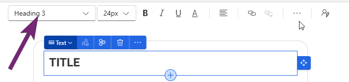
If we start from the top, we can set it to be Heading 1, 2, or 3, or paragraph. I’ve set mine to be Heading 3.
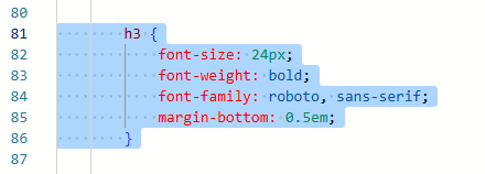
Easiest way to style it is to go in to the HTML of the Content block, then find what you have already in h3. You can then set the font size, font weight, font family and anything else you need for the styling.
  h3 {
            font-size: 24px;
            font-weight: bold;
            font-family: roboto, sans-serif;
            margin-bottom: 0.5em;
        }
Next I want to set the author styling. Notice the style option isn’t there, that’s because I have added a different style to this text. I am going to use heading 4.
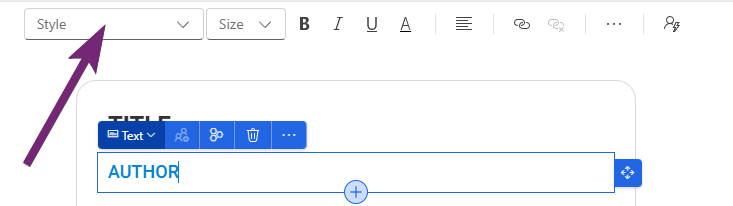
Find where you have added the AUTHOR text and put <h4> right before it and </h4> right after it. This tells the content block that we want the text between the h4 tags to be styled accordingly.
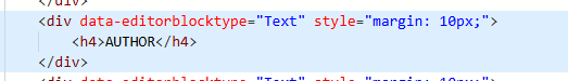
Within the style section of the HTML, if you already have h4, adjust it. Otherwise, add it in like you see below and just adjust accordingly. I always want this text to be uppercase, even if the person creating the email puts it as lowercase. Using text-transform uppercase will do that for us.
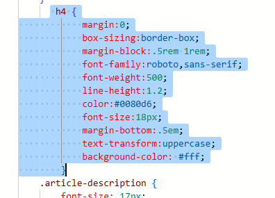
   h4 {
            margin: 0;
            box-sizing: border-box;
            margin-block: .5rem 1rem;
            font-family: roboto, sans-serif;
            font-weight: 500;
            line-height: 1.2;
            color: #0080d6;
            font-size: 18px;
            margin-bottom: .5em;
            text-transform: uppercase;
            background-color: #fff;
        }
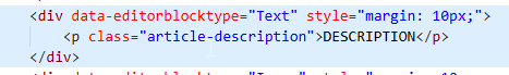
Now we get to the Description which I have set as Paragraph.
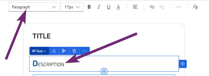
Now I could just leave it as the main p class in the CSS part of the HTML, but I might want to use the ‘real’ paragraph styling later on, so in this one I am adding class=”article-description” in the <p> tag like you see below.
For this, I am setting the main font styling, but then I also want to style the first letter in this section to be a different colour and larger than the rest of the letters.
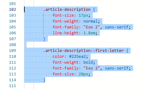
        .article-description {
            font-size: 17px;
            font-weight: normal;
            font-family: "Exo 2", sans-serif;
            line-height: 1.8em;
        }
        .article-description::first-letter {
            color: #225ea2;
            font-weight: bold;
            font-family: "Exo 2", sans-serif;
            font-size: 28px;
        }
For the image, I want to give it a nice bit of padding, then a border with a little shadow on it.
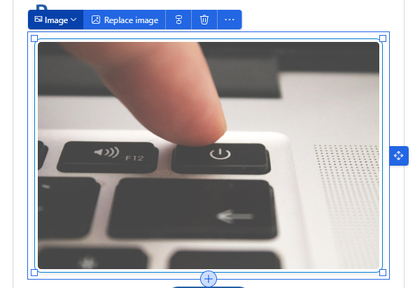
Here we can see that all I’ve done is updated the img class which should already be in the CSS section of your HTML. You can use what I have shared below and just adjust the colour to suit your own requirements.
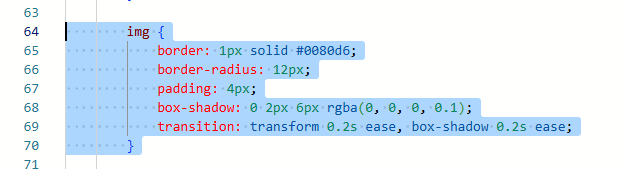
     img {
            border: 1px solid #0080d6;
            border-radius: 12px;
            padding: 4px;
            box-shadow: 0 2px 6px rgba(0, 0, 0, 0.1);
            transition: transform 0.2s ease, box-shadow 0.2s ease;
        }
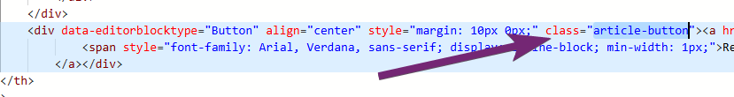
The last part is to adjust the button.
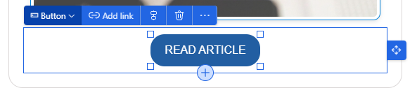
Again, I am going to create a custom button class that I can add so that any other buttons I might want to add will use the standard button class in the CSS. So I find the button I added, then either adjust any existing class, or add in class=”article-button”.
This makes the button text all upper case and sets the font size and family. All pretty standard!
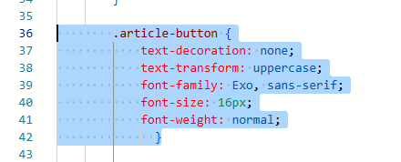
        .article-button {
            text-decoration: none;
            text-transform: uppercase;
            font-family: Exo, sans-serif;
            font-size: 16px;
            font-weight: normal;
              }
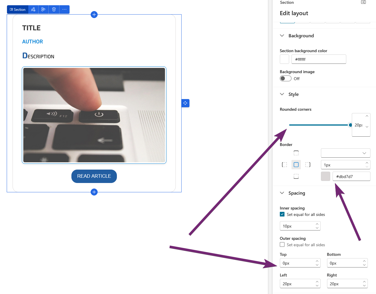
I’ve also added a border to the style of the section with rounded corners, 1 px with a grey colour and then set some spacing either side to give it the card effect.
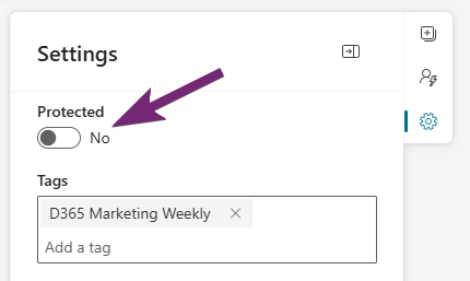
Finally, before making the content block ready to send, be sure to set Protected to No. If you don’t, none of the users will be able to update anything on the content block when they use it. Not fun!
Now when adding to your email template, or when needing more of the content cards in an email, you can simply drag it across from the content blocks area.
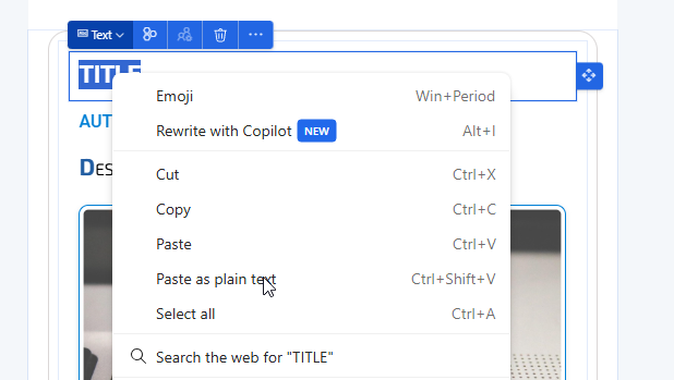
One last tip, when you are adding in the information to the content card, if you have copied stuff from somewhere else (word, a website etc), be sure to right click and paste as plain text. If you simply paste, you could end up pasting in all kinds of other formatting which will break your beautiful CSS you worked so hard on!
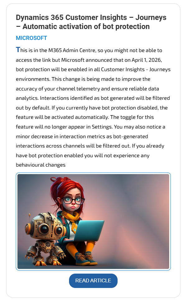
And here we have it, a beautiful content card that has been added to an email. This makes me happy and makes my life a WHOLE LOT EASIER each week. 🩷💙🩷
Check out the latest post:
Add Information Buttons To Provide Additional Details For Custom Page Users
Unsure about your Customer Insights set up?
Customer journeys are powerful, but only if the platform, data model, and compliance framework are aligned.
I work with teams using Customer Insights Journeys to make sure it is set up correctly, data is compliant, and journeys deliver without surprises.
This is just 1 of 580 articles. You can browse through all of them by going to the main blog page, or navigate through different categories to find more content you are interested in. You can also subscribe and get new blog posts emailed to you directly.
We would like to make greater use of content blocks, for example for legal texts. However, what bothers me is that when a content block is updated, the changes are not automatically reflected in all emails where the block is used. Is there a way to implement this so that updates to a content block are applied automatically across all emails that use it?
Hi Laura, without saying too much…. be patient…. and perhaps your wish will be granted soon… 🤔