*** NOTE: ALL INFORMATION IS ACCURATE AT DATE OF PUBLISHING ***
Did you know about the hidden features in a model-driven app? Well maybe not hidden, but perhaps overlooked when you are creating a new app, or reviewing existing ones. There are a whole host of different settings available to turn on and off to create slightly different experiences depending on what app someone is using. In this post, I will walk through some of the current ones that might be of interest and show what happens when they are turned on versus turned off.
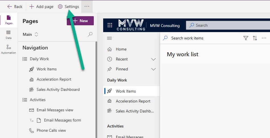
First off, to get to the settings from an app, click to edit the model-driven app from within make.powerapps.com. It’s then this little option here from the top left of the screen.
Settings Area – General
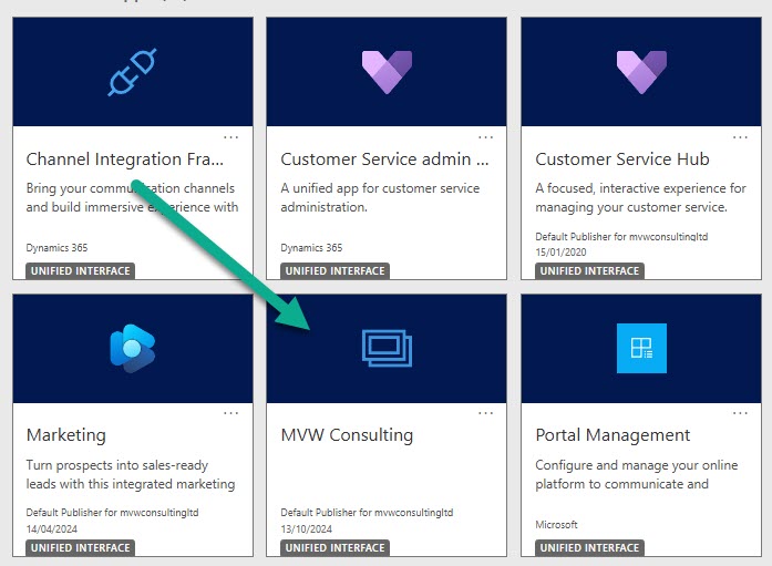
One of the first things you can do is change out the icon that is used for your app. This is what the default icon looks like, which can mean you have a bunch of apps all with the same icon, making it harder to stand out when users have access to a lot of different apps.
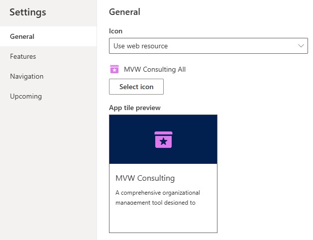
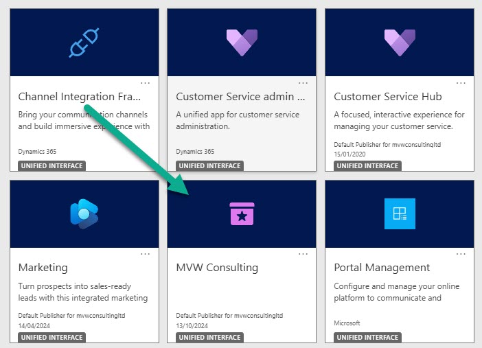
In the general settings, you can swap out the icon by using a web resource (and uploading an svg file for your icon. Here we can see that I have swapped it to a different icon.
Looks a lot better for users hunting for the right app to switch too now that we have our own custom icon.
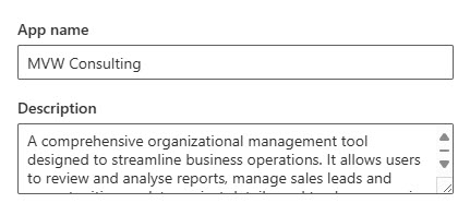
Another thing that often goes overlooked is adding a description to the app. This can also be done from the General settings area.
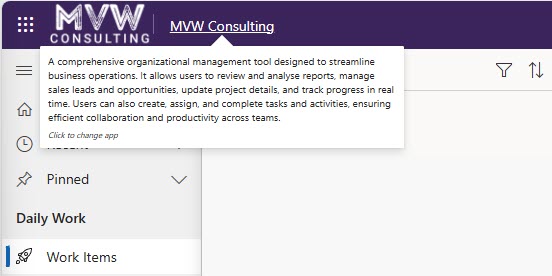
This will show when someone is changing the app, or if they hover their mouse over the name of the app while using it. This then serves as extra information for the user.
Settings Area – Features
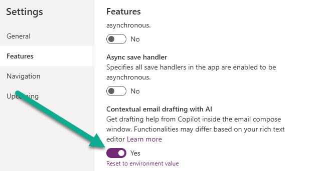
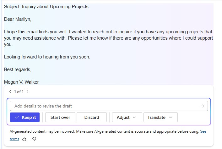
Now let’s move on to the next section of the settings area, the Features. This is a whole host of toggle switches. One thing to note, if the same setting exists at the environment level, that’s what it will be set to by default. You can always reset the toggles back to the environment value if needed. The first one we will look at is ‘Contextual email drafting with AI. This states that it will give drafting help from Copilot inside the email compose window.
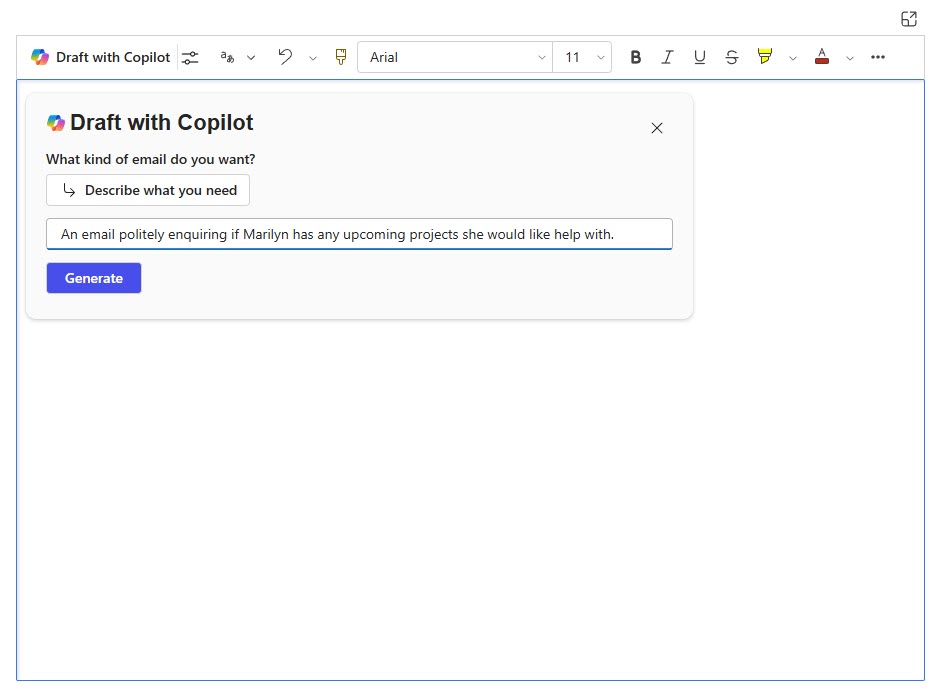
When it is turned on, we can use Copilot to describe what kind of email is required.
Then we get an email we can either keep, adjust, or start over again (and even translate!).
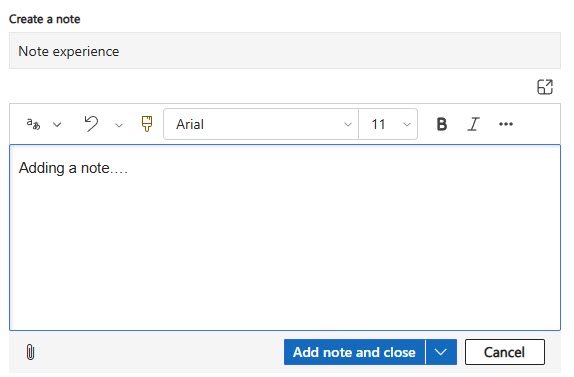
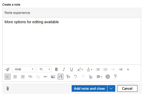
Another switch is to enable a modern RichTextEditor control experience for notes.
This is what it looks like turned off, a few basic controls for the text are provided but not much.
After turning the switch on, we get a wider set of controls on the notes control. Could be useful for users when adding notes to make sure they are formatted accurately.
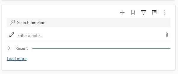
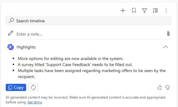
Staying around the notes area, we have a setting for the timeline to enable higlights.
With it turned off, this is what the top of the timeline looks like.
With it turned on, we see a set of highlights that have been generated with AI that could be useful in some circumstances.
Settings Area – Navigation
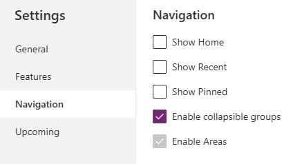
This is one I have written a whole blog about in the past, and that’s the various options under the Navigation settings, namely the collapsible groups feature. This section has 5 different check boxes, one of which is disabled and you can’t interact with. By default, the Show Home, Show Recent and Show Pinned are all selected, and Enable collapsible groups is disabled.
This is what the navigation of an app looks like by default.
However, if we disable all of the ‘Show’ options and enable the collapsible groups, we get a navigation that looks like this. I wouldn’t recommend it…. the recent and pinned features are things that users can get a lot of value out of and for me, the collapsible groups are a bit annoying having to click to expand them all the time.
This next one can end up causing confusion for users, and I’ve needed to turn it off on a couple of apps when it just didn’t make sense. This is the enable Power BI quick report visualisation on a table.
This is what happens when the toggle is turned to Yes, we see a button when on a list of records (view or subgrid) inviting us to visualise this view. For some users that are experienced with Power BI and understand how it works, this can be great. For others, they believe a report is already written and ready to be reviewed in a specific way, or the values shown on the view are not really enough to make it worth reviewing in Power BI.
After turning the toggle to No, the button disappears from the views and subgrids.
Settings Area – Upcoming
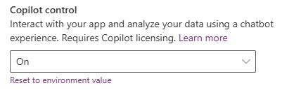
Now we come to the last group in the settings area, Upcoming. Some of these are likely to be Preview items, so use your own judgement as to if you are happy using them in a PRODUCTION environment. The first one is Copilot control to determine if you want to use this feature. Make sure you check out the licensing information to determine if it’s a fit for you.
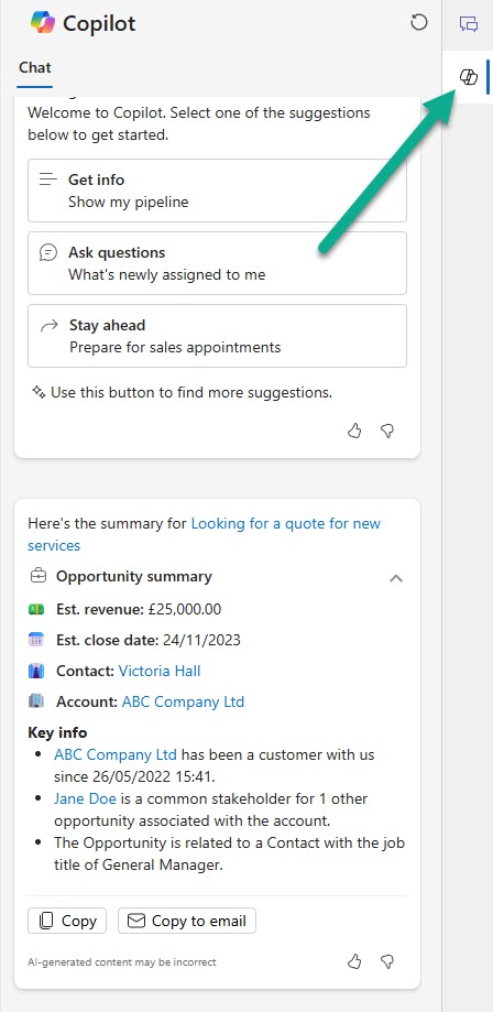
Related to this, we have the setting for Auto trigger summarisation on forms.
If this is turned on, and a user has the Copilot panel open, when they navigate to records such as Leads or Opportunities, they will get a summary of that record like you see below.
The last one I’m covering in this post is the Enable Smart Email Address Validation Control.
This one is a pretty cool feature that checks for accuracy of email format, and also for existing domains as the user types the email address out on the standard email fields.
I hope this helps, and maybe even highlights some features you weren’t aware of. Anything you think you might go and switch on or off?
Check out the latest post:
Setting Up reCAPTCHA v2 For Your Realtime Marketing Forms
This is just 1 of 571 articles. You can browse through all of them by going to the main blog page, or navigate through different categories to find more content you are interested in. You can also subscribe and get new blog posts emailed to you directly.
