*** NOTE: ALL INFORMATION IS ACCURATE AT DATE OF PUBLISHING ***
When first starting out with your Custom Pages and wanting to display data, it’s tempting to pick the Label option. It’s right there in the Popular section when you go to insert, and it likely does what you need. But what about other options like creating a hyperlink, or changing the colour of things, making something underlined or providing key visuals to users without needing all kinds of other controls stacked on each other. Let me tell you, the HTML Text control should become your new best friend. In this post I will show some different ideas of how you can really take advantage of this simple yet powerful component.
To find out more about the HTML Text control, you can view the official documentation from Microsoft here. It converts HTML tags that you might use on a website, or in an email and displays the information using any formatting provided. We can also incorporate expressions by joining them with text and CSS which gives us a really powerful control.
Required Data Indicators
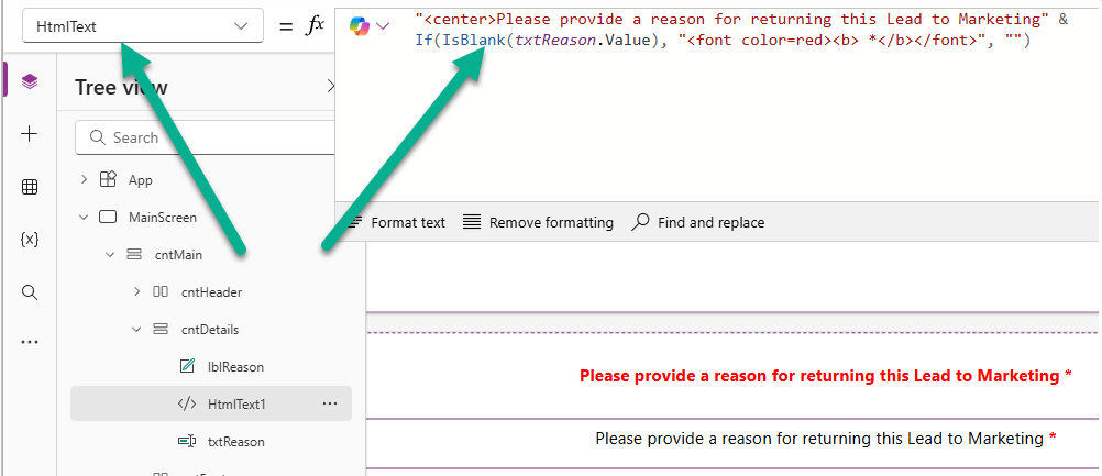
I showed this option in another post that showed how you can make things ‘required’ in your Custom page but it definitely fits in here as a tip. In the HtmlText we can make sure the text is centered, then check to see if a specific field is empty. If it is, we can set the font to be red and add an asterisk.
"<center>Please provide a reason for returning this Lead to Marketing" &
If(IsBlank(txtReason.Value), "<font color=red><b> *</b></font>", "")
Below you can see two options. The first is using a label then having to do conditions to edit the colour of the text which is messy and means updating several properties of the label. The second option shows the result of the HtmlText component. The text is all black, and the asterisk ONLY shows if our field is blank. Neater and cleaner in my opinion.
Mail To Reference For Emails
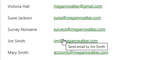
You’ve likely clicked on a link using the mailto option for a hyperlink. This lets someone click on a link which in turn opens up the default email client on their machine and populates the email address in the TO field. We can do this using the HtmlText option and combining basic HTML logic to do this.
"<font color='green'><a href='mailto:" & ThisItem.Email & "'>" & ThisItem.Email & "</a></font>"
In the example below, we are setting the font colour as green, then using the a href mailto tag, and pulling the email address for a record in a gallery (using ThisItem.Email), then displaying the email address, and then closing the href tag, and closing the font tag.

We can also use a tool tip to show further information when a user hovers their mouse over the email.
Links To Websites
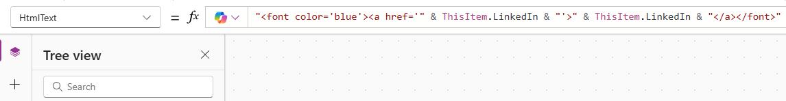
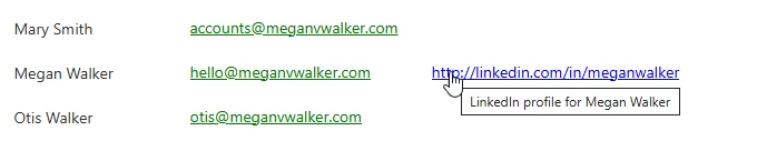
This next one is very similar to the mail to option but just uses a simple a href tag to allow the LinkedIn URL to be a hyperlink that someone can click on. No need to do target=blank (to open in a new window) as the link will open up in a new tab automatically for you.
"<font color='blue'><a href='" & ThisItem.LinkedIn" & "'>" & ThisItem.LinkedIn & "</a></font>"
In the example below we are setting the font to be blue then starting the href tag and pulling in the LinkedIn URL for records in a gallery (using ThisItem), then displaying the LinkedIn URL, then closing out the href tag, then closing out the font tag.
Creating A Custom Contact Method Block
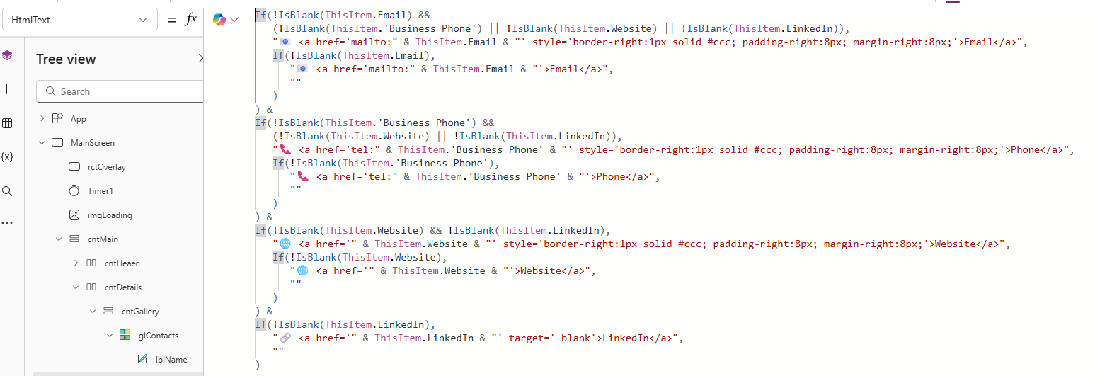
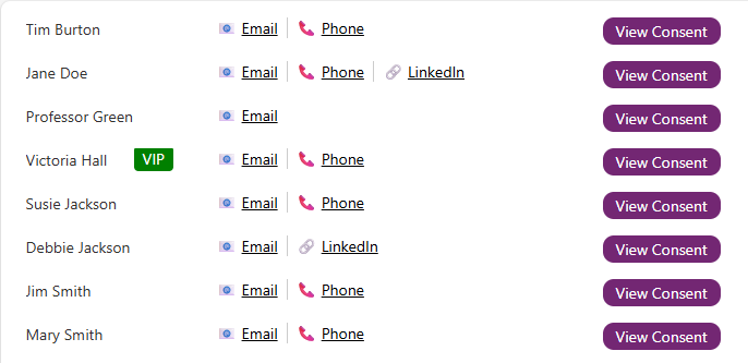
Now lets get a little fancier. Instead of links displaying the value for the email or a website, how about showing nice icons for Contacts who have a value populated in their email, business phone, website or LinkedIn fields.
If(!IsBlank(ThisItem.Email) &&
   (!IsBlank(ThisItem.'Business Phone') || !IsBlank(ThisItem.Website) || !IsBlank(ThisItem.LinkedIn)),
   "📧 <a href='mailto:" & ThisItem.Email & "' style='border-right:1px solid #ccc; padding-right:8px; margin-right:8px;'>Email</a>",
   If(!IsBlank(ThisItem.Email),
      "📧 <a href='mailto:" & ThisItem.Email & "'>Email</a>",
      ""
   )
) &
If(!IsBlank(ThisItem.'Business Phone') &&
   (!IsBlank(ThisItem.Website) || !IsBlank(ThisItem.LinkedIn)),
   "📞 <a href='tel:" & ThisItem.'Business Phone' & "' style='border-right:1px solid #ccc; padding-right:8px; margin-right:8px;'>Phone</a>",
   If(!IsBlank(ThisItem.'Business Phone'),
      "📞 <a href='tel:" & ThisItem.'Business Phone' & "'>Phone</a>",
      ""
   )
) &
If(!IsBlank(ThisItem.Website) && !IsBlank(ThisItem.LinkedIn),
   "🌐 <a href='" & ThisItem.Website & "' style='border-right:1px solid #ccc; padding-right:8px; margin-right:8px;'>Website</a>",
   If(!IsBlank(ThisItem.Website),
      "🌐 <a href='" & ThisItem.Website & "'>Website</a>",
      ""
   )
) &
If(!IsBlank(ThisItem.LinkedIn),
   "🔗 <a href='" & ThisItem.LinkedIn & "' target='_blank'>LinkedIn</a>",
   ""
)
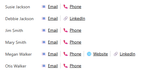
This goes through and checks to see what fields have a value (!IsBlank = not empty), then only shows an icon and link for those that do include a value, and include a line (using a CSS border) in between them. This means if there is only one we don’t have a messy line that is not needed. Different ways of doing this, but this builds up the string nicely and formats the information for each Contact in a gallery. The Email uses the mailto logic, the Website and LinkedIn use the standard href logic, and the Business Phone uses the tel logic. This means someone can click the Phone link which can be used to pick an application for click to dial.
Here is the finished result. We know exactly what information is present for each Contact and there is no wasted clicking only to find out there was no value in a field.
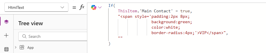
Conditional Styling To Create Badge Effect
We can also use the HtmlText control to style a value to look like a ‘badge’ giving it a bit more of a pop and making important information stand out.
If(
    ThisItem.'Main Contact' = true,
    "<span style='padding:2px 8px;
                  background:green;
                  color:white;
                  border-radius:4px;'>VIP</span>",
    ""
)
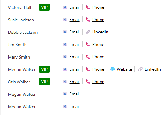
This code is added to a gallery and looks at a specific two option field (Main Contact in this example). If it is YES (true) we can then set some padding, background colour and font colour and display some text (VIP). If it is not YES, we don’t show anything.
The VIP really stands out making it more obvious which are our top Contacts in this list.
Fake Button Effect
This next one can look cool, but keep in mind that creating something that LOOKS like a button won’t have all of the same properties as a button. We can still use OnSelect, but it doesn’t have TabIndex meaning users that like to use their keyboards to tab through information on the custom page won’t be able to do that with your ‘fake button’. That may not be an issue for you, but it’s something to consider when you build your own custom pages.
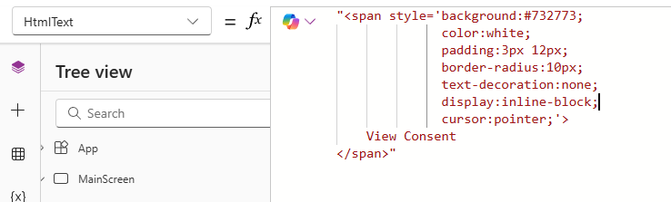
"<span style='background:#732773;
              color:white;
              padding:3px 12px;
              border-radius:10px;
              text-decoration:none;
              display:inline-block;
              cursor:pointer;'>
    View Consent
</span>"
This expression is styling the words View Consent to set a background colour, text colour, some padding, the border radius (determines how round the corners of the ‘button’ are) and changes your cursor to a pointer when hovering over it.
Here we can see a nice button effect. Again, using OnSelect works so in my example you can click it to display a related gallery for the Contact to list all of their consent records.
Conditional Text With Line Breaks
Let’s say you have data related to a record and sometimes there might be value in just one field, and sometimes in two. Adding two labels and using visibility to show and hide can be a bit messy, and making sure they line up nicely can be tricky. Instead, we can use the HtmlText component and take advantage of the <br> tag which adds a line break.
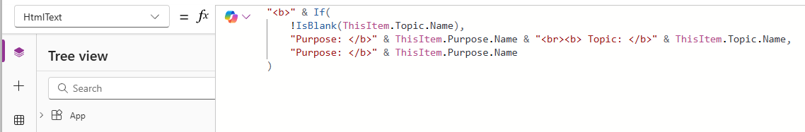
"<b>" & If(
    !IsBlank(ThisItem.Topic.Name),
    "Purpose: </b>" & ThisItem.Purpose.Name & "<br><b> Topic: </b>" & ThisItem.Topic.Name,
    "Purpose: </b>" & ThisItem.Purpose.Name
)
Here we are checking if a record has a Topic value present. If it does, we can make the ‘Purpose:’ bold, then display the name of the Purpose, then do a line break using <br>, then make the ‘Topic:’ bold, and then display the name of the Topic. If there is no Topic, we simple display the Purpose information. It’s neat, consistent and all in one control.
Now we can see clearly which of our Consent records are for a Purpose only, and which are for a Topic that is linked to a Purpose.
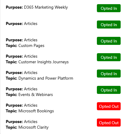
In the screenshot above, I’ve used the ‘badge effect’ I shared above to colour code the status of the consent to show if someone is Opted In, Opted Out or Not Set which makes it stand out a bit more.
"<span style='display:inline-block;
              width:80px;
              text-align:center;
              padding:4px 0;
              background:" & If(
    ThisItem.'Consent status' = 'Consent Value'.'Opted In',
    "green", If(ThisItem.'Consent status' = 'Consent Value'.'Opted Out',
    "red", "grey")
) & ";
              color:white;
              border-radius:4px;'>" & If(
    ThisItem.'Consent status' = 'Consent Value'.'Opted In',
    "Opted In", If(ThisItem.'Consent status' = 'Consent Value'.'Opted Out',
    "Opted Out", "Not Set")
) & "</span>"
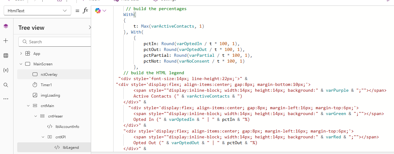
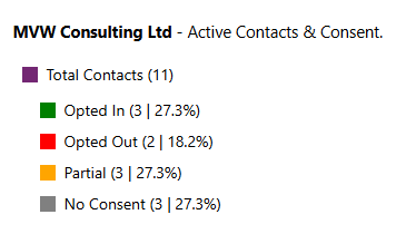
Display Information In Legend
This one could be useful to create a nice colour coded legend. In my example I am going to use it to show total contacts at a top level, then slightly indent the rest of the items for Opted In, Opted Out, Partial Consent and No Consent. It starts off getting a variable (generated with the app OnStart) that contains the total number of active contacts, then builds out some percentages, then finally uses the HTML and CSS to style the legend itself. Each div section has the name of the item, then a count value variable for each section, then the percentage value that was generated.
     // build the percentages
    With(
    {
        t: Max(varActiveContacts, 1)
    }, With(
        {
            pctIn: Round(varOptedIn / t * 100, 1),
            pctOut: Round(varOptedOut / t * 100, 1),
            pctPartial: Round(varPartial / t * 100, 1),
            pctNot: Round(varNoConsent / t * 100, 1)
        },
    // build the HTML legend
  "<div style='font-size:14px; line-height:22px;'>" &
 "<div style='display:flex; align-items:center; gap:8px; margin-bottom:10px;'>
        <span style=""display:inline-block; width:14px; height:14px; background:" & varPurple & ";""></span>
        Active Contacts (" & varActiveContacts & ")
    </div>" &
      "<div style='display:flex; align-items:center; gap:8px; margin-left:16px; margin-top:6px;'>
        <span style=""display:inline-block; width:14px; height:14px; background:" & varGreen & ";""></span>
        Opted In (" & varOptedIn & " | " & pctIn & "%)
    </div>" &
    "<div style='display:flex; align-items:center; gap:8px; margin-left:16px; margin-top:6px;'>
        <span style=""display:inline-block; width:14px; height:14px; background:" & varRed & ";""></span>
        Opted Out (" & varOptedOut & " | " & pctOut & "%)
    </div>" &
    "<div style='display:flex; align-items:center; gap:8px; margin-left:16px; margin-top:6px;'>
        <span style=""display:inline-block; width:14px; height:14px; background:" & varAmber & ";""></span>
        Partial Consent (" & varPartial & " | " & pctPartial & "%)
    </div>" &
    "<div style='display:flex; align-items:center; gap:8px; margin-left:16px; margin-top:6px;'>
        <span style=""display:inline-block; width:14px; height:14px; background:" & varGrey & ";""></span>
        No Consent (" & varNoConsent & " | " & pctNot & "%)
    </div>" &
        "</div>"
)
    )
Your own formula would likely be a lot less complex (or I guess could be more so!), but the concept would be the same.
We then end up with a really nice legend that stands out clearly.
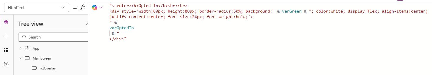
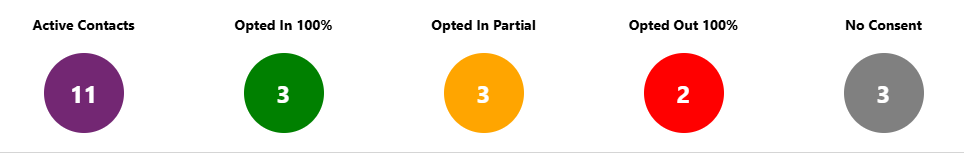
KPI Indicators
Last one, which is similar to the one above in terms displaying a ‘count’ for the total numbers but each KPI circle is a separate HtmlText component. If you are adding collections using the OnStart of the app, you could generate counts right after and use those in your HtmlText. So getting all of the active contacts from a collection would look like something like this.
Set(varActiveContacts,
CountRows(ContactsList));
Or filtering to find the count of Contacts that have Opted In consent records might look like this.
Set(varOptedIn,
CountRows(
        Filter(
            ContactsList,
            CountRows(Filter(colContactConsents, 'Contact point' = Email && 'Consent status' = 'Consent Value'.'Opted Out' )) = 0 &&
            CountRows(Filter(colContactConsents, 'Contact point' = Email && 'Consent status' = 'Consent Value'.'Not Set' )) = 0 &&
            CountRows(Filter(colContactConsents, 'Contact point' = Email)) > 0
        )
    ));
Then your HtmlText components would look something like this, styling the circle, setting a colour and then displaying the varOptedIn variable containing the count created in the OnStart.
"<center><b>Opted In</b><br><br>
<div style='width:80px; height:80px; border-radius:50%; background:" & varGreen & "; color:white; display:flex; align-items:center; justify-content:center; font-size:24px; font-weight:bold;'>
" &
varOptedIn
 & "
</div>"
We are adding in some styling first by putting everything centred, then create a div and provide some colouring, and most important we have a border-radius of 50% which turns it in to a nice circle. Then we join together with our formula to get the count of records, then join in the closing of the div.
And here we have a lovely set of KPI’s for the custom page. Nice and effective and clear to the user.
Do you use the HtmlText component? Feel free to share some of your own ideas and successes in the comments below!
Check out the latest post:
Add Information Buttons To Provide Additional Details For Custom Page Users
Considering Custom Pages?
Thinking about using Custom Pages but unsure where they fit best?
I help organisations design model-driven experiences that are intuitive, scalable, and built for real users, not just technical possibility.
This is just 1 of 580 articles. You can browse through all of them by going to the main blog page, or navigate through different categories to find more content you are interested in. You can also subscribe and get new blog posts emailed to you directly.