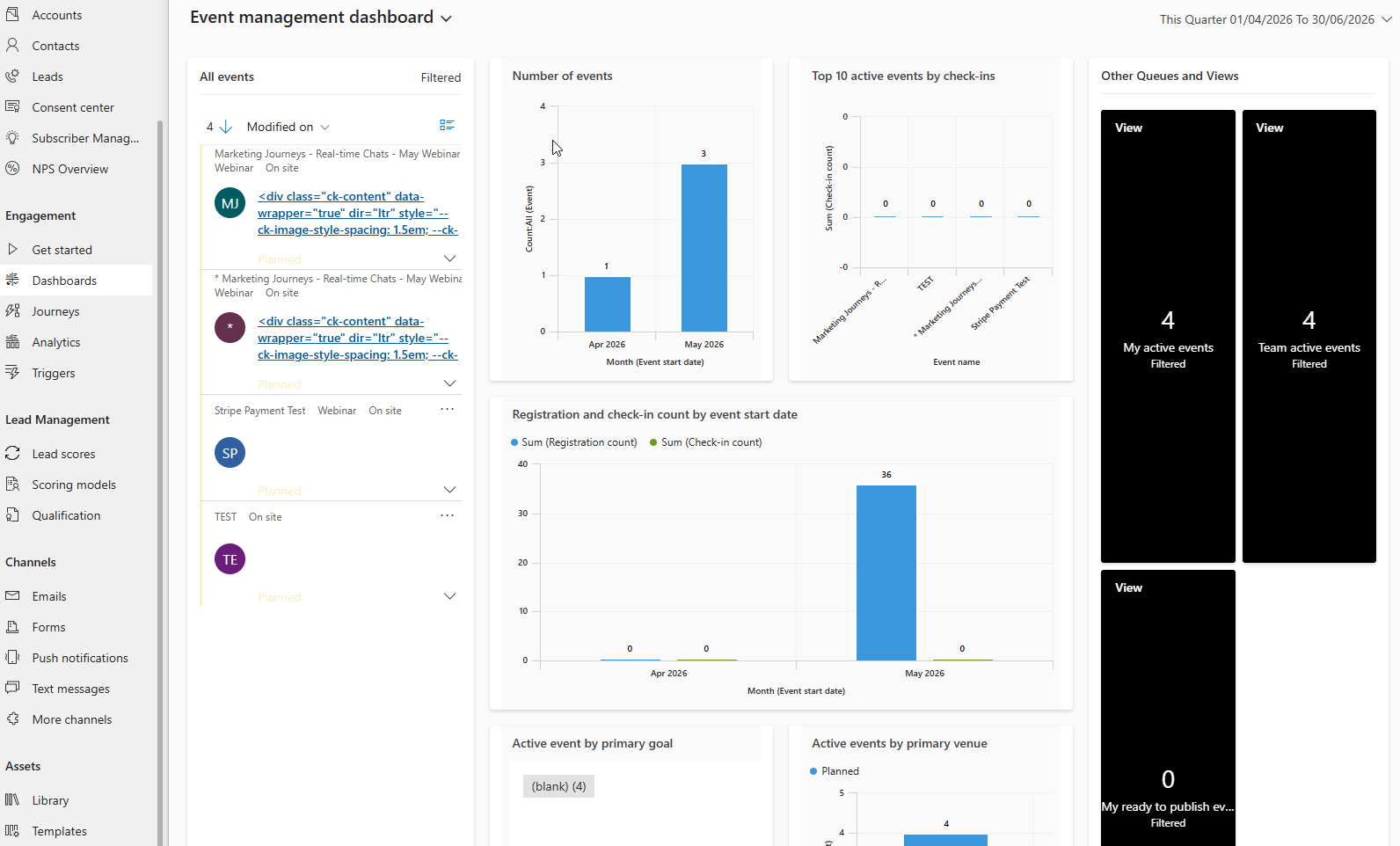
Have you ever spent any time looking at the out of the box event management dashboard? Yeah, me either and I don’t blame you. It looks ugly and is not very informative. Not sure there are plans from Microsoft to update it, but good news, we DO NOT need them to when this is old school CRM and very easy for you or your system administrator to set up. In this post we take a look at what a custom event overview analytics dashboard might look like, and how you can create your own analytics dashboard on an individual event record too. Have fun!
This is the offending out of the box dashboard I am referring to…. 🫣
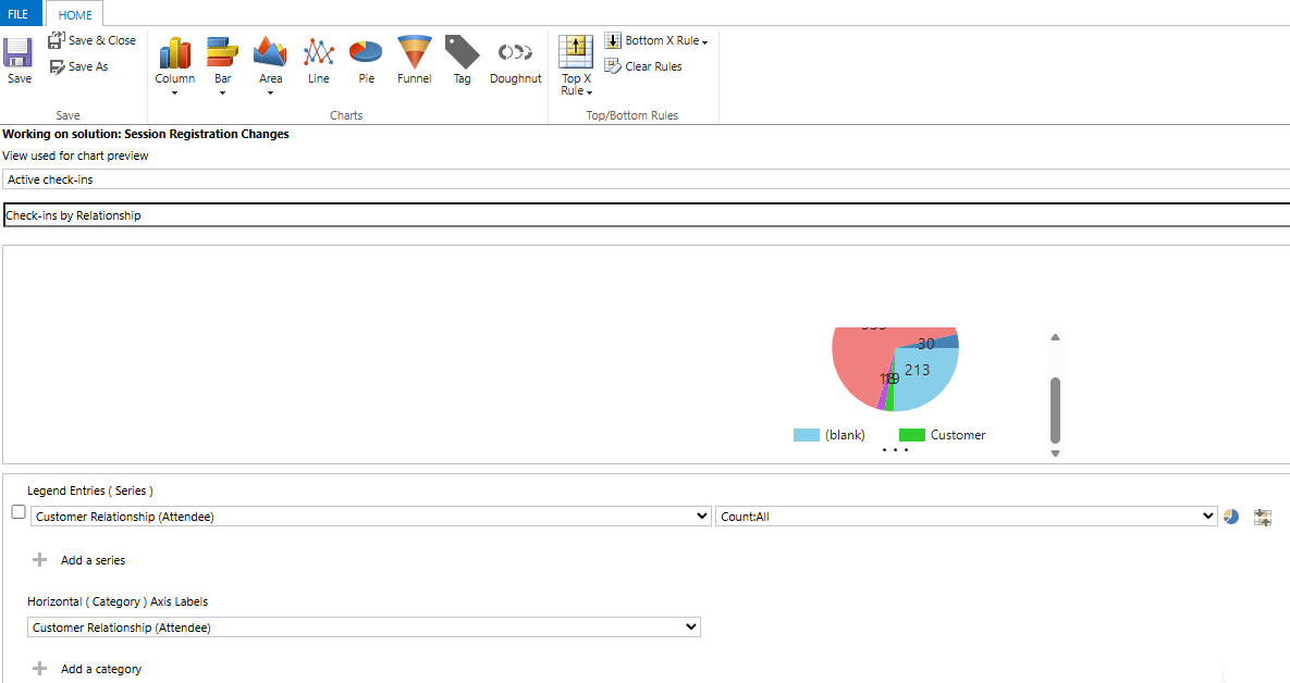
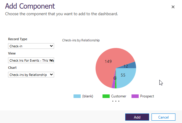
Ideally you will create all of the components in a solution if you are doing system dashboards, but you can always create your own personal dashboards if you want/need to. It’s up to you to decide what you want to show, but most likely will be charts for things like Events, Event Registrations, Sessions, Session Registrations and Check-ins. Below you can see a simple pie chart showing number of Check-in records by Customer Relationship (a field I have on the Contact table).
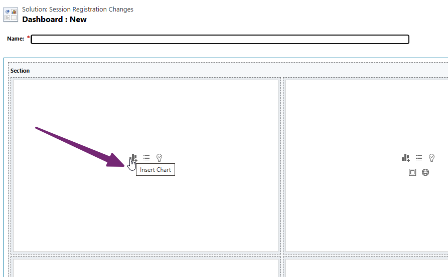
Keep in mind you will need to have a view and chart to create something like you see in this post. Create all of the components you want to use first then create a dashboard. I am a fan of the 3 columns 2 rows option to give a nice layout. Add your chart option.
Then pick the record type, the view to use, the chart, and then click Add.
Give your dashboard a title, then save and close it.
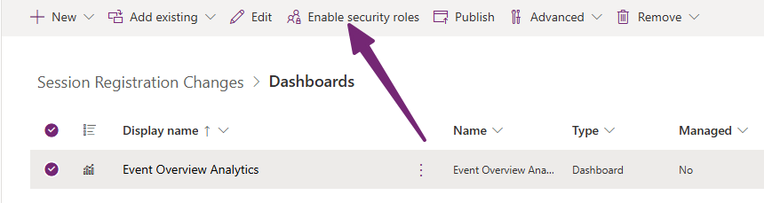
If you are making a system dashboard, don’t forget to determine which security roles will get access to see the new dashboard, then publish the dashboard. Also, is it just me, or does publishing dashboards still take FOREVER for them to even show up for anyone! Blah.
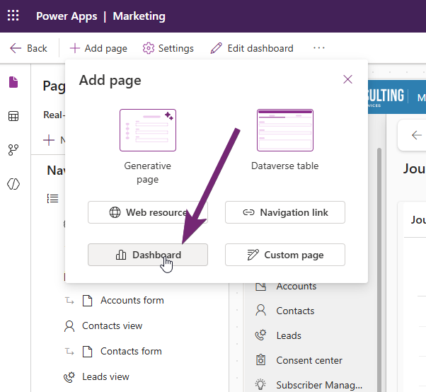
Lastly, make sure it is include in the marketing app. Edit the app, and click Add page then select Dashboard.
Find the dashboard in the list, select it then click Add. Do not leave Show in navigation selected unless it is the ONLY dashboard you have in the app.
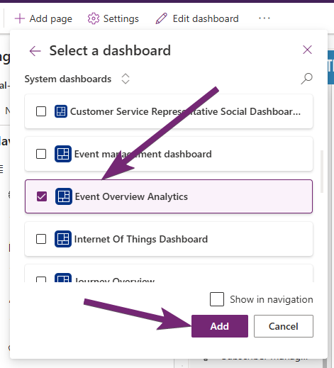
Make sure you see it in the last at the bottom of the navigation then publish the app.
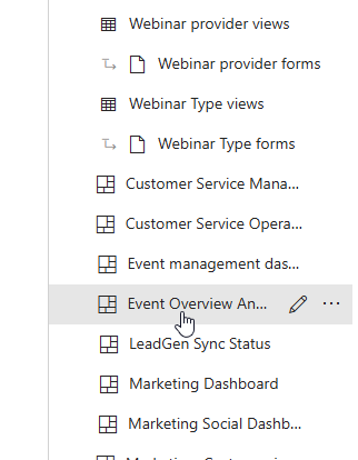
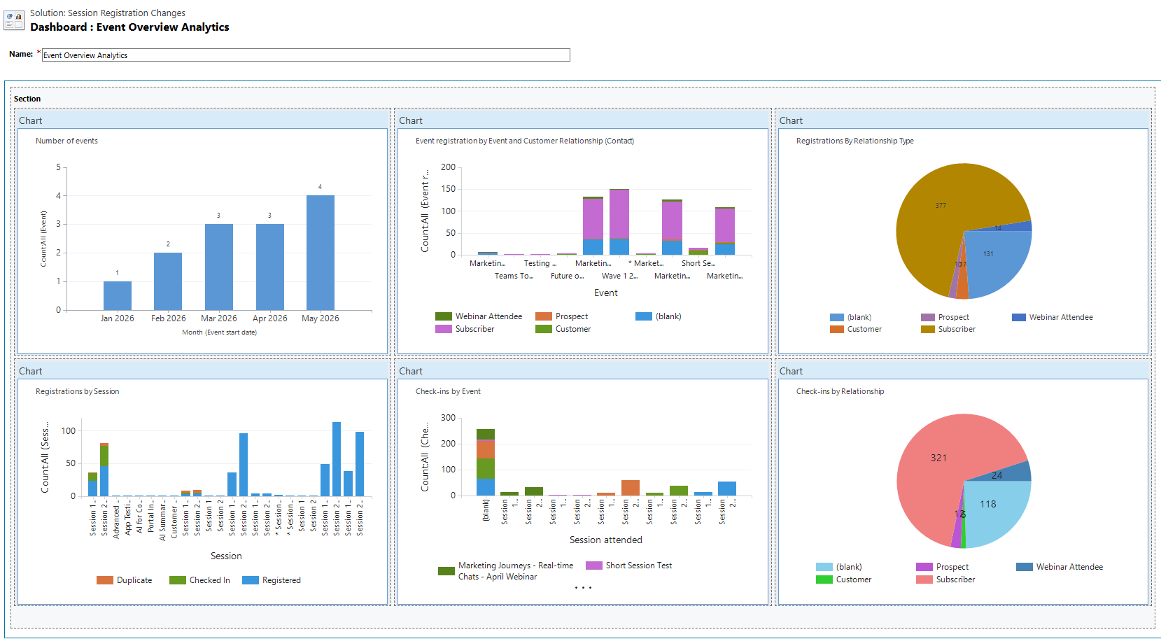
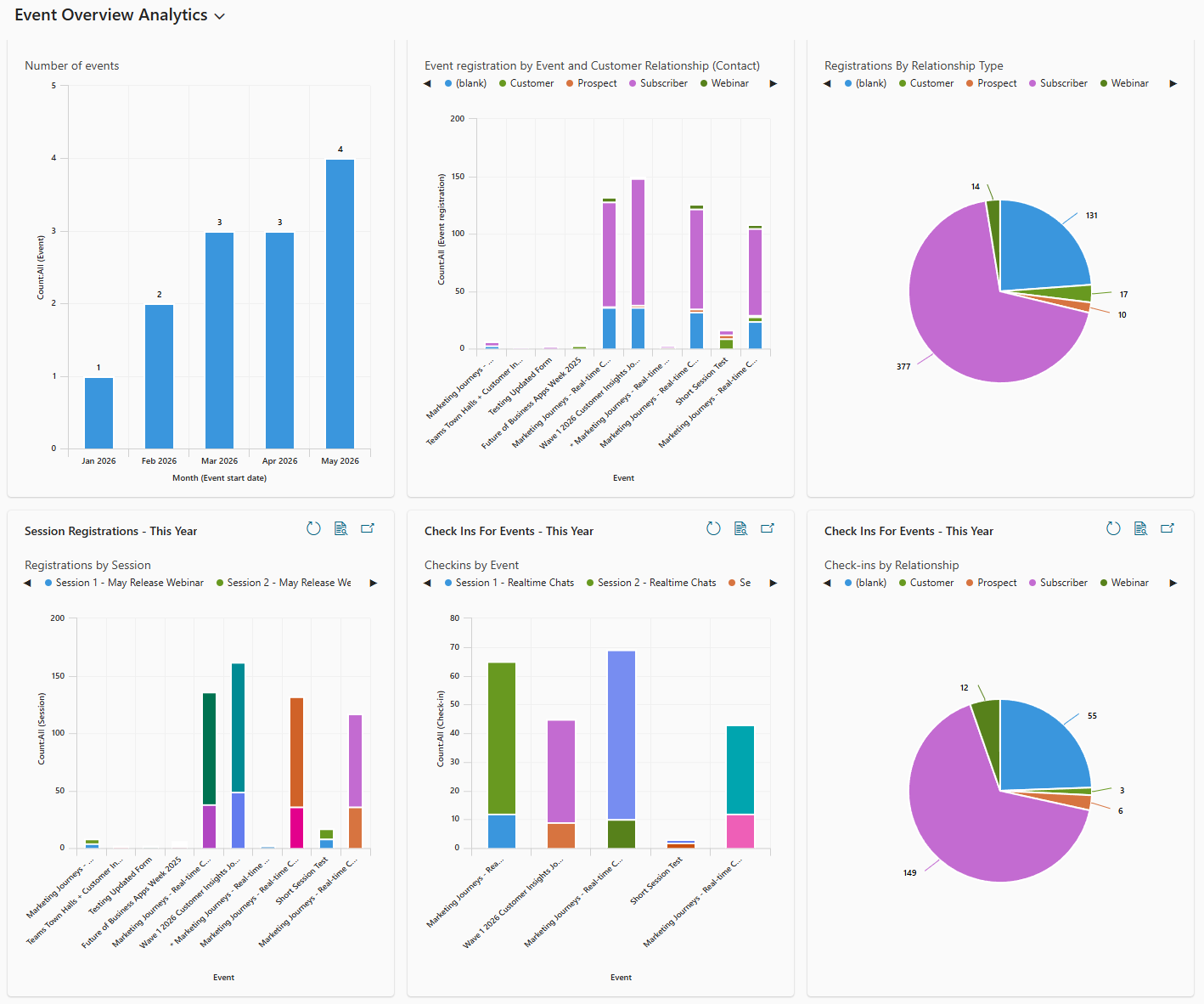
After clearing your cache, or refreshing a bunch of times or even logging out and back in again, you should see the dashboard from the drop down in the dashboards section in the navigation. Hooray! So here I can see information about my events this year for each month along with event registrations, registrations by relationship type, session registrations per event, check-ins by Event and check-ins by relationship. What you add is entirely up to you!
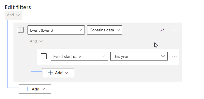
Just a side note if you want to do something like this to show Events from This year or Last year or This month etc. When you decide what views to use, you can create some new ones using the filters below to either set the Event start date to This year (or whatever time frame you want), or add the related table of Event and do it. That way you are only looking at Checkins, Registrations etc based on the start date of the related Event.
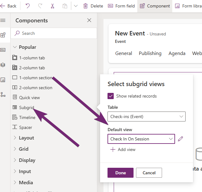
What about doing something that shows up on an individual event record? Well we can utilise the same views and charts used on the main dashboard but use sub grids on the event to make it look pretty. This is best to do on a customised Event form rather than the one out of the box (CRM entity form). Microsoft often add in new features and your customisations could mean you block new stuff. Always good to have the original form and your custom form to flip between. Add a new tab, then add in a component and pick subgrid. Pick the table, then the view you want to use. So here I am going to show check-in records and use a specific custom view I have. Click done.
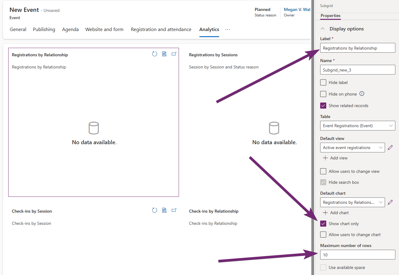
Once you’ve added the subgrid, go to the properties for it on the right hand side. You can give it a nice label, but the important thing is to tick the show chart only box, then pick which chart you want to use. Also set the number of rows to 10. Keep adding subgrids for each chart you want to show until you are happy. Then save and publish the form.
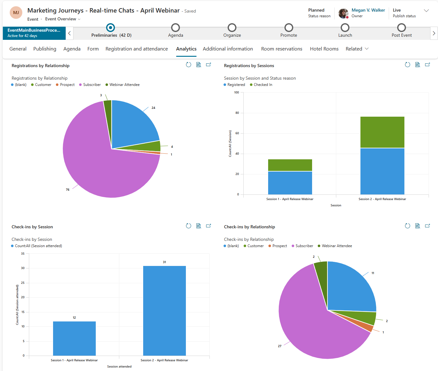
Now I can go to my custom Event Overview form and to my new Analytics tab to get a high level overview of this specific event. Awesome!





Leave a Reply