*** NOTE: ALL INFORMATION IS ACCURATE AT DATE OF PUBLISHING ***
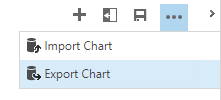
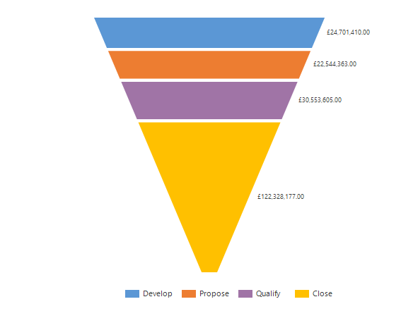
After finding this great article online for creating 3D charts in CRM, I wondered what else I could change. Start off by Exporting the chart. The FetchXML will download. Open it up in an editing tool, Notepad works fine.

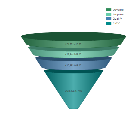
There are quite a few elements that can be adjusted, and many articles online. By changing the following elements, the chart can be transformed into a much more interesting and stylish graphical representation of your data.
 3D – change from false to true: <Area3DStyle Enable3D=”true” />
Chart Palette – change from none to one of 12 valid options: Chart Palette=”SeaGreen”
Legend Alignment – can be Near, Center or Far: Legend Alignment=”Far”
Legend Style – can be Style, Column, Row or Table: LegendStyle=”Column”
Legend Docking – can be top, left, bottom or right: Docking=”top”
Funnel Label – can be inside or outside: FunnelLabelStyle=Inside
Save the XML, then use the Import Chart function to create the new chart.

Check out the latest post:
Adding Multiple Screens To A Custom Page To Provide Confirmation Of New Record Creation
This is just 1 of 576 articles. You can browse through all of them by going to the main blog page, or navigate through different categories to find more content you are interested in. You can also subscribe and get new blog posts emailed to you directly.
