As you start adding custom pages to your model-driven apps in Dataverse (D365), it’s good to provide as much information and assistance to your users to give additional help where needed. A lot of times a tooltip can be used where extra text gets displayed when a user hovers their mouse over a control. Although that can be sufficient, we can also add an information button making it more obvious that there is additional information available to a user. This option isn’t immediately available in custom pages, but using the modern controls means we can easily start utilising this display component.
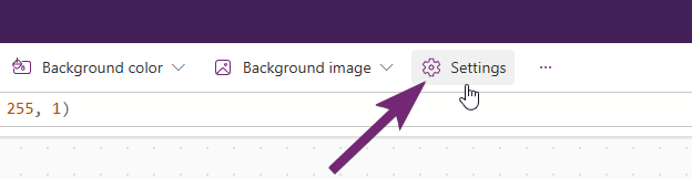
First, if you wan to know more about modern controls, check out this post from the brilliant Matthew Devaney. His posts have helped me out a ton over the years in reference to Canvas Apps, and are definitely relatable and relevant for Custom Pages (some slight differences between the two, but very similar). To turn on the modern controls, click the Settings button from the top of your custom page.
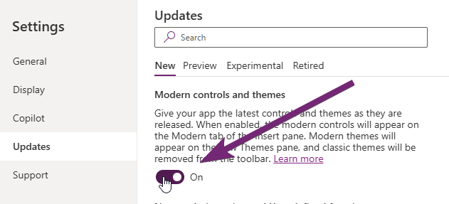
Then head in to the Updates section from the menu, then scroll till you find Modern controls and themes and turn it on.
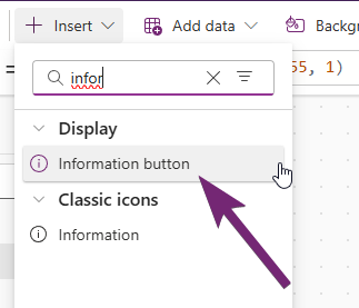
After turning on the modern controls, you can still get to the ‘classic’ controls but will see a bunch of new items too. Search for the information button to add it to your custom page.
The Content is the text that will be displayed when a user clicks on the button. You can add just plain text, or can combine with values from another field, collection, variable, or other expression you’ve built.

There are two options for colours that might be of interest. You can change the icon colour itself by setting a specific named colour or hex. By default the icon will be blue, or a colour based on the theme of your custom page.
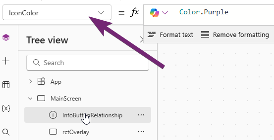
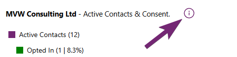
This is what the IconColor changes to where the colour set is the outline border of the button, and the colour of the i.
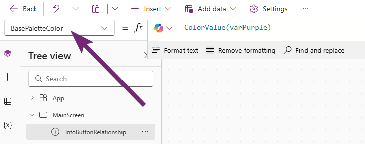
Then you can adjust the colour that shows when the icon button is clicked by adjusting the BasePaletteColor control. Here I am using a colour stored in a variable.
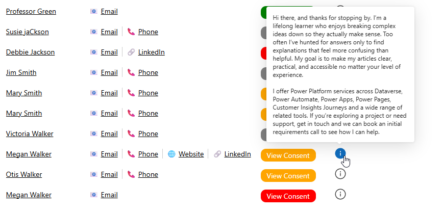
So here we can see that the icon has been clicked on, showing the text and showing the solid colour of the button. I would suggest if you change one of these colours that you change the other to match and keep them in sync.
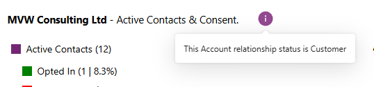
Although you can set pretty long text which will be displayed without any issues, there doesn’t seem to be a way to change the width of the pop up box that shows. This can mean text ends up wrapping on to additional lines depending on the content you want to display. Just something to keep in mind!




Leave a Reply