*** NOTE: ALL INFORMATION IS ACCURATE AT DATE OF PUBLISHING ***
After writing about using a countdown timer functionality in Customer Insights – Journeys by utilising the 3rd party Nifty Images, I started digging through more of their options. Depending on the data you want to show in your emails, the various chart options could be interesting. This post, again not affiliated with Nifty Images (just showing some appreciation), shows a couple of scenarios where you could use a chart.
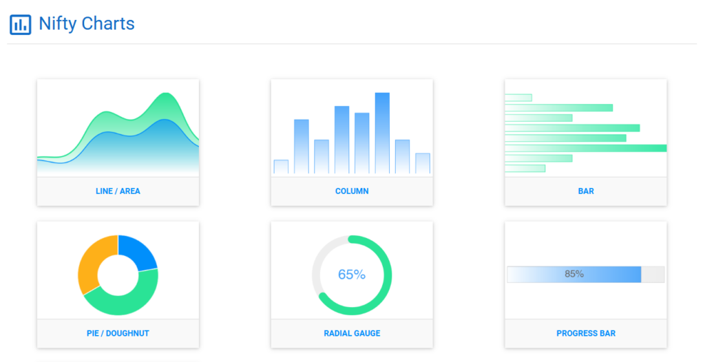
After signing up, create a new image from the dashboard and select the Charts option. From there you have 6 different types of charts to choose from. Take your pick and then you can set up your default colours and styles as per your requirements.
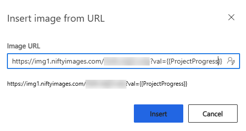
As with the countdown timers, you’ll get a URL for your chart image and a list of dynamic options available for each one. In this example, I am using the Progress Bar chart and will use a whole number field that shows how far along a project is. Adding an image element to an email, we can add the image, add val= at the end of it, then pass through the field that stores the value for our project (in the same way you would add any dynamic field).
Now we can use this in an email to customers about the current project we are working on for them.
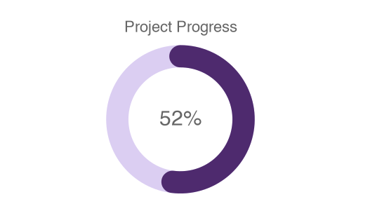
Using the same type of val parameter, the information could also be shown using a radial gauge.
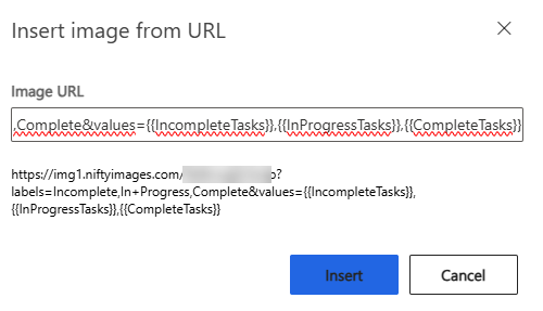
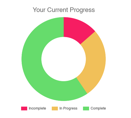
The pie/doughnut option has a lot more in terms of dynamic options and what can be passed through. In this one, I am passing through the different labels to use, and the using dynamic values to show the number of tasks that are incomplete, in progress and complete for a project. This could be used to show the progress of a student taking modules in a class, or the number of credits gained to work towards a goal. It all depends on the data you have in your environment and what you want to portray to the Contact or Lead you are sending your emails to!
This might give you a few ideas of your own! As mentioned at the start, Nifty Images is a 3rd party solution that includes a cost, and I am not affiliated in any way with them, just wanted to share something cool!
Check out the latest post:
Setting Up reCAPTCHA v2 For Your Realtime Marketing Forms
This is just 1 of 571 articles. You can browse through all of them by going to the main blog page, or navigate through different categories to find more content you are interested in. You can also subscribe and get new blog posts emailed to you directly.

