*** NOTE: ALL INFORMATION IS ACCURATE AT DATE OF PUBLISHING ***
The styling of an organisations website and any communication sent out to customers is important. It should be kept consistent to help with building brand identity and make sure information isn’t missed by clients or potential customers. The majority of companies will have brand guidelines making it clear what colours and fonts should be used both internally and externally. How can this be applied when sending out emails using Dynamics 365 Marketing? Let’s take a look and see how using custom CSS can help.
First, what exactly is CSS? It stands for Cascading Style Sheet and is used to define the style and formatting in HTML. There are three types of CSS. They each have a different priority and are read and followed in a specific order. Below the list is from lowest priority to the highest.
- External CSS
- Internal or Embedded CSS.
- Inline CSS
External CSS
If you think about a website, that would typically use an External CSS file. It would have been created and uploaded to the server that hosts the website and the styles within the HTML would then use that to determine what colour to use, or what font to display and so on. Within the D365 Marketing App, External CSS files are not used, so will not be focused on within the post. Could you use them? Not sure, I haven’t tried so let me know in the comments if you have and have found success with this approach.
Internal or Embedded CSS
This is one of the types of CSS that is used in a Marketing Email and also Marketing Forms in the Marketing App. If you are creating a Marketing Email and click on the HTML option from the top right of the screen, you can get into all of the HTML of the email. Somewhere in the top section is a part that starts with <style> then a whole bunch of code, and then the </stlye> to finish it off. Everything else in between is used to define things like the various heading styles (h1, h2, h3, h4, h5, h6), the paragraph text, what hyperlinks look like and so on.
Inline CSS
Inline CSS is used to set styles for one specific item within the HTML. For example, for paragraph text (the main text in the body of an email) we could do something like this to change the colour, size, style and alignment of the text. This has the highest priority of CSS so regardless of what is in the Internal CSS, if this has been added in the HTML, any of the text that comes after it would use the style below. Any other text within the email would use styling that came from the main <style> section at the top of the HTML.
<p style = "color:;#3c245c font-size:20px; font-style:italic; text-align:center;">This text would be formatted differently to the rest</p>
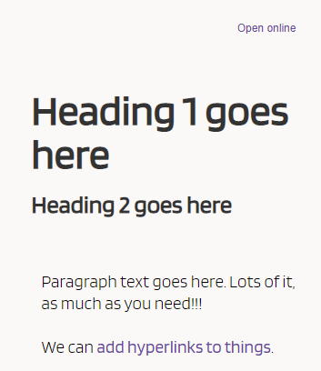
So now we know what the different types of CSS are, we know we focus on the Internal and Inline when reviewing the Marketing Emails. Below we have an email, obviously just set up from an example perspective to show what each item is.

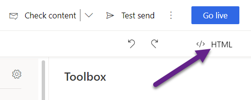
From the Marketing email, click on HTML from the top right.
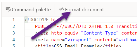
Next, click on Format document from the top left. This will set all of the HTML out neatly so it’s easier to read.
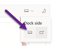
Next, you can click on the little docking icon and change it so that it displays at the bottom of the email. You can also change it to night or dark mode if you prefer.
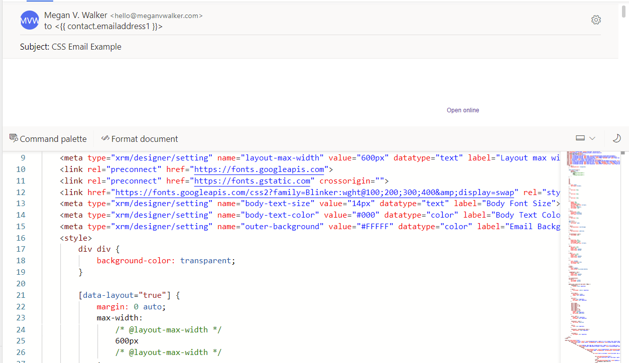
Now you’ve got that sorted you can start looking at the code. One thing you might notice from the screenshot below is that I have added an extra font. You can learn how to do that as part of this post here. The part where changes will be made is where it starts with <style>
If you see anything similar to below, you can either remove anything that relates to any of the headers, or just adjust what is already there. The code below is stating that all of the header styles will have the same colour (using a HEX number) and all use the same font. This is the font that I defined at the start of the HTML code. It then shows that h1, h2 and h3 will each use a slightly different font size.
        h1,
        h2,
        h3,
        h4,
        h5,
        h6 {
            color: #333;
            font-family: Blinker;
        }

        h1 {
            font-size: 38px;
        }

        h2 {
            font-size: 26px;
        }

        h3 {
            font-size: 18px;
        }
If you notice a style that starts with a p, this relates to the paragraph text or main text that is used throughout the email. Below I am defining the font size, family and weight (if it is bold or lighter than regular text. The mso-line-height-rule relates to Outlook and how it treats the line height (the space between different lines within a paragraph). Outlook will often try and change that and increase it, so this tells it to use the exact line-height defined. Then we have margin and padding. The margin property controls the space outside an element, and the padding property controls the space inside an element. So if you want space between the blocks that include paragraph text use the margin, and if you want space around the text WITHIN the block, use the padding.
  p {
            margin: 0px;
            padding: 10px;
            line-height: 20px;
            mso-line-height-rule: exactly;
            font-size: 16px;
            font-family: Blinker;
            font-weight: 300;
        }
Next, we can format how images appear. Using the code below, we make sure that the images is shown in full at 100% but we also want to show a dotted border around the image with a width of 2 pixels.
  img {
            max-width: 100%;
            border: 2px;
            border-color: #312a2a;
            border-style: dotted;
        }

If you add hyperlinks, this uses several different elements for styling. When a link is added, the HTML code uses <a href= and then whatever the link is going to. So the section in the style in the HTML is where it starts with a. However, you might also see a:focus, a:hover and a:visited. This means you can control how the links look in various states. Below we can see that the main a sets the colour and font weight, and then makes sure there is no text decoration. Text decoration might be an underline that shows under the links. The a styles for a focus and a hover will actually add a dotted border when it’s hovered over or clicked on.
 a {
            color: #6c469c;
            text-decoration: none;
            font-weight: 400;
        }

        a:focus,
        a:hover {
            color: #990073;
            border-bottom: 1px dotted #272727;
        }
However, one thing to keep in mind, even though the styling shows up in the preview, not all email clients will show your styles in the same way. I found this great site where you can see which ones can handle different HTML elements.

You can go through the different elements in the style area. Some you might not know what they are used for, and if you don’t need to adjust it, then leave it alone. It could be related to the overall layout formatting rather than the font, links or images. One thing to also be aware of. If you adjust the styles but have already added any text, images etc. to the email, it’s likely that inline CSS has already been added. In which case, you’ll see it as you scroll down past the <style> section and in to the main email HTML. So you can see below that the <h1> style has already been set to 28px, even though the new styling is set to 38px in the <style> section. Just by deleting this extra part, the <h1> section will then use what’s in the Internal CSS.

The easiest approach is to start with a blank email or email template and adjust the <style> section prior to adding anything to the email. Then once you start adding text, images or hyperlinks, they will immediately take on the new styles you’ve set in the Internal CSS.
Another area of the Internal CSS to review is any section that starts with @media only. This determines how the styles are displayed on other devices such as mobile phones and tablets.
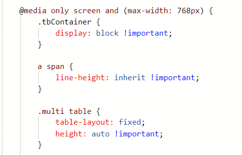
For example, when sending the email and it being reviewed on a mobile phone, the Heading 1 and Heading 2 are overlapping one another.

We can simply add in a new h1 and h2 section within the @media only area that sets a slightly larger margin or padding, and even adjusts the line-height if needed.
Hope this helps! Would love to know what other changes you might have made that could help others. Feel free to share in the comments below!
Check out the latest post:
Create A Segment Using Unmapped Fields On Marketing Forms in Customer Insights Journeys
This is just 1 of 601 articles. You can browse through all of them by going to the main blog page, or navigate through different categories to find more content you are interested in. You can also subscribe and get new blog posts emailed to you directly.
Hi Megan
Thanks for this helpful input!
However, it is quite time absording to change each marketing email before sending it out. Do you know if there is a possibility to set a default Stylesheet which would apply for all marketing emails?
Thanks and Regards
Caroline
I agree 100% That’s why I would suggest creating a Marketing Email Template or a couple, and then using those when starting to create a new email.
Hi and thanks for excellent info. I am developing a template and struggling with CSS.
In my style-section I have the following for h1:
h1 {
font-size: 45px;
font-family: Georgia;
font-weight: normal;
}
But when I add some new content and choose h1 from the Dynamics UI it gets font-size 28px as inline CSS. Where does this style-setting come from and how do I get rid of it without having to edit html manually every time? Weight and font works fine from the CSS-code.
Regards, Per
Hi Per, I would need to see the rest of the HTML to know what might also be in the styling that could be forcing that to occur. Happy for you to send me an email via my Contact page and share it.
Hey Megan, thank you for valuable content! I have a question regarding media queries: Can these be set up in content blocks? It seems that they have no effect when I try to add a new class or change one for mobile view🤔
Hi Timo, I am not sure if the content block inherits from it’s own CSS or the CSS from the email. If you haven’t already, I would suggest adding it in both places and see if that makes a difference. If not, you could try contacting Microsoft support, or adding your question on the D365 Marketing Forum – https://community.dynamics.com/365/marketing/f/dynamics-365-for-marketing-forum
Thank you Megan. Adding it to the content block makes no difference, but it works if I set the CSS classes in the e-mail template HTML and add the classes inline in the content blocks 👍
Ah glad you got it sorted Timo!!!
One more thing by the way, as I can’t find any tips on this anywhere. Do you know of any code snippet I can use to force a content block with columns to not break on mobile view? I have a block with 3 SOME icons in the center columns, with empty columns on the sides to keep them centered (all locked to a certain percent). But on mobile, they stack beneath each other and grow really huge. I have tried copying other footers, but it doesn’t work as I hoped :\
Hi Timo, I know you can do things with CSS that show or hide blocks on a mobile/desktop advice, but I’ve not tried it out to see if it would work here. If I have time I will try and test it but might not be for a few weeks!