*** NOTE: ALL INFORMATION IS ACCURATE AT DATE OF PUBLISHING ***
When creating Real-time Marketing Forms in D365 Marketing/Customer Insights – Journeys, there are two options in terms of what happens when a form is submitted. You can either redirect the person to another page, OR you can opt to display a message (which is the default submission option). Although you can set what the message should be, what you can’t set is the little image that shows with a green tick/check icon. In this post I will show you how you can actually modify that by adding a bit of CSS in to the HTML of your forms and show something entirely different, or simply just hide it. Let’s take a look!
OK, so this is the image I am referring to. Although it’s not terrible, it might not be the kind of thing you want to show.
If you right click on that image when viewing the form after submitting it, you can inspect the code and will see a few lines that relate to an onFormSubmitted set of CSS classes.
The first two classes are as follows. No need to change anything about the standard .onFormSubmittedFeedback class, unless you want to change the background of that whole section in which case you can adjust the background from #fff (white) to something else. The second class of .onFormSubmittedFeedbackIcon relates to the green tick icon that shows. Set the display of that to none which means it will not be shown at all. If you don’t want to see any icon at all, there is nothing further to do, and you can just add these two CSS classes in to the <style> section in the HTML of the form.
div[data-cached-form-url] .onFormSubmittedFeedback {
    display: flex;
    align-items: center;
    justify-content: center;
    background: #fff;
    margin: 0 auto;
}
div[data-cached-form-url] .onFormSubmittedFeedbackIcon {
    display: none;
    margin-left: auto;
    margin-right: auto;
    height: 64px;
    size: 64px;
}
If you do want a different image, you will likely need to adjust the CSS for .onFormSubmittedFeedbackMessage to make sure the text you added that should be displayed to the user is set directly in the middle, and has slightly different padding. That way the image shouldn’t cover over any part of the new image you want to show.
div[data-cached-form-url] .onFormSubmittedFeedback .onFormSubmittedFeedbackMessage {
    padding: 10em 1em 0em 1em;
    color: #000;
    font-size: 14px;
    line-height: 20px;
    font-family: Segoe UI;
    margin-left: auto;
    margin-right: auto;
}
Now we adjust the .onFormSubmittedFeedbackInternalContainer class. This is where we are going to adjust the padding and add in a centered image using a URL to set the background image. We only want it to be shown once, so no-repeat is used also. Put in the URL of the image. You can leave out the domain if the image is stored on the same site as your forms are. It will pull in the image correctly.
div[data-cached-form-url] .onFormSubmittedFeedback .onFormSubmittedFeedbackInternalContainer {
    padding: 30px 0px 30px 1px;
    background: url(/wp-content/uploads/2023/01/cropped-black-logo-1.jpg) no-repeat;
    margin: auto;
    background-position: center;
}
Here we can see the image and the text displayed after the form is submitted.
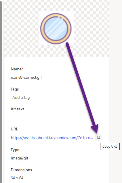
If you want to be in control of the images you are using and don’t have access to your website to upload new images, you can upload them in to the Asset Library in the D365 Marketing App. Once you’ve done that, you can copy the URL of the image.
Same CSS as before, but we just use the URL for the new image file uploaded to the marketing app. I’ve gone for a gif in this example.
div[data-cached-form-url] .onFormSubmittedFeedback .onFormSubmittedFeedbackInternalContainer {
    padding: 30px 0px 30px 1px;
    background: url(https://assets-gbr.mkt.dynamics.com/7e1cce80-df82-4656-a02f-9ac1442e28e1/digitalassets/images/58b495e1-4967-ee11-9ae7-0022481b5b6a?ts=638325245567991435) no-repeat;
    margin: auto;
    background-position: center;
}
Now we can see that when the form is submitted, we can see our new custom gif playing instead of the default icon with the green tick/check on it. Hooray!
All of the new CSS styles I have provided will need to be added to your marketing form by editing it, clicking on HTML from the top right of the form and then pasting them in to the <style> section like you see below.
That’s it! Not so difficult when you know how to do it!
Check out the latest post:
Assign Records To A User Or A Team From Your Custom Page
This is just 1 of 571 articles. You can browse through all of them by going to the main blog page, or navigate through different categories to find more content you are interested in. You can also subscribe and get new blog posts emailed to you directly.


Brilliant as usual Megan!
Thanks for this solution!!
You are very welcome!