*** NOTE: ALL INFORMATION IS ACCURATE AT DATE OF PUBLISHING ***
Although it might not seem like it, I do way more than ‘just’ D365 Marketing stuff. 🙄 No matter what area of the Power Platform you delve in to, knowing the basics for customising Model Driven Apps (MDA) is important for any consultant or individual customising Dynamics 365. In this blog post I’m going to walk through subgrids, the options you have when adding them to a form and the grid you should really start using (assuming you haven’t already)!
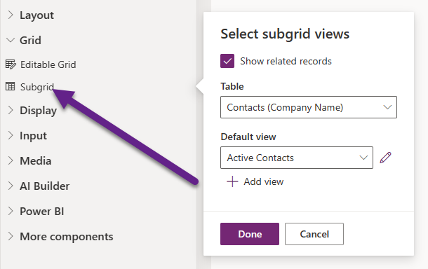
Note that all of the screenshots are done in the app maker (https://make.powerapps.com) rather than the classic (aka old) customisation area. Let’s get started by adding a Component to an Account form and choosing the Subgrid option. I want to show a list of all of the Contacts linked to that Account, so I will tick the box to Show related records and then pick the view to use. Simple stuff.
After saving and publishing, this is what we see on the Account record. It’s likely what most people are used to seeing. However, as per this article from Microsoft, a Power Apps grid control will eventually replace all read-only and editable grids in model-driven apps (no timeframe given yet). Let’s look at the progression from the standard subgrid below through to the latest Power Apps grid control.

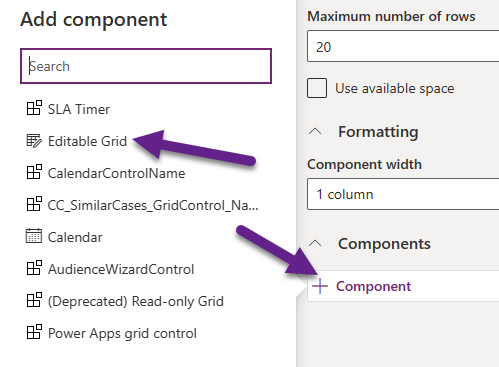
If we go back to the editor and click on the subgrid, then from the bottom of the panel that opens, click on Component. Then let’s click on Editable Grid. Note, you can get to this if you had clicked on Editable Grid instead of Subgrid when initially adding the grid in the steps above.
Now without doing anything else, I will save and publish the form. This is how the grid now looks. We can edit any fields that can be edited without navigating to the record and save changes from the subgrid. Note that the navigation and pagination are in the footer.

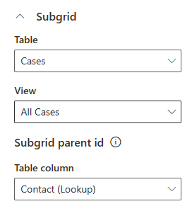
Now let’s go back to the subgrid in the editor and click on it to see the options for that editable grid component. One of the first things is a subgrid. So that’s the ability to display a grid of related records on the form, but then also show further records for the related records. Got it? 😊For my example, on the Account form I will show a list of the related Contacts, then provide the ability to expand a Contact and see Cases related to them. I pick Cases, then a View to use (which columns to show), then pick the field to use that links Contacts to Cases.
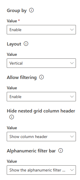
Now we can determine a few more settings such as enabling a group by drop down, the layout, if filtering should be allowed and if the column header of the subgrid should be shown or hidden. Finally, determine if the navigation bar at the bottom should be shown on the grid.
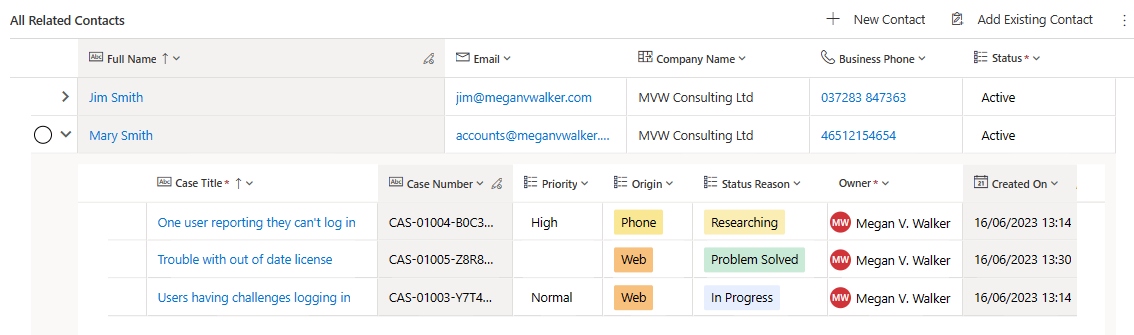
After saving and publishing, we can see the list of Contacts with an arrow next to each one. Clicking on the arrow will then open the subgrid linked to the Contact and show any Cases linked. Based on settings, the Case records can also be edited directly from the grid.

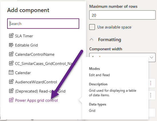
Alright, so now that we have seen those options and can understand how the grids have evolved, let’s look at the Power Apps grid control. Back in the maker editor area, click on the subgrid again then components. This time add the Power Apps grid control component.
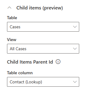
This one has a slight change in terminology for the subgrid, now called Child items. We can set the same thing again with the cases, the view we want, and the field to use that joins the Contacts to Cases.
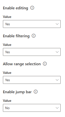
You can see all of the definitions for each setting in this article from Microsoft. A couple of items to note… the allow range selection means users can select records in the grid, use Ctrl+C and copy and paste the row information somewhere else (Excel, Word etc.). The jump bar is the navigation bar that shows with the letters and numbers at the bottom of the grid.
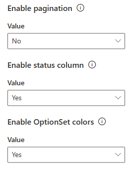
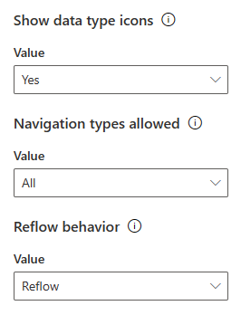
The pagination, which forces the user to have to go through pages to get through all of the rows, can be turned off if you wish. The Optionset Choices colours is nice and helps to make important information stand out in the subgrid.
A few more settings before we can save and publish to show the new grid. The data type icons show at the top of the grids to indicate the type of column (field) it is such as text, lookup, choice etc. Navigation type determines if you can click on hyperlinks to get to different records or not. For example, if your View shows the Contact, and it’s related Account, having the value set to All means they would both be links. Primary means only the Contact would have a link to that record and the Account value wouldn’t include a link to that record. I think a lot of times users are confused having too many links, so this might be a good option to set as Primary to remove some of those annoying clicks people do by mistake! Reflow determine what happens if the user resizes their browser or views on different size monitors.
Now the grid looks like this. A bit more colourful than before if you choose to show the colour of the choice field options.

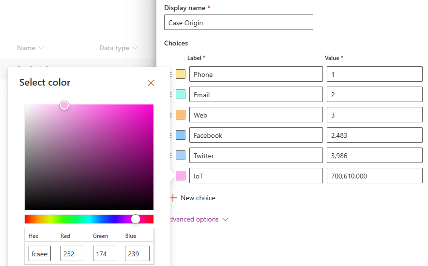
If you are not sure where the colours are coming from, open the choice field you are using in your view. For each value, there is a colour. Clicking on the colour allows you to then pick and change it from a selector. Keep in mind, some of the default colours are very dark and will make it difficult to see the word of the option in the grid. Make the colours as light as possible and then review them in the app. Also be conscious of accessibility issues or users who may be colour blind and need to have some contrast.
Hope you’ve enjoyed the little journey that lead us here. I think it’s important to know and understand when changes are planned and try and get ahead of the curve! What do you think? Have you already started using the Power Apps grid control?
Check out the latest post:
Use Custom Event Registration Questions To Branch Your Journeys In Customer Insights
This is just 1 of 603 articles. You can browse through all of them by going to the main blog page, or navigate through different categories to find more content you are interested in. You can also subscribe and get new blog posts emailed to you directly.
Hi Megan,
I’m totally new in Model Driven Apps and searching for a way how to display subgrid in a view. Specifically, I have table Applications and SubApplications with one-to-many relationship. I would like to expand each Application and show related SubApplications.
Is there a solution for this?
Thank you a lot! 🙂
Hi Jan, unless I am misunderstanding, what you are asking for is what I explain in the blog when it shows adding a Power Apps grid control. The first options in that control are to pick the table (which you would have Application) then the Child Items (where you would put the SubApplications), but there must be a link from the Application table to Sub Applications in some way.
Hi Megan
You might be interested in https://pnp.github.io/blog/post/preparing-for-dark-mode-model-driven-app-choices/ which discusses the background for why pastel colours are best for usability and speculates on the impact of dark mode for model-driven apps for choice colours.
All the best
Alex
Ah brilliant, thanks for sharing Alex!!!
Hi megan – can we show two view at time instead time instead of clopase
Ex – if I open first view and if open second view first view getting clopased
So i need to open both like 1,2,3 etc
Hi Naveen, not out of the box. It’s possible someone might create a PCF Control to do this, but I’ve not seen one yet. You can check out the community PCF Gallery – https://pcf.gallery
Hi Megan
Thanks for publishing this. Have you found that for some columns (Status in my case) you’re unable to edit the colours? The whole area is greyed out for me, for some columns, but not all!
Thanks
Pete
Hi Pete, although I haven’t tried that field specifically, it doesn’t surprise me as fields like Status and Status Reason are unique and specific to D365. There are other areas where you can’t do things with those fields along with other standard fields like Created On, Modified On, Modified By, Created By etc. So if you can’t use colours it would certainly make sense.
Hi Megan:
Is there a way to show a sub grid of information in a model driven form so it acts like a view? I want to show a related list of records on a tab within a form but I do not want the user to be able to add records, export records or any of the other options that get included when I use a read only power grid. I would turn off these options but apparently this is not possible. What I really want is to show the records as View within the tab on the form but I do not see a way to do this. Have you run into this situation and did you find a way to solve?
Hi Dan, if you are adding a subgrid, the only way to hide the ‘new’ record button would be to use the Ribbon Workbench to do so. However, that means unless you do something with display rules to only hide for certain security roles or access, you are hiding it for everyone.