*** NOTE: ALL INFORMATION IS ACCURATE AT DATE OF PUBLISHING ***
I love a good out of the box solution to make something look more aesthetically pleasing in a Model-driven Power App (D365). It’s likely you’ve been using custom controls on fields for some time, think toggles for Yes No fields or auto complete fields. Using controls on views is also a good way to improve usability and help engage users. Something like the Power Apps Grid Control can be used to change how editing and sorting work on a view too. In this post I will walk through the Gallery Control for views (currently listed as Preview).
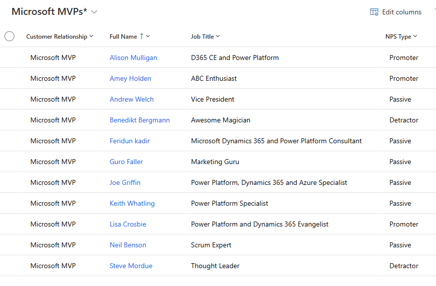
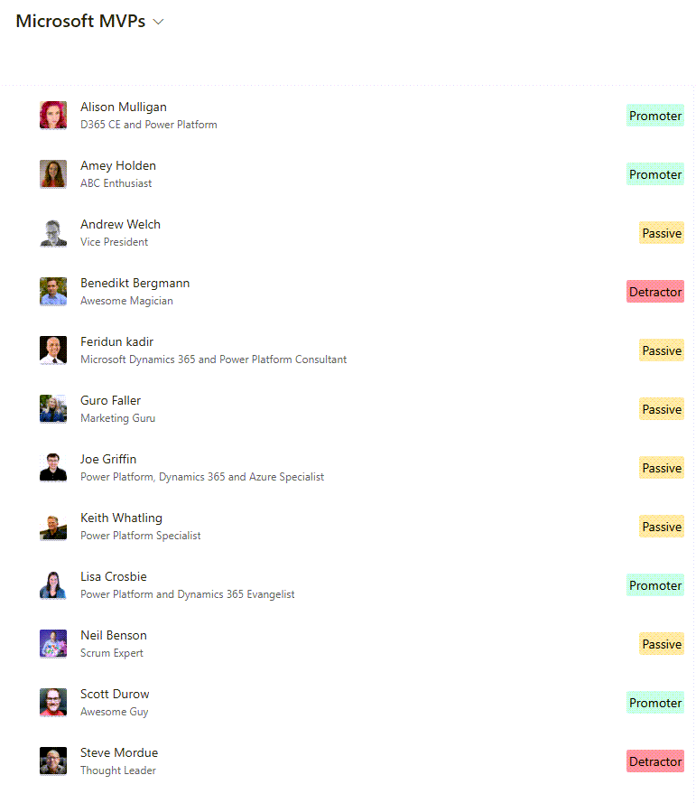
For me, this control really only makes sense if you have a record type with images, and you will see why in just a moment. I wouldn’t consider doing it for records that are purely text where no one would ever add an image to a record. If we consider a view typically, you’ve got rows of records with columns displaying data. Below we can see a list of Contacts that are Microsoft MVP’s, including their name, job title and Net Promoter Score type.
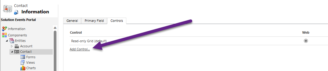
If you go in to the old school way of editing a solution you can add the table (Contact in my example) and click on the Controls panel. I haven’t seen a way yet to do this in the most up to date maker experience but share in the comments if you have seen a way! By default the control used is currently the Read-only Grid (what you would be used to). We can add a new default Control at this level, but that means it would be used for ALL views for that specific table.
Instead, open one of the Views that you want to change, then click on Custom Controls from the right side, then look for the PreviewCalleryControl option and add it to the view.

If you want to force this to be used, click the radio buttons for the new control so it’s set. If you don’t set them, the user can still use the new control but would have to dig in and know how to find where to swap it to use the new control and it’s not all that obvious to find.

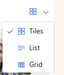
Before we look at all of the properties you can set, let’s first look at the results. There are three options to choose from: Tiles, List and Grid.
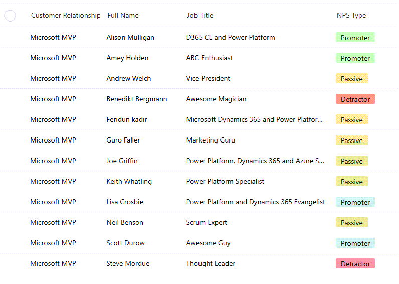
First we have a grid. It’s mainly text but if you have a choice field you will see that the colour for each value in the choice record is used. It’s best to use fairly light colours on those choice values so that it doesn’t look too dark and heavy.
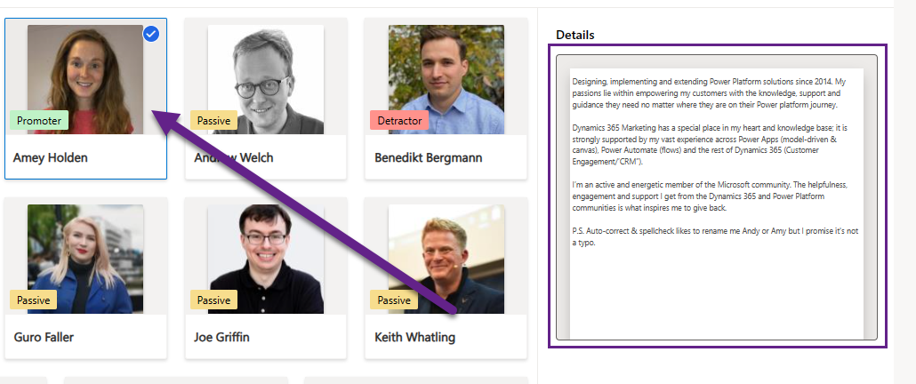
Now we have a List. Notice we can see the entity image on each record which is nice! There is a field used as a label (the NPS Type field in my case) which stands out nicely, and we can see the Name and Job Title displayed.
The last option is my favourite, and that’s to display the records in Tiles. How nice is this? We can see the Contact name, entity image and also the label pulling from the NPS Type choice field.

No matter which layout you are looking at, you can also have a details pane that displays when clicking on a record. Here I am showing a bio field in the details. You can click to expand the details and tab through each details pane if you wish. For anyone using the Marketing app, this functionality is used on things like Email Templates and Content Blocks.
Now to the properties on the Grid Control. I won’t go through all of them as some don’t have any options or at least didn’t on the Contact table. These are used on the Tiles and List layouts. The Grid shows the fields that are actually on the View itself. These are the ones I found to actually work and do something!
- Gallery Dataset Title Name – this is used on the Tiles and List and can be mapped to a Single Line Text field
- Gallery Dataset HTML Name – this one is used to display the details. It can be mapped to a Single or Multi Line Text field. I used a Rich Text field to store a bio which makes it look a bit better, and you can increase the size of the text that is used in the display. You can of course ignore this, which means there would be no preview pane of details
- Gallery Dataset Label Name – this shows on the Tiles and List and is mapped to an OptionSet field (Choice field). This shows up with the colours set on the field values
- Gallery Dataset Description Name – this is used on the Lists layout (I used Job Title) and can be mapped to a Single or Multi Line Text field
- Gallery Dataset Category Name – annoyingly, I couldn’t figure out what this did, so if you can please let me know in the comments!!! I thought maybe it could be used to provide additional filters at the top of the view but didn’t seem to do anything!
- Is Multi Select Name – options are Yes or No to determine if you can select more than one record from the gallery
- Action Name – this is set to open the record by default when clicking the name of the record, but can be changed so it does nothing (which is slightly confusing behaviour for users I think!)
- Is Search Available – this is either Yes or No. There is really no need to turn this on because a filter box is already there at the top right of the view which is standard functionality
- Is Preview Pane Available – this will determine if the Preview Pane (with your HTML item) shows up when you click on a record. It’s either Yes or No
- Is View Selector Available – this will determine if the option is there to swap from the Tiles to the List to the Grid. It’s either Yes or No
- Default View – if you think the Tiles would be most useful, set that as your default, or the List or the Grid, it’s your choice!
That’s all I have used for my layout on the Grid Control. Would be curious to hear from you if you set this up and find other options useful. Go ahead and share in the comments below what worked for you!
Check out the latest post:
Use Custom Event Registration Questions To Branch Your Journeys In Customer Insights
This is just 1 of 603 articles. You can browse through all of them by going to the main blog page, or navigate through different categories to find more content you are interested in. You can also subscribe and get new blog posts emailed to you directly.
Hi Megan,
Thanks for sharing this! One thing that stops me from using this is the reduced contrast between the background colour/color and the label. If one was to then go for very light colours, would that work when dark mode is introduced do you think? I would assume the labels will then go white but the choice option colours would remain the same.
Alex
Hi Alex! Good to ‘see’ you! 😄 Not sure how the control will handle dark mode. Will be interesting to see if they take that in to consideration. Dark colours on the option set values looks terrible and you almost need to pick a shade way lighter than you actually want the colour to be. You almost need a light and dark mode version of the colour. However, as we don’t have dark mode yet, it’s still speculation. Plus, this control is still in preview… so I guess the response would always be ‘it’s not fully supported till it’s GA’.
Hello,
thank you for your blog. I found the new gallery view to be buggy. My pictures don’t show up. I am using the standard image column and set it up as main image for table. storing .jpg files that are not that large. Who knows. I like it though, hopefully all the bugs are out soon
Hi Juan, I’ve not tested on a custom entity that didn’t have an entity image until I added an image column, so not sure about that approach. I’ve only used it on tables that are standard that already had an entity image. I guess until it’s out of preview, it’s hard to know what is going to be fully supported. There is no way( that I saw) to pick what image to use, it just seems to default to the entity image. It’s definitely a nice view control though!
Hi Megan, thanks for your interesting post. I followed your steps and everythings works fine. After that I tried to get on step further and use this control in a subgrid. I wanted to show all contacts of an account with their images, but I was not able to implement that. Do you have experience with that?
Hi Christian, I just tried it, and it doesn’t seem to work. I am guessing it’s not possible based on all of the space for resizing that is required for the gallery. It’s a shame because it would be good to be able to use!
Hi Megan
Do you know if this control ever made it to GA or is it still in preview (Nov 24)?
Hi Adrian, I don’t know. Sometimes the word preview can remain on things for a LONG time, like years. I don’t see anything in their documentation (or at least I can’t find anything) that shows otherwise.