*** NOTE: ALL INFORMATION IS ACCURATE AT DATE OF PUBLISHING ***
If you are using Dynamics 365 Customer Engagement, you will no doubt have used Charts, Views and Dashboards to get a visual representation of your data. This is no different for your Forms Pro Survey responses! We can create charts to display the responses from a view (search) and display them in various places. It’s an easy and familiar way to review your survey feedback.
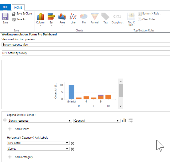
Just a quick overview if you haven’t created a chart before. Create the charts as system charts under the Forms Pro Survey Response entity. Select a view for the chart preview, then give it a name. For this one, I am counting all of the survey responses, then breaking it out by Net Promoter Score, and the actual Survey that was filled out. Save your chart, then publish the entity.
Now if you navigate to the Survey Response entity, and look at a view, you can click on the Show Chart button which will add it to the left of your view. Clicking on the various segments of your chart will filter the results in the view.

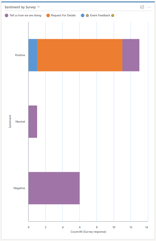
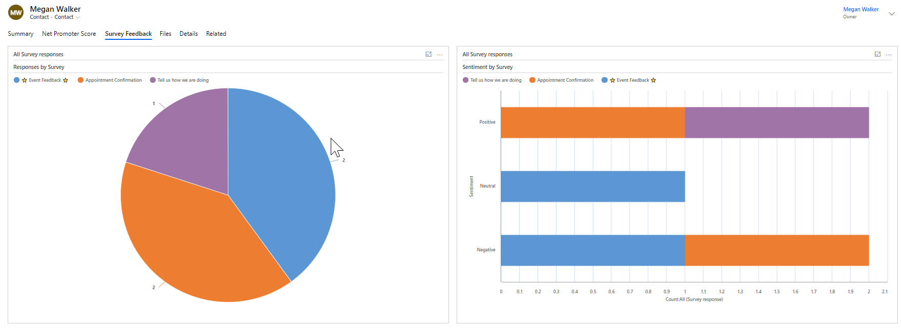
Here we can see a chart showing the sentiment by survey. If the responses showed positive, neutral or negative feedback, we can see it easily in this visual.
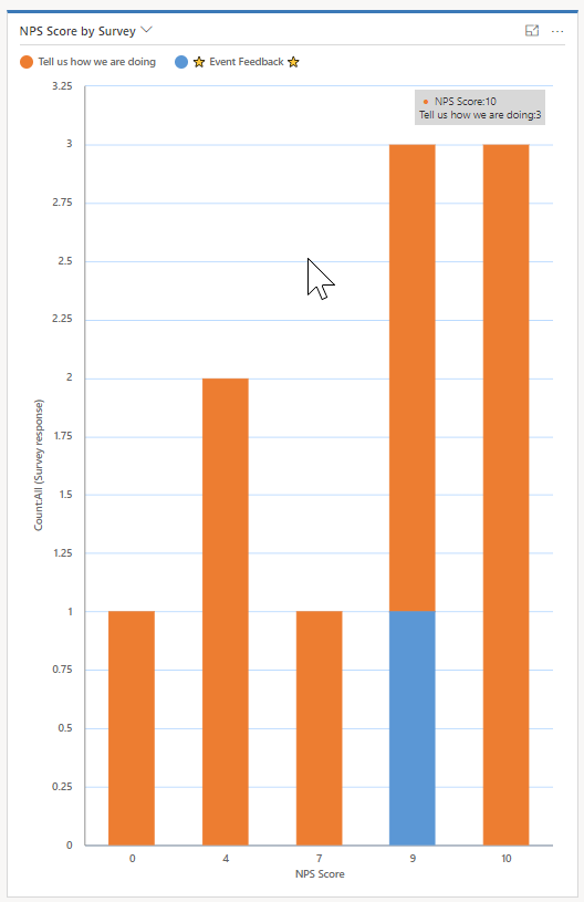
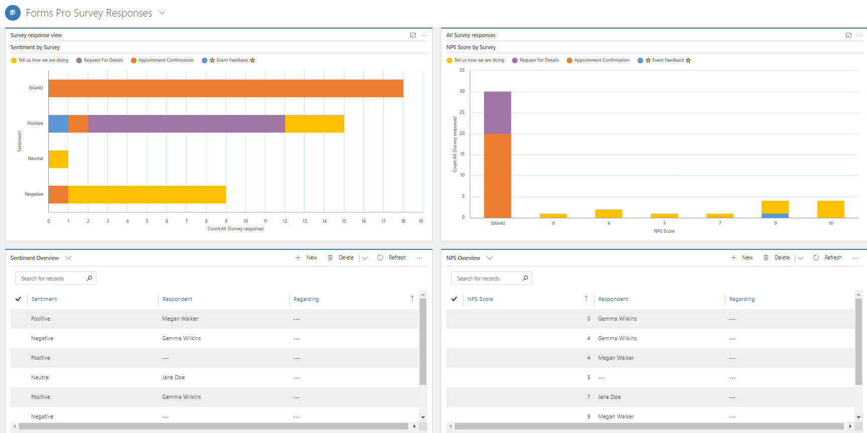
Next we have the Net Promoter Score by Survey. So based on each response, we can see how many have given a specific number response on an NPS specific question.
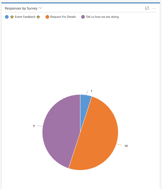
And were we can see the overall number of responses received for each of the surveys.
Another option is to add charts to a Contact record. You could do this for Leads, Accounts or any entity that you are using to set regarding on the survey responses. If you aren’t sure how to do this, check out this post on creating account specific dashboards. It’s the same principle. Below we can see responses by survey and sentiment by survey for a specific Contact.
Finally, we can use a combination of charts and views to create a Forms Pro Survey Response Dashboard. Simple! What ideas do you have? How else might you want to see the data using charts?
Want to just watch how to do this? Check out the video below:
Check out the latest post:
Use Custom Event Registration Questions To Branch Your Journeys In Customer Insights
This is just 1 of 603 articles. You can browse through all of them by going to the main blog page, or navigate through different categories to find more content you are interested in. You can also subscribe and get new blog posts emailed to you directly.
Hi Megan
Great Blog !
Can you repeat the “Using Charts & Dashboards to View Survey Responses” blog using PowerBI please ?
Thanks
Nigel
Hi Nigel, thanks for the comment! I am working on one, hopefully it will be published within the next few week.
Hi Megan, Thank you this! When working on a chart for a survey question with a pick list (to choose answers from), I am having trouble because the value option (where the answers are listed) is not coming up as an option in the Horizontal (Category) Axis level. It only comes up as an option for the Legend entities. Do you have any ideas on how I can create a chart based off a pick list?
Thanks, Robyn
Hi Robyn. The way in which the options for a choice question are stored is in a list of comma-separated values. So they aren’t really stored in the same way as a picklist or option set in the same way option set fields are in Dynamics 365. So you aren’t going to be able to create a chart from those kinds of questions in that way, unfortunately. You might be able to do something a little easier with Power BI for that.