*** NOTE: ALL INFORMATION IS ACCURATE AT DATE OF PUBLISHING ***
Dashboards in CRM/D365 are a fantastic way to provide an overview of key data to users in the organisation. Most likely if you are using CRM you’ve created your own dashboard, or a system administrator has created helpful dashboard layouts to share with relevant teams. What about displaying data specific to an Account record? Let’s look at how to create account specific dashboards using subgrids.
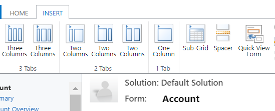
So, let’s rephrase, these aren’t going to be dashboards in the usual sense, rather we can create a dashboard feel on an Account form. You can either do this on an existing form layout, or create a new one just for the new ‘dashboard’. First thing, add a new tab (we’ll use a three column tab in this example). Then on one of the sections, insert a Sub-Grid.
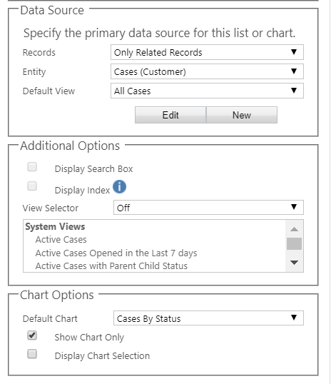
When adding a sub-grid we would typically be displaying a list of related records. We’ll pick only related records, and find the Cases entity where the Account is the Customer. The default view will be All cases in this example. If you scroll down, you will see a Chart Options section. We can pick the chart to display, and then select the ‘Show Chart Only’ box, and make sure ‘Display Chart Section’ is deselected. Leaving that selected will allow the user to change the chart from a list. While this could be a powerful option, not all charts will work with the default view selected in the Data Source on the sub-grid.
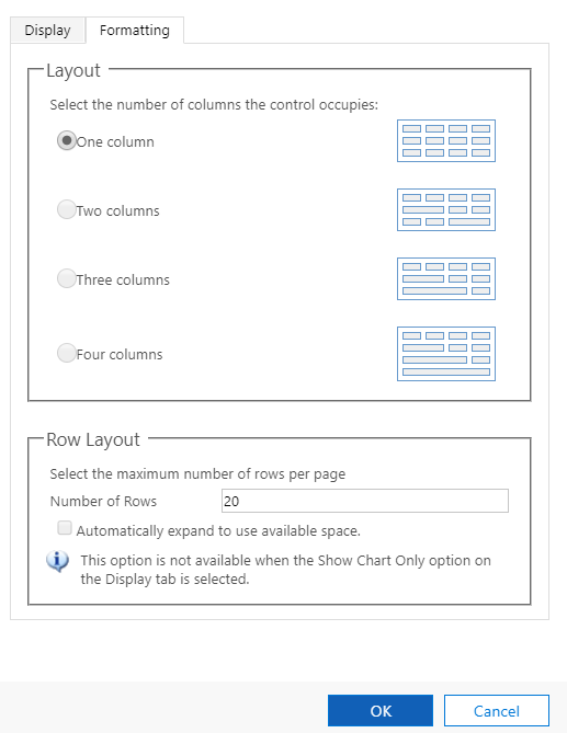
Clicking on the formatting tab, increase the number of rows. You may need to play around with this, but you will find that the chart won’t display if the number of rows is to low. 20 gives a nice visual of some of the charts, but you may need to increase it further if you use the sales pipeline funnel for example. Add a label to the sub grid component and make sure you tick the box to display it.
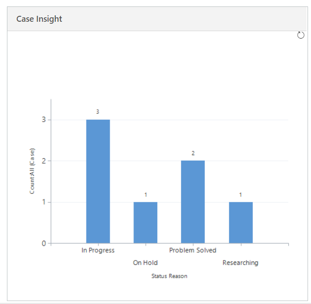
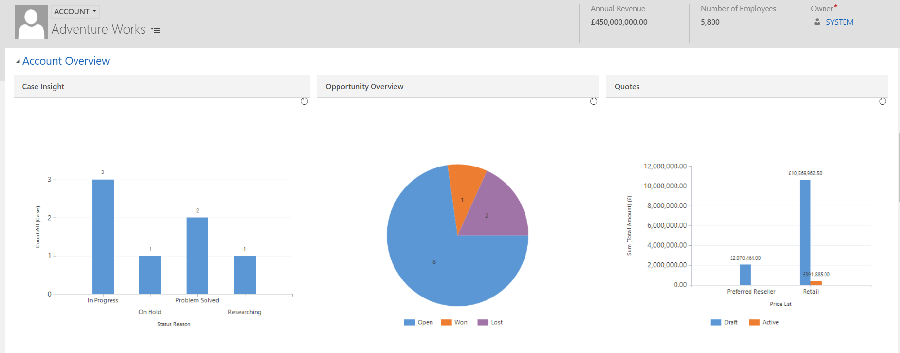
Now save and publish the form. Here we can see a useful visual showing all cases for the Account sorted by Status.
Add in additional graphs you feel would be useful to the end user, and save and publish again. One drawback to this is the graphs can not be drilled in to as they can from a dashboard. This means you can’t get to the records that make up the graph. However, you could always display additional subgrids displaying a view underneath the chart should you wish.
Check out the latest post:
Find Contacts With Failed Form Submissions Via A Segment
This is just 1 of 586 articles. You can browse through all of them by going to the main blog page, or navigate through different categories to find more content you are interested in. You can also subscribe and get new blog posts emailed to you directly.

One of the elements I often neglect to show customers – but can be very powerful. Excellent reminder Megan.
Thanks Peter! It was in fact a meeting with a member of the sales team that reminded me of the feature. When I saw it I thought, there’s the next blog post!