*** NOTE: ALL INFORMATION IS ACCURATE AT DATE OF PUBLISHING ***
I’ve written a series of blogs all about Compliance Profiles which walk through a series of steps for getting up and running with Realtime Marketing compliance. Part one shows how to create a new Compliance Profile and then make sure your Preference Centre looks good. This is the page someone will land on if they click on the link from the bottom of the email, giving your Contacts and Leads a way to update their preferences or opt out completely if needed. In this post, I will walk through how to modify those pages a little more using some CSS and a few tricks to make it look more appealing.
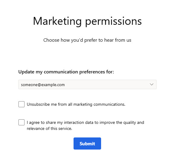
First, this is what the Preference Centre looks like when you first create your Compliance Profile. It’s bare bones, so definitely needs reviewing and modifying! You can put it in Edit mode, then add in all the tick boxes for your Topics etc. to guide the person through updating their preferences. Again, more information on this is found in this blog post, so start there if you aren’t sure.
This is the end result I wanted. It looks nice, clear and easy to read, and the style is more in line with my company branding. How did I achieve it though?
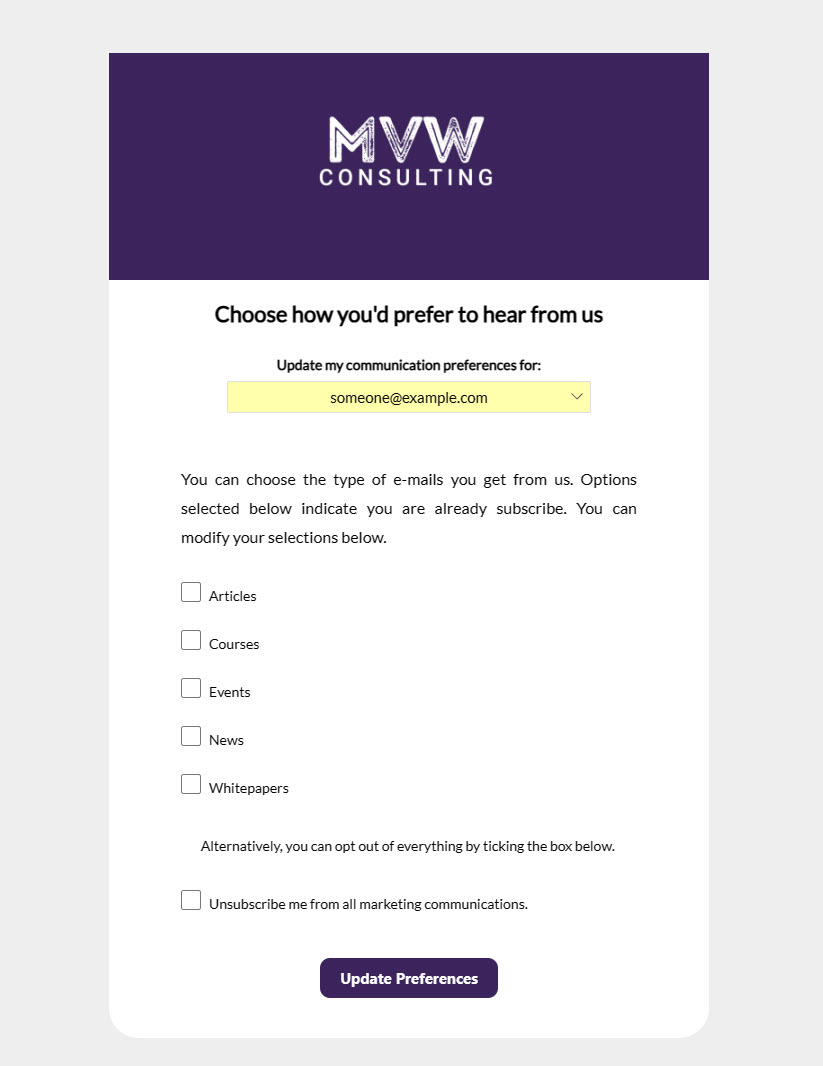
Oh one other thing, I also added my logo in as the favourite icon so it appears at the top when landing on the Preference Centre page.

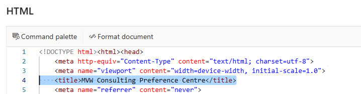
All of these things can be done in the HTML. After clicking Edit on the Preference Centre form, click on the HTML link from the right side of the form. The title is the first thing to edit. By default, it says ‘Form Editor’ which is what will then show up in the browser above where you see MVW Consulting Preference Centre. So just modify what you what to see in the title section like you see below. Will look much nicer than seeing ‘Form Editor’!
Next, I’ve got a few extra lines of code I’ve added in right before the start of the CSS <style> tag.
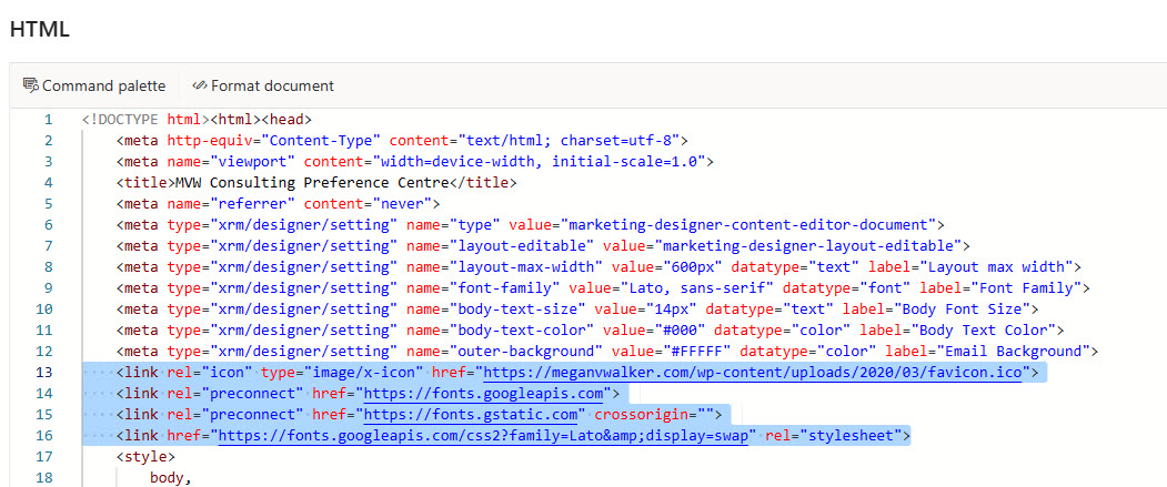
The first one is a link for my favourite icon. If you are not sure what this is, check with your web designer and they should be able to help. Most websites use a fav icon, which is a small image file that then shows up at the very top of the browser when someone is on your website. You should use a link to that file like you see below. Note that even after adding this, sometimes it can take a while to show up, so delete or refresh the cache of your browser or check incognito and it should show up. This is just a little ‘nice to have’ option.
<link rel="icon" type="image/x-icon" href="https://meganvwalker.com/wp-content/uploads/2020/03/favicon.ico">
The next thing that can be done is adding in a different font. If you want more information on doing this, you can take a look at this post where I showed how to do it for marketing forms. After adding in links to Google Fonts, you can then use your new font in all areas of the form and simply update the CSS to use it.
<link rel="preconnect" href="https://fonts.googleapis.com">
<link rel="preconnect" href="https://fonts.gstatic.com" crossorigin="">
<link href="https://fonts.googleapis.com/css2?family=Lato&display=swap" rel="stylesheet">
Now let’s move on to the CSS which I will share to give you a starting point. You can then adjust and change as needed. These first two elements already exist, but I’ve adjusted them. I’ve updated the background colour to be a light grey, and set the background of the main layout to remain white. I’ve also set the radius of the form layout to have rounded corners which is the border-radius.
        body,
        div {
            font-family: 'Lato', sans-serif;
            font-size: 14px;
            color: #000;
            background-color: #eeeeee;
        }
   [data-layout="true"] {
            margin: 0 auto;
            max-width: 600px;
            background-color: white;
            border-radius: 30px !important;
        }
The next one is a new element I added. This adds a bit of padding above the form, and also keeps the background of the form itself (not the main layout inside it) light grey.
 form {
            background: #eeeeee;
            padding-top: 4em;
        }
This might not be needed based on your own requirements, but I also wanted to adjust the paragraph text, so added this in to make it easier to adjust some of the text. This is a new element and doesn’t exist in the CSS out of the box.
        p {
            text-align: center;
            line-height: 2em;
        }
These two elements already exist, so find them and replace if you want to adjust the drop down for the person to pick their email or mobile phone number like I did. I’ve centred things, and put a yellow background on it to make it stand out. Just showing an example of what COULD be done, so ignore or adjust if it’s not quite right for your own requirements.
        div.contactPoint {
            font-size: 15px;
            font-weight: 500;
            line-height: 20px;
            background-color: #ffff0054 !important;
            padding: 10px 0 10px 0;
            text-align: center;
        }
        .preferenceCenterBlock select {
            padding: 6px 8px;
            background-color: #ffff0054 !important;
            border: 1px solid #e1dfdd;
            border-radius: 2px;
            background-image: url(data:image/svg+xml;base64,PHN2ZyB3aWR0aD0iMTIiIGhlaWdodD0iNyIgdmlld0JveD0iMCAwIDEyIDciIGZpbGw9Im5vbmUiIHhtbG5zPSJodHRwOi8vd3d3LnczLm9yZy8yMDAwL3N2ZyI+CjxwYXRoIGQ9Ik02IDYuNzA4OThMMC4xNDY0ODQgMC44NTU0NjlMMC44NTU0NjkgMC4xNDY0ODRMNiA1LjI5MTAyTDExLjE0NDUgMC4xNDY0ODRMMTEuODUzNSAwLjg1NTQ2OUw2IDYuNzA4OThaIiBmaWxsPSIjNjA1RTVDIi8+Cjwvc3ZnPgo=);
            background-repeat: no-repeat;
            background-position-x: 98%;
            background-position-y: center;
            appearance: none;
            text-align: center;
            width: 80%;
            margin: auto;
            font-family: 'Lato';
            font-size: 15px;
        }
That’s it! Make your changes, save your form and then check it out. Hopefully it looks more like this than the plain and non branded version you get originally for a Preference Centre.
Check out the latest post:
Use Custom Event Registration Questions To Branch Your Journeys In Customer Insights
This is just 1 of 603 articles. You can browse through all of them by going to the main blog page, or navigate through different categories to find more content you are interested in. You can also subscribe and get new blog posts emailed to you directly.
Dear Megan,
Great topic once again thank you !
Small question regarding preference center : Is it possible to let contact modify their own data (e.g. firstname, lastname, …) on contact entity ?
We cannot select contact (or lead) fields on the preference center. This point seems critical in order to adopt Real-Time Marketing.
Thanks in advance for your answer.
Best regards
Hi Quentin, not on the Preference Centre, no. You could always add text on the Preference Center to let them know if they need to change any of their personal details to ‘click here’ which could then be a link to another page on your site, however, the pre-filling of fields on forms is not currently released and will be October I believe before that is possible. https://learn.microsoft.com/en-gb/dynamics365/release-plan/2024wave2/customer-insights/dynamics365-customer-insights-journeys/form-prefill-simplifies-form-filling-event-sign-up?WT.mc_id=DX-MVP-5003395
Hi Megan,
I have a specific question about the Contact Opt-in field, which is a dropdown with options for email and phone number. According to GDPR requirements, users must be able to give their consent separately for each contact point—email and phone number. How does this work? In this case, if you use purpose checkboxes for Commercial or Tracking consent, do they apply to both the email and phone number, or can the consent be given individually for each?
Hi Agnieszka, as you have stated, there is a drop down that shows the email address for the person who has clicked on the Unsubscribe link (from an email or text), and phone number. It only appears as a drop down if the person has both of those things on their Contact or Lead record. Consent is given individually for each. So if you visit the Preference Centre by clicking the unsubscribe link, and your email is showing, any changes you make will be related to emails. if you change the drop down to your phone number (or click on the unsubscribe link from a text message), any changes you make will be related to texts.
Hello Megan,
Do you happen to know if it’s possible to collect the reasons for opt outs through Preference Centre form?
I’ve been trying to add some fields on the form, but it seems impossible.
Thank you,
Hi Emma, currently there is no way to do it on the same Preference Centre form. You could possibly add some Javascript to the form and based on if the overall unsubscribe box is ticked you could redirect them to another form to ask them the reason why. However, that isn’t a great user experience, especially for someone who has just opted out. Would be great to see this added in the future as standard from Microsoft.
I was trying to do the same but unable to do so.
As mentioned to Emma, it is not possible currently to add additional fields to the Compliance Preference Centre forms.
Hi Megan,
I’m still wondering how I can “cover” the standard URL for the preference center. Branded URLs (or vanity domains) have been vanished from the roadmap without any future date. But while using real-time marketing I couldn’t find an ootb feature to redirect to a personal domain to show the preference center. In OBM that was easy possible when hosting the subscription form on any page with the JavaScript beeing prodivided. But for the preference center this is no possible anymore. Do you have any ideas on that?
Hi Jan, at this point, it’s not something that can be done. 😟 Hopefully they will allow embedding as an option in the future!
I have just entered an idea on this as I couldn’t find any proper workarounds, other ideas or items on the roadmap. Feel free to vote, if you are missing this as well 🙂
https://experience.dynamics.com/ideas/idea/?ideaid=93e7bbe0-3e06-f011-a4de-6045bdb53877
Hi Jan, voted!
Hi Megan,
How do I get the unsubscribe Url, preference center url. If i need to use my own hyper text , eg I would prefer to use unsubscribe/Subscribe and have preference center url link to it
Hi Ramona, the URL is generated dynamically, there isn’t a place where you can get it. if you are referring to making your own text a hyperlink, then add the word ‘Unsubscribe’ to the bottom of the email, then select it and click the link icon from the top of the WYSIWYG editor. Then from there, for the URL, you would need to add personalisation and map to the preference centre like you see below.

Hi Megan,
Great article.
Is that topics you have added to the form? “Articles”, “Courses”, etc.
How do you add these? Are these marketing interests that can be used to build segments?
I am asking with the purpose of building a preference centre where contacts can add what theme of newsletters they would like to receive.
Hi Graham, glad you are making progress! If you haven’t already found it, I would suggest checking out this and going through the series of posts on Compliance that should help: https://meganvwalker.com/compliance-profiles-marketing-leads-contacts/
Hi Megan 🙂
If we wanted to give people the ability to update their email addresses… how would we do that?
Hi JP! 😊 if it’s a different email address they would really need to opt in with the new one because it would need a new contact point consent record.