*** NOTE: ALL INFORMATION IS ACCURATE AT DATE OF PUBLISHING ***
Brand consistency is important, and getting your Realtime Marketing Forms to look good and fit in with your website look and feel is key for a seamless experience. The forms have a fantastic theme panel providing you with the ability to set the colour palette, background, h1, h2, h3, paragraph and other components on your form. Although that is all there on a form by default, you might have a need to adjust the CSS… potentially removing stuff without realising it. In this post I will walk through the components that exist in the theme area and which CSS determines what shows up for a user to edit.
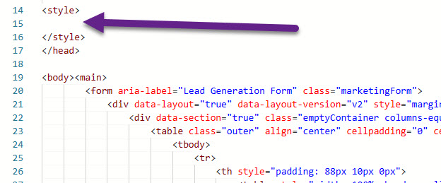
If we go in to the HTML of the form, we can see all of the different CSS classes that exist between the two style tags.
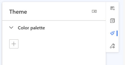
Removing all of the styles means the theme control is empty apart from the colour palette section. Now we can start to understand what each part of the theme does, and what CSS classes need to exist in order for the control to be present on the form.
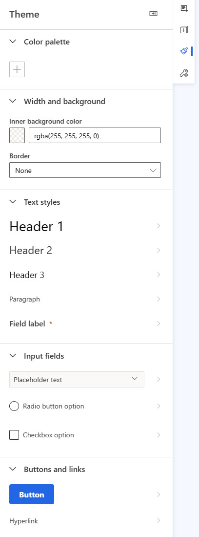
Theme Colour Palette
First, the theme colour palette exists no matter what you have in your CSS. The purpose here is to add in your own theme colours by clicking the plus sign.
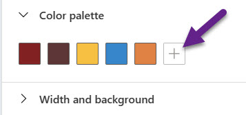
You can then select from a standard colour, or click custom and add your own brand colours using RGB or HEX references.
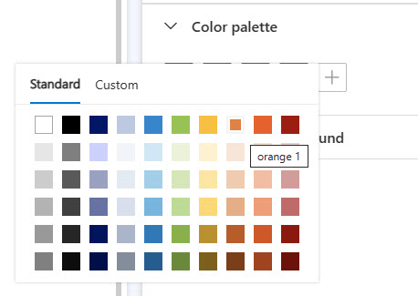
The intent is to create a quick place to access your theme colours when setting the colour within other areas of the theme. Saves you having to go and search for the HEX or RGB references again later!
Once the theme colours are selected, this will be added to the style section automatically within the HTML.
        :root {
            --brand-color1: #822222;
            --brand-color2: #5c3636;
            --brand-color3: #F6C042;
            --brand-color4: #3786CA;
            --brand-color5: #DF8244;
        }
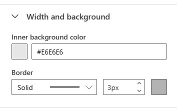
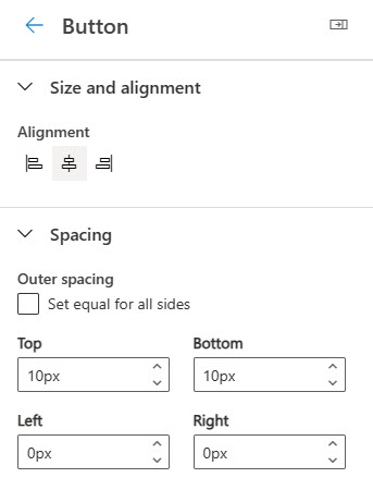
Width & Background Styling
Next we have the width and background styling. Although the label states width, and the CSS includes a width, it’s not something you can actually set in the theme. This is the CSS to add to the style section in the HTML.
        [data-layout="true"] {
            margin: 0px auto;
            max-width: 600px;
            background-color: rgb(255, 255, 255);
            border-style: solid;
            border-color: rgb(255, 255, 255);
            border-width: 3px;
        }
After adding the CSS block, you can now set the inner background colour and border style, width and colour of the overall form.
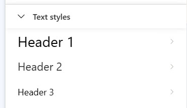
Header Styles
Next we have the header styles for h1, h2 and h3. I tried adding in h4 to see if I could include and force it in to the theme section… but sadly it didn’t work. However, it’s unlikely you would need to go to that level for a form. The following CSS should be added in to the style section of the HTML.
      .marketingForm h1 {
            color: rgb(0, 0, 0);
            margin: 0px;
            padding: 0px;
            width: 100%;
            font-family: "Segoe UI", Arial, sans-serif;
            line-height: 1.25;
            font-size: 28px;
        }
        .marketingForm h2 {
            color: rgb(51, 51, 51);
            margin: 0px;
            padding: 0px;
            width: 100%;
            line-height: 1.25;
            font-family: "Segoe UI", Arial, sans-serif;
            font-size: 22px;
        }
        .marketingForm h3 {
            color: rgb(0, 0, 0);
            margin: 0px;
            padding: 0px;
            width: 100%;
            line-height: 1.25;
            font-family: "Segoe UI", Arial, sans-serif;
            font-size: 18px;
        }
This adds the following text styles section in to the theme panel. We can set the font style, size, colour, weight and line height for each. We can also set the spacing, size and alignment for any text block using one of the header styles.
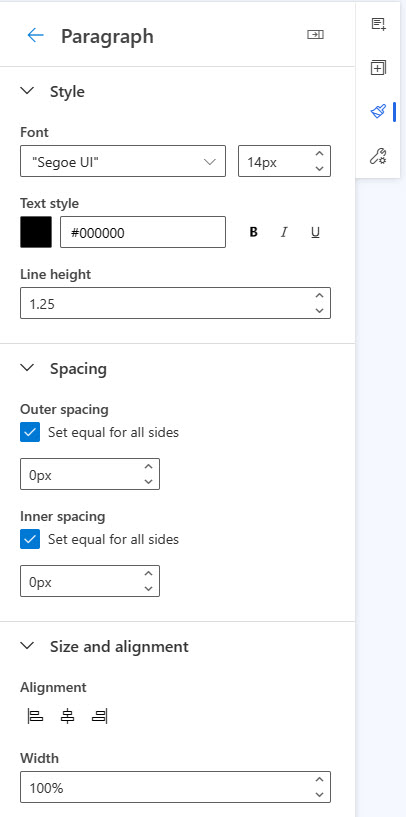
Paragraph Style
Any sections using plain text will likely use the paragraph style. Add in the following CSS to make sure this shows in the theme panel.
        .marketingForm p {
            margin: 0px;
            padding: 0px;
            width: 100%;
            line-height: 1.25;
            font-family: "Segoe UI", Arial, sans-serif;
            font-size: 14px;
        }
After adding the CSS, Paragraph will show up in the text styles section under the header styles.
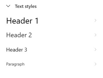
We can set all of the same things on the paragraph as we could on the header styles.
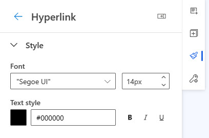
Hyperlink Styling
Anywhere you’ve added a text link in the form will use the hyperlink styling. The following CSS style is needed to add hyperlink to the theme panel.
        .marketingForm a, div[data-editorblocktype="Captcha"] td:nth-of-type(2) a {
            text-decoration: none;
            font-family: "Segoe UI", Arial, sans-serif;
            font-size: 14px;
        }
Once added, a new Buttons and links section will appear in the theme.
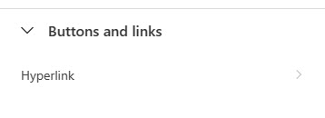
Not much to this style, just font style, size, colour and if you would like it bold, italic or underlined.
Button Styling
Now for the button styling. We have this CSS first that can be used.
   .marketingForm .primaryButtonWrapper, .submitButtonWrapper {
            text-align: center;
            margin: 10px 0px;
        }
Although it adds in the button section, it doesn’t give us any of the control over the button colour, rounding or font styling.
For that, we need to include the following.
        .marketingForm .primaryButton, .submitButton {
            font-family: "Segoe UI", Arial, sans-serif;
            font-weight: 700;
            font-size: 16px;
            line-height: 22px;
            background-color: rgb(34, 102, 227);
            border: none;
            border-radius: 4px;
            color: rgb(255, 255, 255);
            padding: 10px 20px;
            cursor: pointer;
        }
        .marketingForm .secondaryButton {
            font-family: "Segoe UI", Arial, sans-serif;
            font-weight: 700;
            font-size: 16px;
            line-height: 22px;
            background-color: rgb(255, 255, 255);
            border: 1px solid rgb(0, 130, 221);
            border-radius: 4px;
            color: rgb(34, 102, 227);
            padding: 10px 20px;
            margin: 0px;
            cursor: pointer;
        }
If you look closely at the CSS blocks above, you will see there is one for a Primary Button and one block for a Secondary Button. Hopefully this is something we will see the ability to actually use in the future, but for now there is no such thing as a secondary button concept in the theme or even by adding two buttons to a form.
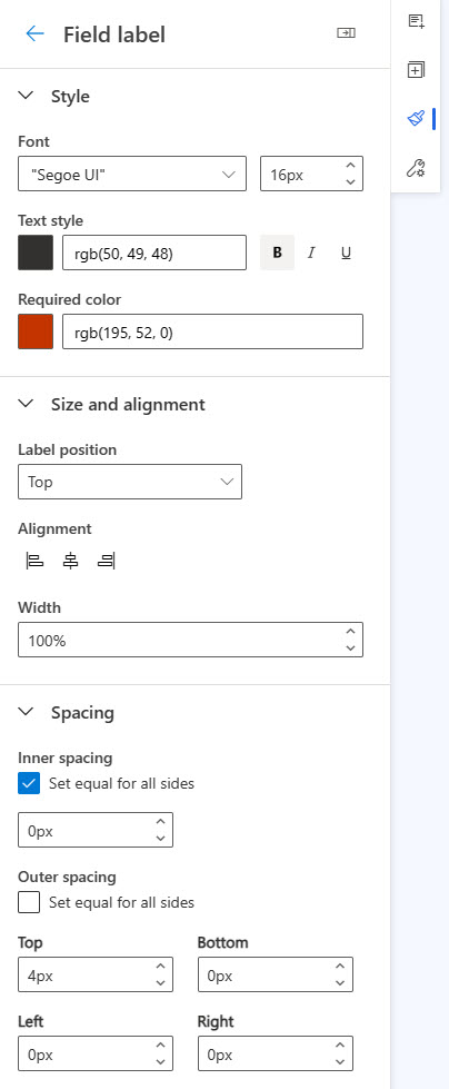
Field Label Styling
The styling of the field labels provides the ability to set the font styling, required colour (the asterisk for required fields), position of the labels, alignment and spacing. There are quite a few CSS styles for this to appear in full in the theme panel.
.textFormFieldBlock,
.dateTimeFormFieldBlock,
.twoOptionFormFieldBlock,
.optionSetFormFieldBlock,
.multiOptionSetFormFieldBlock,
.lookupFormFieldBlock {
padding: 20px 30px;
display: flex;
flex-direction: column;
gap: 16px;
}
.textFormFieldBlock label,
.dateTimeFormFieldBlock label,
.lookupFormFieldBlock label,
.twoOptionFormFieldBlock label.block-label,
.optionSetFormFieldBlock label.block-label,
.multiOptionSetFormFieldBlock label.block-label,
div[data-editorblocktype="Captcha"] label[id^="wlspispHipInstructionContainer"],
.textFormFieldBlock label *,
.dateTimeFormFieldBlock label *,
.lookupFormFieldBlock label *,
.twoOptionFormFieldBlock label.block-label *,
.optionSetFormFieldBlock label.block-label *,
.multiOptionSetFormFieldBlock label.block-label *,
.consentBlock label * {
font-family: "Segoe UI", Arial, sans-serif;
font-size: 16px;
font-weight: 600;
color: rgb(50, 49, 48);
}
.textFormFieldBlock label,
.dateTimeFormFieldBlock label,
.lookupFormFieldBlock label,
.twoOptionFormFieldBlock label.block-label,
.optionSetFormFieldBlock label.block-label,
.multiOptionSetFormFieldBlock label.block-label,
div[data-editorblocktype="Captcha"] label[id^="wlspispHipInstructionContainer"] {
display: inline-block;
margin: 4px 0px 0px;
padding: 0px;
flex: 1 1 0%;
width: 100%;
}
.textFormFieldBlock label>*,
.dateTimeFormFieldBlock label>*,
.lookupFormFieldBlock label>*,
.twoOptionFormFieldBlock label.block-label>*,
.optionSetFormFieldBlock label.block-label>*,
.multiOptionSetFormFieldBlock label.block-label>*,
.consentBlock label>* {
display: inline-block;
}
.textFormFieldBlock label::after,
.twooption_checkbox label::after,
.dateTimeFormFieldBlock label::after,
.lookupFormFieldBlock label::after,
.twoOptionFormFieldBlock label.block-label::after,
.twoOptionFormFieldBlock div.twooption_checkbox label::after,
.optionSetFormFieldBlock label.block-label::after,
.multiOptionSetFormFieldBlock label.block-label::after,
.consentBlock label::after,
div[data-editorblocktype="Captcha"] label[id^="wlspispHipInstructionContainer"]::after {
width: 22px;
display: inline-block;
line-height: 22px;
text-align: center;
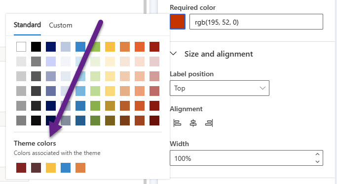
color: rgb(195, 52, 0);
content: "*";
visibility: hidden;
}
The Field label option will be added in to the theme under the Paragraph option. All of the above CSS will give us all of this when clicking in to the Field label option.
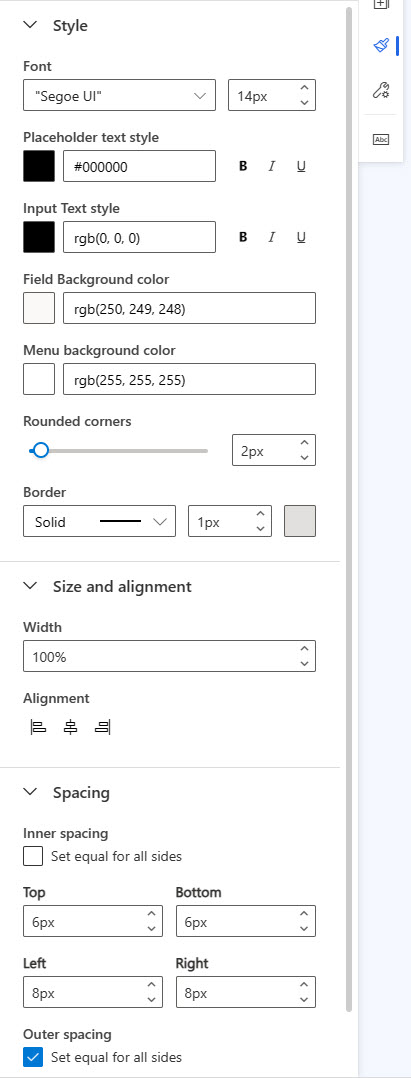
Placeholder Text Styling
Next we have the start of the input fields section on the theme panel. This one is for the placeholder text which can be used to guide the user or explain what needs to be added to a field. It shows until the field is clicked in to and the user starts adding text.
 .optionSetFormFieldBlock select,
        .textFormFieldBlock input::placeholder,
        .dateTimeFormFieldBlock input,
        .lookupFormFieldBlock input::placeholder,
        .marketingForm textarea::placeholder,
        div[data-editorblocktype="Captcha"] input::placeholder {}

        .optionSetFormFieldBlock select,
        .textFormFieldBlock input,
        .dateTimeFormFieldBlock input,
        .lookupFormFieldBlock input,
        .marketingForm textarea,
        div[data-editorblocktype="Captcha"] input {
            font-family: "Segoe UI", Arial, sans-serif;
            padding: 6px 8px;
            background-color: rgb(250, 249, 248);
            border: 1px solid rgb(225, 223, 221);
            border-radius: 2px;
            display: block;
            width: 100%;
            height: 100%;
            box-sizing: border-box;
            font-size: 14px;
            flex: 2 1 0%;
            color: rgb(0, 0, 0);
        }

        .optionSetFormFieldBlock select option {
            background-color: rgb(255, 255, 255);
        }
Once the CSS is added, a new Input fields section will appear in the theme.
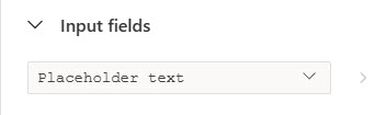
Clicking on Placeholder text will provide a lot of options for styling.
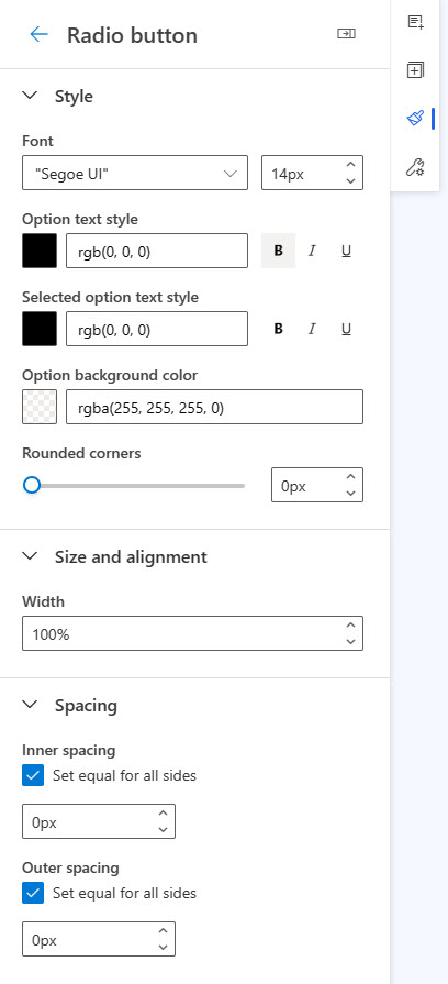
Radio Button Styling
Adding to the Input fields section, we now have the CSS for radio button options.
    .optionSetFormFieldBlock div.radiobuttons div input[type="radio"]:checked+label,
        .twoOptionFormFieldBlock div.radiobuttons div input[type="radio"]:checked+label {
            color: rgb(0, 0, 0);
        }

        .twoOptionFormFieldBlock div.radiobuttons div label,
        .optionSetFormFieldBlock div.radiobuttons div label {
            font-family: "Segoe UI", Arial, sans-serif;
            font-weight: 400;
            font-size: 14px;
            line-height: 20px;
            color: rgb(0, 0, 0);
        }

        .twoOptionFormFieldBlock div.radiobuttons,
        .optionSetFormFieldBlock div.radiobuttons {
            padding: 0px;
            margin: 0px;
            border-radius: 0px;
            background-color: rgba(255, 255, 255, 0);
        }

        .twoOptionFormFieldBlock div.radiobuttons div,
        .optionSetFormFieldBlock div.radiobuttons div {
            width: 100%;
        }
Here are the options added for adjusting how radio buttons appear. One thing I think is currently missing that would be nice to see is the accent colour to determine what the selected option(s) look like rather than just changing the text of the item(s) picked. Hopefully we will see this in the future!
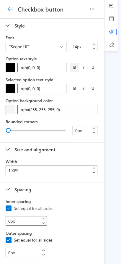
Checkbox Styling
The last item in the Input fields section is for the checkbox options. The following CSS will need to be included in the style section in your form HTML.
 .twoOptionFormFieldBlock div.twooption_checkbox div input[type="checkbox"]:checked+label,
        .twoOptionFormFieldBlock div.twooption_checkbox div input[type="checkbox"]:checked+label div,
        .consentBlock div input[type="checkbox"]:checked+label p {
            color: rgb(0, 0, 0);
        }

        .twoOptionFormFieldBlock div.twooption_checkbox div label,
        .twoOptionFormFieldBlock div.twooption_checkbox div label div,
        .consentBlock div label p {
            font-family: "Segoe UI", Arial, sans-serif;
            font-weight: 400;
            font-size: 14px;
            line-height: 20px;
            color: rgb(0, 0, 0);
        }

        .twoOptionFormFieldBlock div.twooption_checkbox>div,
        .consentBlock>div {
            width: 100%;
            border-radius: 0px;
            background-color: rgba(255, 255, 255, 0);
        }

        .twoOptionFormFieldBlock div.twooption_checkbox div,
        .consentBlock div {
            padding: 0px;
            margin: 0px;
        }
This will make sure the following style components are available for users to change on the form in relation to checkboxes. As with the radio buttons, there isn’t an option to change the colour of the box when items are selected… yet. Hopefully that will be added in a future release!
Required Asterisk
In addition to the theming, we also have an asterisk that displays for any fields that have had the Required toggle set to Yes. If you strip out the CSS, this won’t be displayed any more.
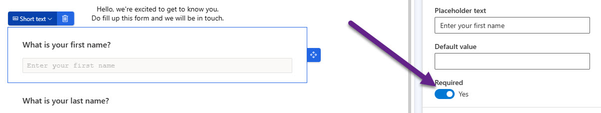
Add this in to the CSS part to make sure the required asterisk displays.
        div[data-required].textFormFieldBlock label::after,
        div[data-required].dateTimeFormFieldBlock label::after,
        div[data-required].lookupFormFieldBlock label::after,
        div[data-required] div.twooption_checkbox label::after,
        div[data-required] label.block-label::after,
        div[data-required="true"].consentBlock label::after,
        div[data-editorblocktype="Captcha"] label[id^="wlspispHipInstructionContainer"]::after {
            visibility: visible;
        }
Now we will see the required asterisk on the form in D365 and also where you embedded the form on the website.
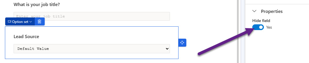
Hidden Field Icon
Similar to the item above, stripping out the CSS could also strip out the icon that shows when a field is hidden on the form. Although the field will still remain hidden to the person filling out the form, it makes it challenging for the person editing the form in the future. It will just look like a regular field unless you look at the hide field property.
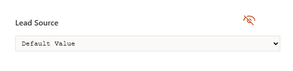
This will need to be included back in the CSS for the icon to show up again.
        div[data-hide].textFormFieldBlock,
        div[data-hide].dateTimeFormFieldBlock,
        div[data-hide].lookupFormFieldBlock,
        div[data-hide].twoOptionFormFieldBlock,
        div[data-hide].optionSetFormFieldBlock,
        div[data-hide].multiOptionSetFormFieldBlock {
            background-image: url(data:image/svg+xml;base64,PHN2ZyBjbGFzc05hbWU9ImhpZGRlbkZpZWxkSWNvbiIgeG1sbnM9Imh0dHA6Ly93d3cudzMub3JnLzIwMDAvc3ZnIiB3aWR0aD0nMjQnIGhlaWdodD0nMjQnIHZpZXdCb3g9IjAgMCAyMDQ4IDIwNDgiPg0KICAgICAgICA8cGF0aCBkPSJNNzQgMjkybDkwLTkwIDE2MzAgMTYyOS05MSA5MS00NTctNDU3cS01NCAzNS0xMDUgNTN0LTExNyAxOHEtODAgMC0xNTAtMzB0LTEyMi04Mi04Mi0xMjItMzAtMTUwcTAtNjUgMTgtMTE2dDUzLTEwNkwzOTEgNjEwUTI2NiA3MTUgMTk3IDg1MXQtNjkgMzAxSDBxMC05MSAyMS0xNzl0NjAtMTcwIDk0LTE1MyAxMjYtMTMwTDc0IDI5MnptNjk0IDg2MHEwIDUzIDIwIDk5dDU1IDgyIDgxIDU1IDEwMCAyMHEzNiAwIDY3LTl0NjItMjdsLTM0OS0zNDlxLTE3IDMxLTI2IDYydC0xMCA2N3ptMzI4LTI0NUw5NjMgNzc0bDMwLTRxMTUtMiAzMS0yIDc5IDAgMTQ5IDMwdDEyMiA4MiA4MyAxMjMgMzAgMTQ5cTAgMTUtMiAzMHQtNCAzMWwtMTMzLTEzM3EtNDItMTMxLTE3My0xNzN6bTk1MiAyNDVoLTEyOHEwLTExOC0zNi0yMjF0LTk5LTE4OC0xNTAtMTUyLTE4NS0xMTMtMjA4LTcwLTIxOC0yNHEtOTggMC0xOTIgMTl0LTE4NSA1NmwtOTgtOThxMTE2LTUzIDIzMS03OXQyNDQtMjZxMTQ0IDAgMjg1IDM1dDI2NSAxMDUgMjI2IDE3MCAxNjYgMjM0cTQwIDgyIDYxIDE3MXQyMSAxODF6Ig0KICAgICAgICBmaWxsPSIjQzMzNDAwIiAvPg0KICAgICAgICA8L3N2Zz4= );
            background-repeat: no-repeat;
            background-position: 86% 20%;
        }
Now we can see the hidden field icon again.
Custom Fonts
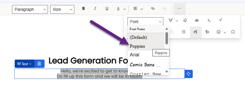
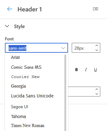
This last one is a bit of a bonus in case you aren’t already aware. You can add custom fonts in to your forms. Check out what I think is maybe the original post about this from Matt Wittemann in 2020. The approach is still the same, and in this example I will add in Poppins from Google Fonts. This goes in to the top of the HTML in the header section.
<link rel="preconnect" href="https://fonts.googleapis.com"> <link rel="preconnect" href="https://fonts.gstatic.com" crossorigin=""> <link href="https://fonts.googleapis.com/css2?family=Poppins&display=swap" rel="stylesheet">
We can then add another line of code to the header section of the HTML to allow Poppins to show up in the list of additional fonts if you want to include it there.
<meta type="xrm/designer/setting" name="additional-fonts" datatype="font" value="Poppins">
More than likely if you are using the theme, you would want to include the font(s) there too. Unfortunately it doesn’t show up in the drop down list.
However, you can type out the name of the font and if you’ve added it in the HTML it should show as an option!
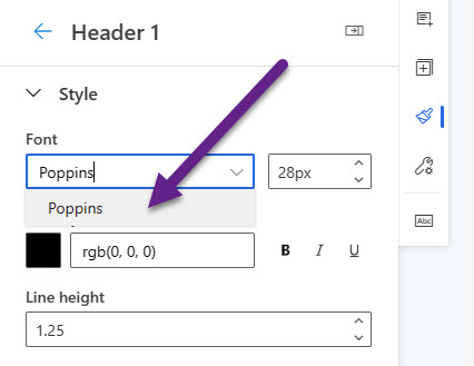
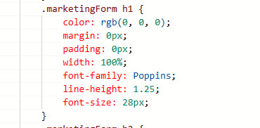
When you do this, it will update the corresponding CSS style in the HTML with the custom font.
I hope this helps! Thought it might be useful to understand all of the styles and what pulls from which section.
Check out the latest post:
Open Different Custom Pages In Model-driven Apps With A Reusable Script
This is just 1 of 589 articles. You can browse through all of them by going to the main blog page, or navigate through different categories to find more content you are interested in. You can also subscribe and get new blog posts emailed to you directly.
Thank you so much its simply amazing.
You are welcome Jesica!
Hi Megan,
I love this article. How can i implement it in such a way that it is default for all emails being created. For instance, the color themes.
I would suggest you use email templates for this and set up your emails in the way you want them to look. You would then also be able to include a theme within your email template. If you just create an email from scratch each time without selecting a template, then you would be creating extra work for yourself each and every time.
Hi Megan,
In Customer Insights – Journeys, I don’t see any way to save marketing form templates. When you create a new form, you can choose between some default templates, but no way to add a custom one. Do you have any ideas or workaround for that?
Our workaround is to create a form as a “template” and then create copies from this.
Thanks and br,
David
There is currently no feature for marketing form templates in Realtime Marketing. This is supposed to be on the roadmap but no official date for it yet!
Hi Megan,
Do you know if it’s possible to use the custom variables option documented in this link https://learn.microsoft.com/en-us/dynamics365/customer-insights/journeys/custom-template-attributes#add-settings-to-the-styles-tab not only in the email templates but also in Form and Form templates?
The title says “Use custom attributes to enable designer features in emails, pages, and forms” but I can’t get it to work in Forms.
Thank you very much,
Hi Jaume, not sure what I am missing. That link shows how to include the theme/styles tab. Those exist already on the form and form templates. What am I missing? Can you explain further?
Hi Magan,
thanks for the article.
Do you eventually know, how to set the width of e-Mail permanently to another value?
In brand profiles i can’t find anny settings. I’ve set the width of the email/form to 800 px but everytime I switch the brand profile it is set back to 600px.
Do you have any suggestions?
THX
Tobias
Hi Tobias, industry standard is for the email width to be 600px. It could be that Microsoft are forcing it back, or could be some logic in the changing of a Brand Profile. Are you using email templates? If so, have you tried setting it there, and if so, does it also revert back?