*** NOTE: ALL INFORMATION IS ACCURATE AT DATE OF PUBLISHING ***
I’ve talked about using emojis in the past, by adding them to option sets. I’ve also talked about using CSS on a survey to make it look better in terms of branding. So what about using emojis in voice of the customer and changing it slightly with CSS to make it awesome? You’re in luck!

Gathering feedback from customers is so important to help an organisation grow and maintain a high level of service. We should WANT to know when things aren’t great so that we can fix them. Net Promoter Score is a good indicator to use, and one I have done a presentation on it previously, but it’s not without it’s challenges. It works on a scale of 0 – 10, with 0 – 6 indicating a detractor (negative), 7 – 8 being a passive (neither overly positive or negative) and 9 – 10 being a promoter. However, this can be challenging to get an accurate understanding of exactly who is happy or frustrated. One persons 9 could be another persons 7, and they are both happy. What is easier to relate to is perhaps faces, or emotions.
If you haven’t ever set up a Voice of the Customer survey before, first take a look at this playlist on my YouTube channel. You can find how to install it, add a logo, create a theme and set up your first survey. Looking through the question options you can see that one of them is a smilies rating, perfect for allowing a customer to show you how they are feeling about their latest interaction with your organisation. Don’t know about you, but I am not a fan. They look a bit dated, plus the images have a white background which just looks bad.
There is no getting around this, so instead let’s turn to a different kind of question, a single response question. When you first add it it will look like this. Click either the save icon or the X to get out of this editing mode.
Now we will see a pencil icon in the middle. Click on this to edit the field.
Make sure that your single response type is big buttons. Now, what we can do is find some emojis and just paste them in, one on each line. I typically go to this site called Get Emoji which allows you to simply copy the emoji, then you will paste it on to a new line.
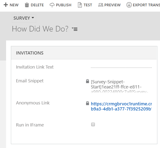
Once you have added your question, go back to your main Survey tab (instead of the Designer tab), then publish it. Use the Preview option, or click the Anonymous link in the invitations section to open up the survey.
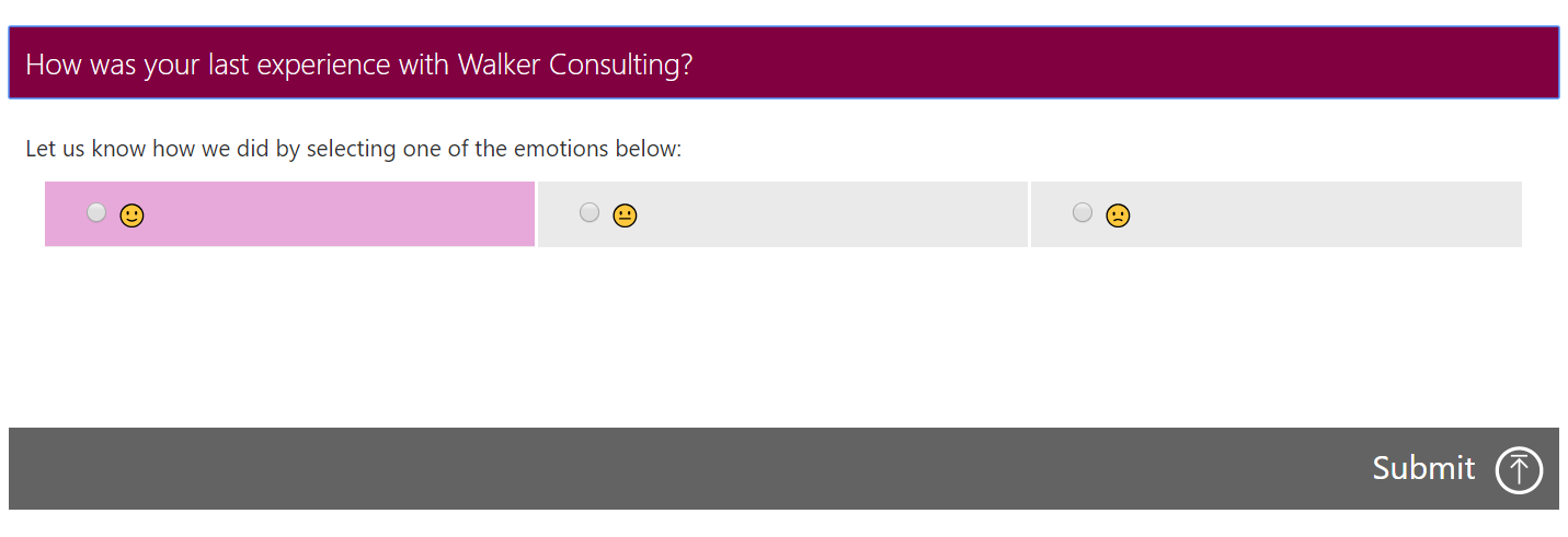
Now, let’s look at what we added. 🙁 not great is it? The emojis are tiny, and because the single option question uses radio buttons, those are present too.
Also, one thing to keep in mind, what ever colours you have used for answer fields to display them normally, then hover and selected, those will be used on the survey behind the emojis.
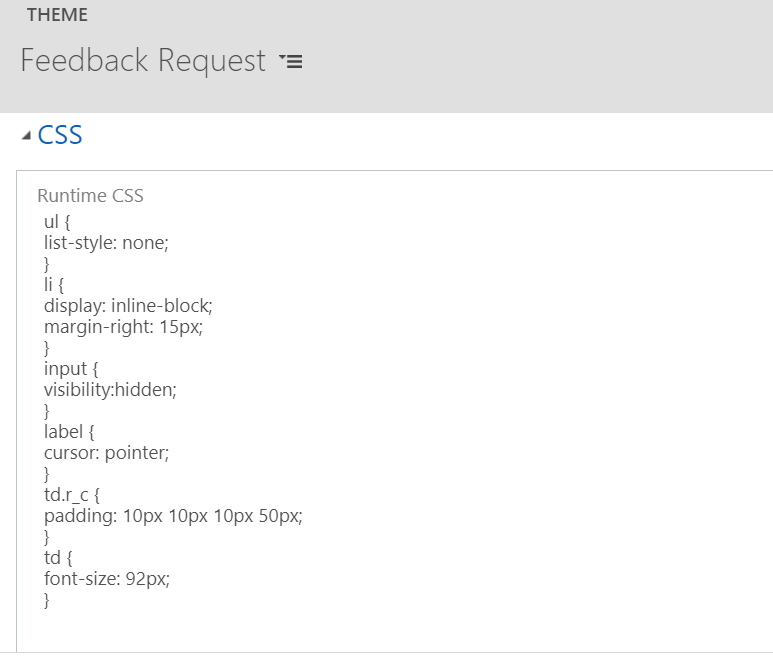
Go back to your Theme. In the CSS section we can add in some style changes which will do a couple of things for us. First, it will hide the radio button, and make the emoji the selector instead. We can also change the position of the emoji so it’s in the centre by giving it some padding. Finally, we can increase the size of the emojis so they can be seen a whole lot easier! Here is the exact css that I used. Feel free to copy and paste and modify as needed. Depending on how many surveys you have, you should probably make a new custom theme before you do this. Otherwise it will change any of your other surveys, and specifically change how the radio buttons are styled… so keep it separate.
ul {
    list-style: none;
}
li {
    display: inline-block;
    margin-right: 15px;
}
input {
    visibility:hidden;
}
label {
    cursor: pointer;
}
td.r_c {
    padding: 10px 10px 10px 60px;
}
td {
    font-size: 92px;
}
And here we have it! The finished modified feedback survey. Quick and easy to understand, and simple for customers to give clear feedback. You can always add a long answer question to allow them to provide details if they wish. Any responses will come through with a response id of 1, 2 or 3 (or as many for each emoji you added).
Now that you know how to do it, you could use any kind of emoji!
Check out the latest post:
Set A Business Process Flow Stage With Custom Page
This is just 1 of 572 articles. You can browse through all of them by going to the main blog page, or navigate through different categories to find more content you are interested in. You can also subscribe and get new blog posts emailed to you directly.


Hi Megan! Awesome post 🙂 : You’ve serious html / css chops!
One question if you don’t mind. I am trying to create a survey question with 5 available response options. Problem is, 5th element goes by default to a new row and, gosh, it gets soooooo ugly!
I’m investigating whether I can manipulate this through css but I am unsure. The fith element is rendered through a new “tr” html element node… Do you have any hint!
Thanks,
Jorge
Hi Jorge,
Yes that might be possible. Do you have a link to your survey and I’ll take a look for you? Feel free to email me. Hello@meganvwalker.com
Hi, I had the same problem and resolved it by this custom CSS:
tr.tal{
display: table-cell;
}
ul {
list-style: none;
}
li {
display: inline-block;
margin-right: 0px;
width: 20px;
}
input {
visibility:hidden;
}
label {
cursor: pointer;
}
td.r_c {
padding: 0px 0px 0px 0px;
width: 30px !important;
}
td.r_c.r_cc {
width: 30px !important;
}
td {
font-size: 42px;
}
ul {
list-style: none;
}
li {
display: inline-block;
margin-right: 0px;
}
input {
visibility:hidden;
}
label {
cursor: pointer;
}
td {
font-size: 42px;
}
td.r_cc {
background: #fff;
width: 30px !important;
}
div.srcell {margin: 0px;}
.g {width: 0%;
border-spacing: 0px;
}
input.tabinp {
display: none;
}
Might not be the best solution but it works! 🙂