*** NOTE: ALL INFORMATION IS ACCURATE AT DATE OF PUBLISHING ***
Once your Microsoft Clarity tracking code has been added to your website, and you’ve waited a few hours, it’s time to check out your data. In this post, let’s walk through the dashboard to get an understanding of the metrics and analytics provided.
After logging in to Microsoft Clarity, you can navigate to your project (or go directly if you only have one), and then click on the Dashboard tab. You should see something similar to this, with doughnuts, score cards showing metrics, and bar charts providing insights. By default, it will show data from the last 3 days (but can be changed using filters – more on that in a future post).
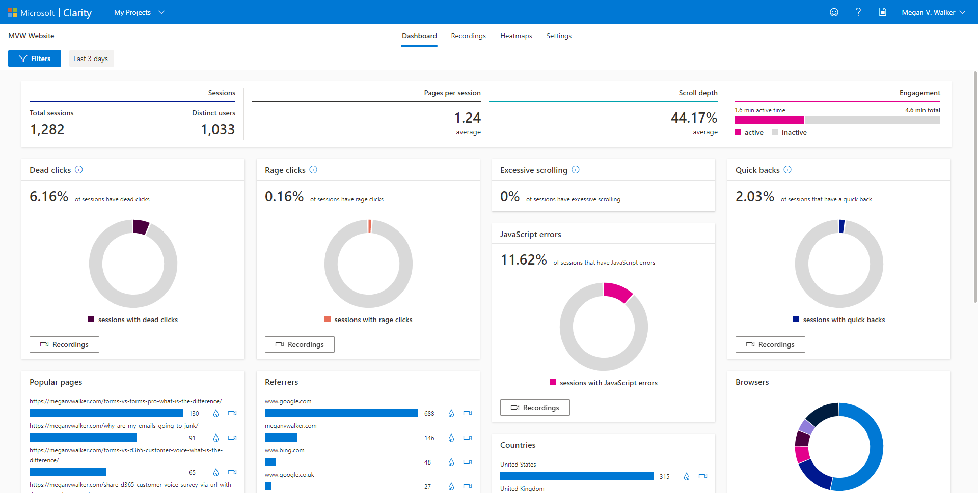
Along the top, we can see the type of data you might expect to find in Google Analytics, showing the number of sessions, distinct users and pages per session. Scroll depth indicates how far down the page users are scrolling before they leave it and move on. Finally, the engagement will show the amount of time spent on a page divided by active vs. inactive time.

We can then see clicks on the site, with dead clicks and the awesomely named rage clicks. Dead clicks are tracked when a user clicks on something on the page but gets no response in a reasonable amount of time. This means nothing has happened on the page, and the user isn’t taken away to another page either. This could signify a broken link, but I’ve also seen it where users are just clicking on text, with no indication that there is any kind of call to action. If the user clicks multiple times in a clustered area on a given page in rapid succession, this is where the rage clicks are tracked. Rage clicks can also indicate deadlinks, or a button that doesn’t work, that kind of thing. However, I’ve also noticed it where someone has just clicked a bunch of times for no apparent reason. It’s interesting to watch!
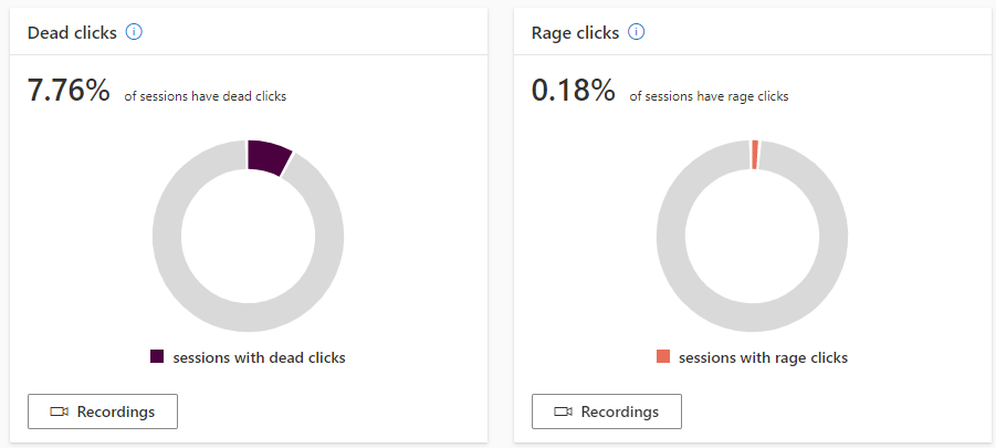
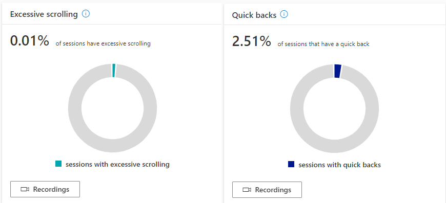
Next we’ve got excessive scrolling and quick backs. Session that have higher amounts of scrolling up and down a page than expected, are marked as excessive scrolling. than the expected average for a given page. If someone scrolls up and down the page, not finding what they are looking for, then leaves the page, or even the site, that could be a good indicator that the page content needs adjusting so as to provide clearer information. Quick backs are classed as interactions where a user clicks away from the page, then returns back to the page they started from in a short amount of time. This could mean they went to another page from a link on your site, realised it wasn’t what they were looking for, then came back right away. It might then be a good idea to review what you are linking to, and make sure it’s relevant.
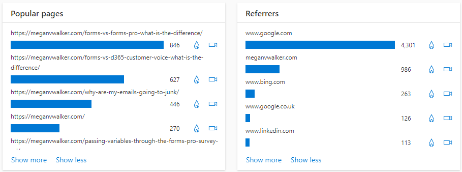
The two bar charts show popular pages and referrers. During the timeframe selected, we can see how many times a specific page was visited, and then out of those pages visited, how many times did they come from a specific places as the referrer.
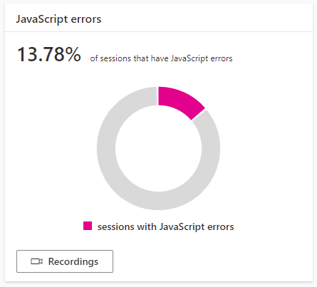
For the JavaScript errors, this will show the percentage of the sessions within the filter timeframe that have JavaScript errors. This should help you see if it’s one specific page, or a series of pages, and what could be causing the errors. JavaScript errors could contribute to dead clicks, rage clicks or even reduce the amount of time a user stays on a page.
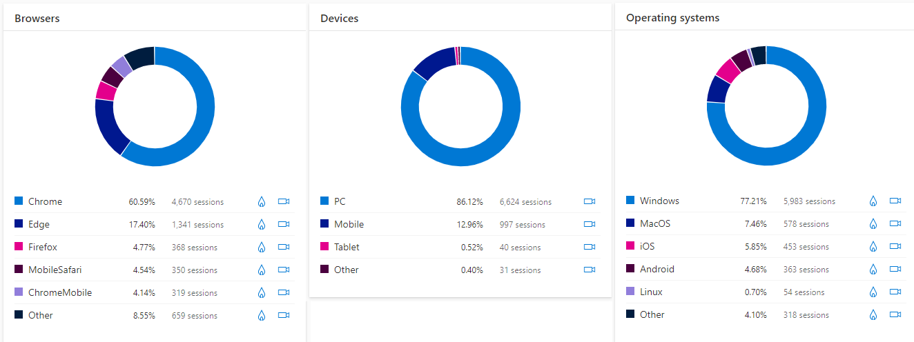
These next doughnut charts are pretty self explanatory and show data similar to that found in Google Analytics. What browsers are your visitors using when viewing your website, and on what devices, and what operating system. This could help you in terms of figuring out you have issues or errors but only when visitors are viewing on a specific device or using a specific browser.
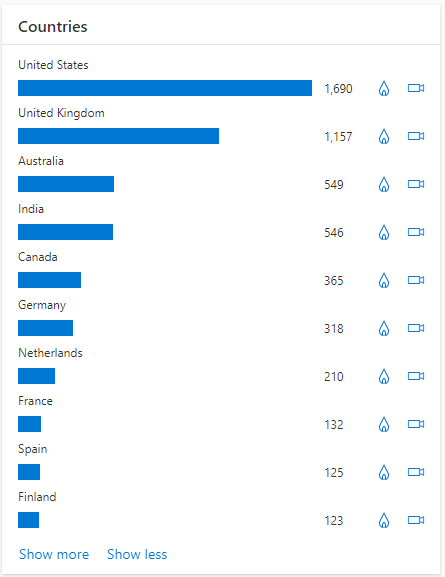
Finally, you can see the countries that your visitors are coming to your website from. Depending on the type of content you have on your site, it could help you identify if a specific type of content resonates more with one country over another, or if users navigate through your website slightly differently. Lots of interesting analytics for sure!
You can watch a video on this here.
Check out the latest post:
Use Custom Event Registration Questions To Branch Your Journeys In Customer Insights
This is just 1 of 603 articles. You can browse through all of them by going to the main blog page, or navigate through different categories to find more content you are interested in. You can also subscribe and get new blog posts emailed to you directly.