*** NOTE: ALL INFORMATION IS ACCURATE AT DATE OF PUBLISHING ***
Building emails in the Dynamics 365 Marketing App is pretty easy. You pick a layout section that can contain one or more columns, then add elements of text, image, button, divider or even QR code. Then you preview it, make sure it looks good in different screen sizes, and then you’re ready to go! Or are you? If you’ve got more than one column in a section, you might notice it looks a bit different in the mobile preview compared with the desktop preview. You’ve checked the alignment of sections and they all look good but can’t figure out how to resolve things. When the order of the content is not as you intended it to look, how do you ‘fix’ it so it looks good for people reading the email on their phone?
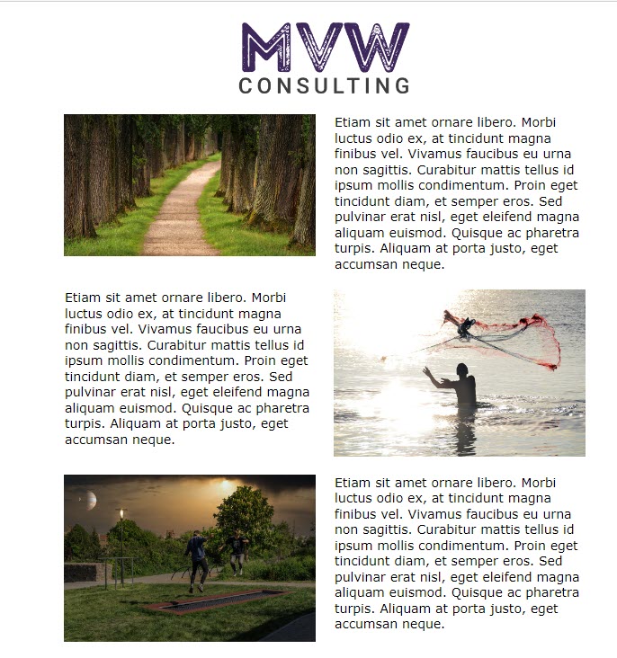
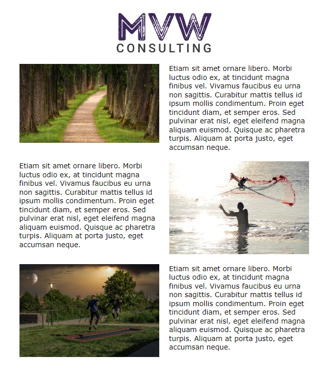
Below I have an email with several sections. For three of the sections, they have two columns to show an image and text, text and an image, then image and text again. So it’s in this order from left to right.
- Image
- Text
- Text
- Image
- Image
- Text
This is how it looks for someone viewing it on their computer.
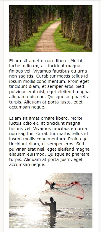
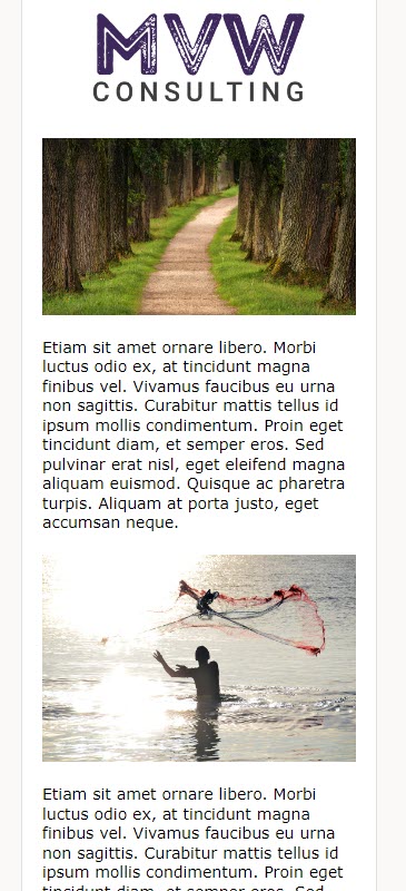
However, when looking at the preview (or sending a test) on a mobile, this isn’t really what we want the recipient to see right? It would look much better if that second image was above the second block of text. So, is it wrong? Well, no, it’s not. The email is showing the content in the order of left to right on desktop as the blocks have been placed. For a mobile they are stacked top to bottom. So, for each section where we have the two columns, the second section has the text first, then the image. As it follows the first section with image first then text, stands to reason that the order of the content would then follow on with the text box from section two. So how can we ‘fix’ the issue that isn’t an issue but looks a bit crappy?
First thing let’s change our email a bit. Remove the second section with the text on the left and the image on the right, and instead, place them in the same way as the other two so all images are on the left, and all text is on the right.
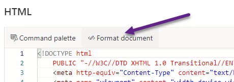
Now this is where we need to do a TINY bit of editing to the HTML of the email. Click on the HTML button from the top right of the email. Note that you can only do this if your email is in draft mode.
Now we need to find the container that includes the section where we swapped things to show the ‘wrong way round’. As you add new sections to the email, this creates containers which have a mixture of tables, divs and other code in them. In my email this is the 3rd container down. You can click in to the HTML then press Ctrl+F on your keyboard. This will give you a search box where you can add emptyContainer to use as the search keyword. This will then give you a quick way to jump to each container. Unless you’ve done any weird and wonderful things to your HTML already (in which case you likely don’t need my help anyway 😜), we should be looking for the second line that starts with table in this section.

Go to the end of the line and paste in the following:
dir="rtl" width="100%"
This changes the direction of the items within that table (your section on the email). So instead of going from left to right (ltr) which would be the norm and show image on left and text on right as per the section layout, it goes from right to left (rtl).

Once you’ve changed the HTML, click on Format document from the top. I have found that this readjusts the layout of the HTML and also on occasion when NOT doing this, my changes don’t take. Once you’ve done this, close the HTML panel from the X in the top right corner.
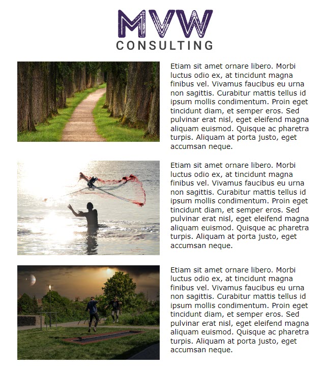
Your email should automatically change and now swap the direction of the components in the second section and switch the text to the left and the image to the right. Perfect. This is what we wanted to happen.
The image is in fact still REALLY on the left… so this means the order of it being displayed on a mobile device from top to bottom will be as follows:
- Image
- Text
- Image
- Text
- Image
- Text
Editing the HTML might seem scary and maybe even that we shouldn’t NEED to do it. However, keep in mind that your emails that use various columns are indeed working correctly on a mobile… it’s just that aesthetically it might not be what our eyes would expect to see. So next time this happens, just change the direction of your section and things should look a whole lot prettier. 😊
Check out the latest post:
Send Unique Event Registration Response With QR Code Using No Code
This is just 1 of 449 articles. You can browse through all of them by going to the main blog page, or navigate through different categories to find more content you are interested in. You can also subscribe and get new blog posts emailed to you directly.
Hi Megan,
Sound interesting. I found myself struggling with the mobile design when it comes to Gmail App. Do you have any advices on that? Gmail completely ignores the column wrap Microsoft uses in their HTML Stylesheet…
Hi Sven, yes, Gmail does seem to do different things than Outlook (along with some other email clients). I found this which is interesting, but certainly appreciate it doesn’t give you a ‘quick fix’ to make your marketing emails look good in Gmail too – https://www.emailonacid.com/blog/article/email-development/12_things_you_must_know_when_developing_for_gmail_and_gmail_mobile_apps-2/