*** NOTE: ALL INFORMATION IS ACCURATE AT DATE OF PUBLISHING ***
One of the smart approaches to take with your emails in Customer Insights Journeys (D365 Marketing) is to build Content Blocks that can be used when creating email templates or one off emails as needed. Building them is easy and makes sense for repeated things such as headers, footers, unsubscribe copy and social media profiles. We can create blocks using multiple columns to lay out the different images and space them in a nice looking layout. BUT, have you ever noticed they look a bit strange on a mobile device? If you are seeing those images all one on top of each other, this might be the post for you! Let’s look at how you can make the image layout look good no matter what device your email are viewed on and create responsive social media content blocks.
This is how we want the social media block to look on a desktop, all laid out in a nice row.

However, when it comes to the mobile view, they look like this! This is NOT what was intended and looks pretty bad. So how can we fix it? Easily!

Go in to your Content Block and click to select the Section. Here we can see that mine has multiple columns, six in total so the layout can fit perfectly on our emails.
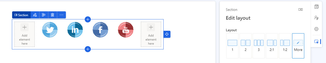
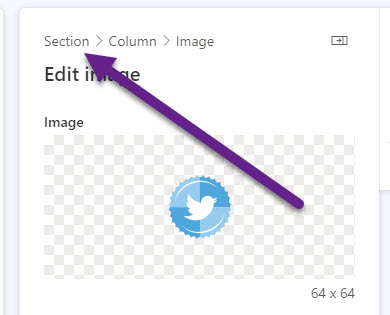
TOP TIP! If you are finding it hard to click to select the section, just click on one of the images. From there on the right, you can use the breadcrumbs to jump directly to the Section! So much easier and less fiddley than trying to make sure you select exactly the right place from within the Content Block.
Scroll to the bottom of the menu for the section until you get to Responsive design which is right at the bottom. The very first item on here is a tick box that says ‘Wrap columns on mobile’ which is selected by default on any Section added in a Content Block, Email Template, Email or Form! My Content Block has six columns which means when viewing on a mobile device they will all be displayed one on top of each other rather than in a row. Simply untick this then make your Content Block live again.

Now we can see the social media content block just resizes on a mobile and doesn’t wrap. Hooray! THIS looks WAY better than before!

We have a couple of other options for our sections too. We can untick the box to show on mobile meaning a content block just will not be shown at all when viewed on a mobile device.

Or we can do the opposite and untick the show on desktop and opt to only show it on a mobile device.

Here we have an email with two social media content blocks, the top one (purple block) set to show on desktop but not mobile, and the bottom one (green block) set to show on mobile but not desktop.
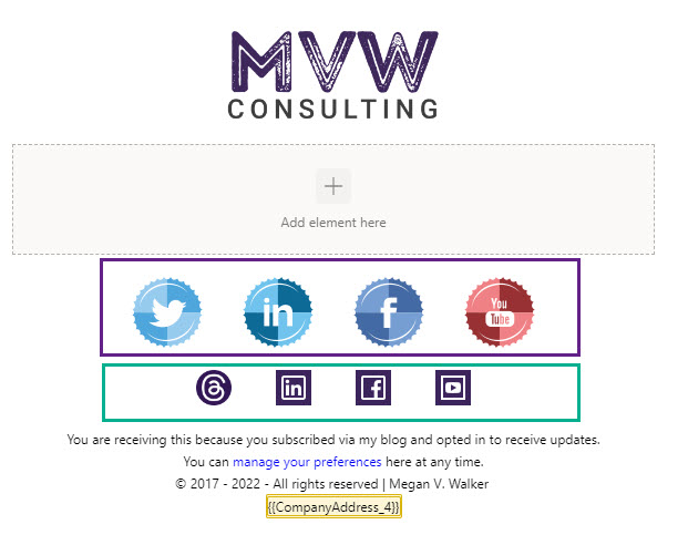
And here we have the top one showing on the desktop preview:

And the bottom one showing on the mobile preview:

So, paying attention to settings and tick boxes is important and can help to create really valuable and great looking content for your audience members!
Check out the latest post:
Use Custom Event Registration Questions To Branch Your Journeys In Customer Insights
This is just 1 of 603 articles. You can browse through all of them by going to the main blog page, or navigate through different categories to find more content you are interested in. You can also subscribe and get new blog posts emailed to you directly.
Thanks Megan. This was very useful as we recently had users raise this issue.
Hi Immi, you are very welcome, glad it helped you out!