*** NOTE: ALL INFORMATION IS ACCURATE AT DATE OF PUBLISHING ***
In Part One of this topic we looked at using the manager field on a User to allow for filtering of data, and adding users to teams to make it easier to share views, charts and dashboards. What if we want to use Teams for reviewing data and not just sharing things? And how about making charts dividing data by Manager? Here are a few more ideas.
First, when creating views and adding fields to the filtering criteria, the first set of fields you get are all of those on the entity you are searching on. However, once you get to the bottom of that list of fields, you are then scrolling through Related entities. In this example we are looking for Opportunities, so we scroll past the last field in the list.
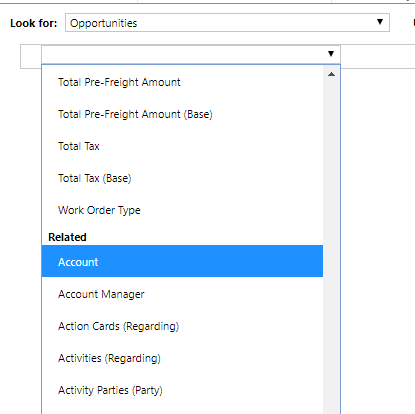
Once you find Owning User in the list, select that. You will notice that a new Select option has appeared for you. Click on that.
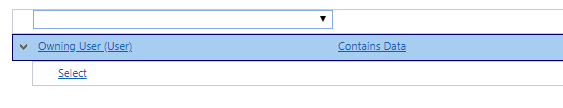
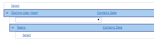
Now scroll past all of the fields related to the User, and find Teams, then select that. You will notice another new Select option has appeared for you. Click on that.
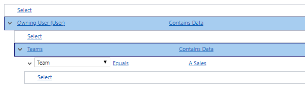
Finally, look for Team in the list of Teams related fields. Then you can choose Equals, then look up the name of the Team or Teams you wish to search on. You can add in any Opportunity related fields back at the top of the view. You are then able to search for any Opportunities where the Owning User of the Opportunities are in a specific team. This can be used across any other types of records, so all Accounts owned by people in a team, or Cases owned by people in a team and so on. Easy once you know how!
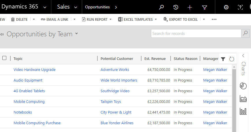
Now let’s go back to the Manager field we used in Part One. How can we use that further for reporting? We can create charts using that field to go along with any of our views. First, make sure you have a view that includes a column for the Manager. You will find this by scrolling past all of the Opportunity fields (like in the examples above), the go to the Owning User option. From there, pick the Manager field. Next, go to the Opportunities area in D365 and make sure you are displaying your new view. If you haven’t used it before, you might not know about the Charts area. You can see it on the right hand side. Click the arrow which will expand this area for you.
You should see a plus button at the top of the charts area. Click on this to open the Chart Designer and create a new chart.

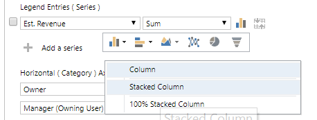
Give your chart a name. Next, select Est. Revenue for your legend series, and choose the Sum option. Then click the chart icon next to that line, then pick the bar chart and click the drop down arrow next to it. From here select the Stacked Column option.
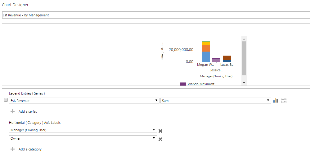
Now move down to the Horizontal Axis section and add in two fields. First you need the Manager (Owning User), then the Owner. You will not be able to add the Manager unless you have added it to your view. Now save the chart and close out of the designer.
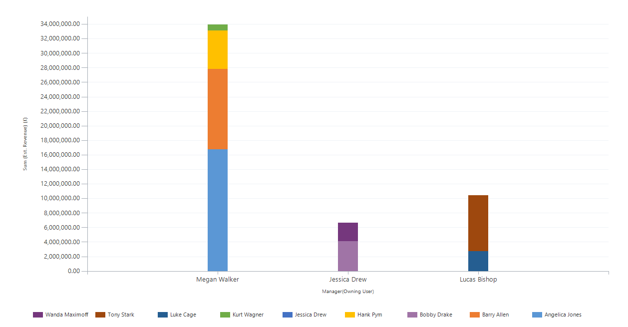
Now you can see a chart sorted by Manager with a legend below showing all of the Sales Reps. Hovering your mouse over each colour will show you the exact amount for each sales rep.
Check out the latest post:
Use Custom Event Registration Questions To Branch Your Journeys In Customer Insights
This is just 1 of 603 articles. You can browse through all of them by going to the main blog page, or navigate through different categories to find more content you are interested in. You can also subscribe and get new blog posts emailed to you directly.
Huge fan of Liquid. I use it in my blog posts as Jekyll (static site generation) uses it quite a bit.
Great post.
Thanks for taking the time to comment Owen. I am becoming a huge fan also, the more I learn and dig in to it. Really cool to be able to customise a portal using it.